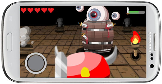
On September 26, team BarrelEye gave our quarter-semester presentation to an audience of EA employees and ETC alumni. You can see video of our presentation on the ETC Silicon Valley blog!
Four Swords Adventures
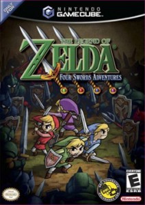
One game that bears some similarity to Torch is The Legend of Zelda: Four Swords Adventures for the Nintendo GameCube. We haven’t had the opportunity to play this one yet, but we have studied it a bit to see what they do right and what we could improve upon.
LoZ:4SA takes the classic Zelda formula and turns it into a four-player cooperative experience. The game depends on a special link cable that turns a Game Boy Advance into a controller for the GameCube, granting each player their own local screen, while the television is used as a shared screen for all players. This allowed individual players to wander off from the group, with gameplay transitioning from the TV to their local screen and back.
In terms of hardware setup alone, this might be the closest thing we’ve seen to the game we are creating. It gives us a whole set of multi-screen design decisions to compare our game against.
The first thing one notices when watching videos of the game is how rapid and chaotic it seems. It’s very difficult for one person to follow the action on all five screens. However experience with the game will reveal that each player only ever needs their attention in one place unless they really want to check other screens. When a player character is on the main screen, their local screen only shows a message saying “Look at the TV!” (There are occasional callouts on the main screen to alert a player to a message on their local screen.) When they leave the main screen the only need look at their local screen. Thus, there is not much need for divided attention in this game.
The designers also made an interesting choice by giving each player a “picture-in-picture” bubble on the main screen when their character is out of sight. This gives players a clue to each other’s activities without looking at one another’s screens, and it makes it easy to tell if an ally has gone indoors or is just hiding behind a tree.
The game contains lots of small puzzles and obstacles that require a synchronized effort to overcome, such as rocks that must be pushed as a group or pressure plates for all four players. For now, we’ve decided that these challenges are not appropriate for our game, because we want it to be drop-in drop-out friendly. We may take this design into account for the boss encounters though.
It also features a ranking system after each level that scores players on several game statistics (it’s very transparent about it). It also lets players secretly vote each other up and down according to how nice they were, which influences the final score for each player a bit. It’s a nice touch that encourages friendly play.
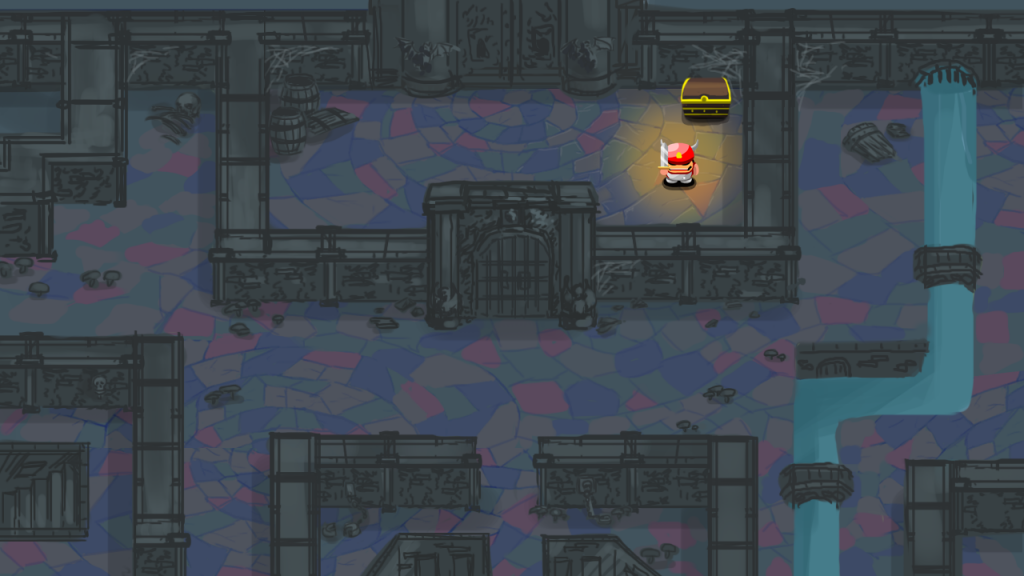
While there are many key takeaways from this game for us, it’s a more open experience than we intend to create. Torch is designed with a different feel in mind, so that while we want the game to be fast and fun, the constrained dungeon setting is essential to our experience. That also means limiting the items that we have in the game, and thinking about our controls in a whole different way – Zelda would be very different on a touchscreen. Finally, we want to get the players using both screens as much as possible rather than only moving between one and the other. It’s a tough design challenge – which is why we’re looking for good examples like this one to solve some of the challenges for us.
Boss Scene #1
Categories


