Turning Point
It’s a great feeling when a project has a week of planning. It’s an opportunity to find a stable spot, get oriented, and take a collective deep breath before continuing on the journey. BarrelEye’s fifth week, though busy, was full of reflection and preparation.
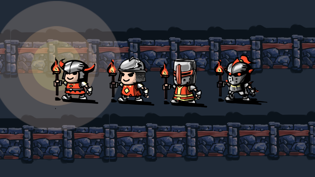
After a successful playtest last Friday we took some time to review the feedback we had collected. Our guests had provided us with a wealth of suggestions and we walked through the list together, discussing the changes that made the most sense for Torch. We generated a yes/maybe/no list with reasons for many of the design decisions we made. It’s nice to have the whole team invested in the design.
We also spent a few days preparing for our quarter-semester presentation. As part of this process we examined the work we have done, so that we could explain it to our audience. We also looked forward to the next twelve weeks, to describe our roadmap to success. In the process we discovered that while the last four weeks of planning and prototyping have been productive, it is time to lay the cornerstone of Torch and build.
In addition to a successful Quarters presentation, Wednesday marked the end of our first work sprint. After the presentation the team convened upstairs for a sprint retrospective. We spent about 45 minutes discussing the state of the project, what we felt was working and what we needed to change. This was followed by discipline-specific meetings to discuss and estimate the features we want to include in the game, and thus need to build during the next two sprints.
The next morning we met to formally plan sprint #2. With our tasks divided into stories (or features) we selected a subset to focus on during the next two weeks. We hope that set of stories will be within our reach, and that it will best represent our vision for the game at our next progress update on October 10th. We spent the afternoon getting organized and doing individual task estimates for our next burndown chart. The time spent planning is worth having a clear sense of the work ahead of us.
Today we turn the corner into the next stage of our project. It was a busy week and while we’re not exactly refreshed, it’s nice to have a plan and move forward with confidence about our direction. We’re a little intimidated by the amount of work ahead of us, so we’ll be reaching out to the OCCO for support as much as possible. Next week is all about building the foundation of Torch and investigating the least familiar parts of our plan, especially the networking and graphics technologies we are using. See you then!
Wii U
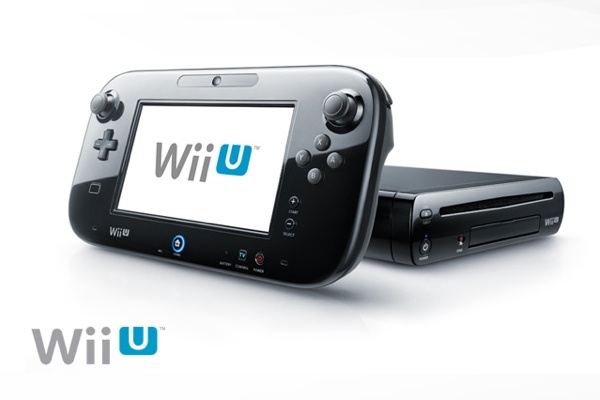
One topic that came up very early in our research process was Nintendo’s Wii U. The new console (set to release in November) prominently features a large touch screen in the controller, which enables two-screen gaming in the living room. A handful of launch titles are already being advertised, and we’ve been taking a look at how they are using the second screen.
We’ve watched gameplay trailers for ZombiU and Arkham City (trailers may contain mature content). What we’ve seen are a few common categories of interaction with the second screen.
- Mini-map: This is something we’ve seen on the DS quite a bit. It frees up some screen space, but doesn’t add much to gameplay.
- Inventory: It’s fairly common to use the second screen to host menus, which is appropriate for a touch interface. This also allows the player to pull up menus without pausing the game. Usually this would create a divided attention problem, but it’s used to great effect in ZombiU to create a tense situation.
- Look-thru: Several games have demoed a kind of augmented reality where the player holds the gamepad up and “looks through it” to get an alternate view of the TV. This is used for sniper rifles, or scanner views like Metroid Prime’s different visors. This has some potential, but curiously it’s kind of like having one screen again.
- Alternate perspectives: This is a variant on the Inventory interaction, but it feels different. There’s a great moment in the ZombiU trailer when the player is trying to enter a code on a keypad. The keypad comes up on the touch screen, but the TV view reverses to show the slowly approaching zombies. It gives the player useful ambient information on the secondary screen (in this case, the TV) that also increases the tension.
These interactions are interesting, but not as diverse as we expected. We’re wondering what other two-screen interactions will arise during the console’s lifetime.
We also did a quick comparison of the Wii U’s capabilities vs. a phone+TV setup.
Form Factor
Wii U wins this one – their gamepad is designed to be held in two hands for long sessions, where phones are not.
Dual Screens
Wii U’s screen looks pretty good, but it will be hard-pressed to rival recent phones and tablets.
Touch Control
Hard to judge before the system is released, but touch control has gotten very good on phones, and is also very software-dependent. Availability of a stylus might be an advantage of Wii U, but some tablets come with a stylus too.
Front-facing camera and mic
Phones are likely to have better quality.
Multiplayer
This is a major bottleneck for Wii U. It sounds like the system will only support one gamepad with touchscreen at launch (maybe a maximum of two eventually), but in theory we could connect up any number of phones and tablets for multiplayer. This difference is one reason we opted to create a multiplayer game.
That’s what we think about Wii U. We hope to set our game apart with its multiplayer that requires many screens, and a more unique use of the phone’s capabilities.
Categories

