Currently viewing the category: "Photos"


It’s a great feeling when a project has a week of planning. It’s an opportunity to find a stable spot, get oriented, and take a collective deep breath before continuing on the journey. BarrelEye’s fifth week, though busy, was full of reflection and preparation.

After a successful playtest last Friday we took some time to review the feedback we had collected. Our guests had provided us with a wealth of suggestions and we walked through the list together, discussing the changes that made the most sense for Torch. We generated a yes/maybe/no list with reasons for many of the design decisions we made. It’s nice to have the whole team invested in the design.

We also spent a few days preparing for our quarter-semester presentation. As part of this process we examined the work we have done, so that we could explain it to our audience. We also looked forward to the next twelve weeks, to describe our roadmap to success. In the process we discovered that while the last four weeks of planning and prototyping have been productive, it is time to lay the cornerstone of Torch and build.

In addition to a successful Quarters presentation, Wednesday marked the end of our first work sprint. After the presentation the team convened upstairs for a sprint retrospective. We spent about 45 minutes discussing the state of the project, what we felt was working and what we needed to change. This was followed by discipline-specific meetings to discuss and estimate the features we want to include in the game, and thus need to build during the next two sprints.

The next morning we met to formally plan sprint #2. With our tasks divided into stories (or features) we selected a subset to focus on during the next two weeks. We hope that set of stories will be within our reach, and that it will best represent our vision for the game at our next progress update on October 10th. We spent the afternoon getting organized and doing individual task estimates for our next burndown chart. The time spent planning is worth having a clear sense of the work ahead of us.

Today we turn the corner into the next stage of our project. It was a busy week and while we’re not exactly refreshed, it’s nice to have a plan and move forward with confidence about our direction. We’re a little intimidated by the amount of work ahead of us, so we’ll be reaching out to the OCCO for support as much as possible. Next week is all about building the foundation of Torch and investigating the least familiar parts of our plan, especially the networking and graphics technologies we are using. See you then!

 

 NEWSLETTER #5  PDF FORMAT – DOWNLOAD


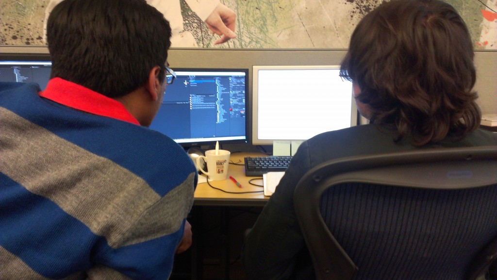
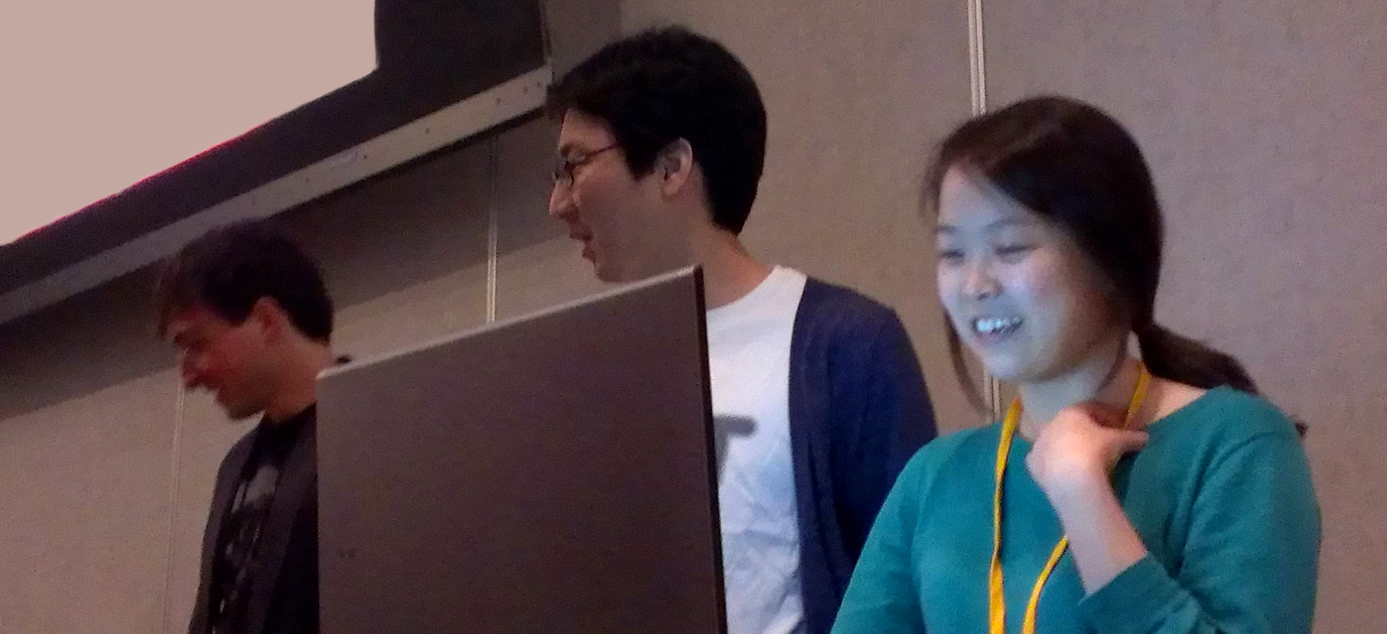
Neerav and Romain testing the network integration for our digital prototype.
Photo © Brad Buchanan.

“He dares to be a fool,
and that is the first step
in the direction of wisdom.”
– James Huneker

The team shared a nervous energy this week as we prepared for our playtest. We had made plans, prepared our pitch, promised a revolution and now – a meager seventeen days later – it was time to reveal our hand. Our plan was to demo our first digital prototype, and we had boldly sent out a public invite both to our fellow students and to the EA team. “We’re using Unity,” we thought, “how hard can it be?”

Of course, it’s never that easy.

On Monday and Tuesday our engineers spent all their time working through Unity networking to set up our prototype. Every few hours they would have a breakthrough and would celebrate, until they realized they had uncovered three more problems to be addressed. Networking can be tricky business.

By Wednesday we were starting to worry. The prototype was working, but it was all grey floors and grey walls and cube people. We understood the game, but our guests would not. Art started dropping temporary assets in anywhere they could, and by that night the game looked quite impressive. We expected to leave our guests amazed.

We knew that Thursday would be our final push, because Friday morning would not afford enough time for fixes. After attending morning classes, the team gathered to test out the game one more time. That’s when we realized it wasn’t working on the phones. Our engineers spent hours trying to track down the problem, then rolled back to the last working build, then spent more hours reconstructing crucial elements for our playtest. Art could only continue working on research and presentation materials, and wait patiently for an answer. At ten o’clock we were back to cube people and grey floors, and we’d thrown out so many other features we wanted to show. But we agreed to stop – the build was stable, and we weren’t about to tempt fate any further.

The morning of the playtest we prepared with mounting anxiety. Somehow the prototype felt sub-par, having watched a more polished version slip through our fingers the day before. Why had we ever invited our client to this, our most vulnerable moment? How would they respond to boxes sliding around on a screen, when just a week ago we were showing beautiful concept art?

So, somehow, it was a surprise when our guests showed up and incredible feedback started pouring in. People understood the prototype nature of our test. They picked up on what the shapes represented and got the hang of the experience faster than we expected. Best of all, some of them started to have fun! We should have known – we did invite game developers to our test, after all.

We came away from our playtest with a mountain of feedback that we will sort through next week in preparation for Quarters, but also with a new appreciation for the value of early testing. It wasn’t easy to show our game knowing that it was so incomplete, but we would have missed out on so much insight if we had not done so. If our next several playtests are half as productive as this one, then Torch is going to be a great game.


 NEWSLETTER #4  PDF FORMAT – DOWNLOAD

On Friday September 14th we tested out a “paper prototype” using an ingenious system devised by our level designer, Jaewan Park. What follows is his description of the prototype and the playtest itself. -Brad

Main Screen – Transparent Acrylic

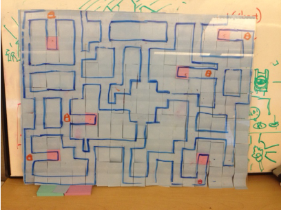
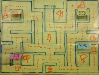
We used a transparent acrylic board as the main screen. On the back of the board I drew a map with a marker, and on the other side I hid the map with post-its so that players cannot see the entire map at the beginning.

Dungeon map version 1 (36×28)

Before we playtested, I got feedback from Rich [Hilleman] that the map is probably too large for a two-minute experience. So I scaled it down to about a quarter of the original map size.

Dungeon map version 2 (19×15)

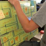
As gamemaster, I move paper characters manually on the back side of the board. The players don’t see their characters on the front unless they have a torch, in which case I move the post-its to reveal that part of the map.

Individual Screen – Workstation with Photoshop
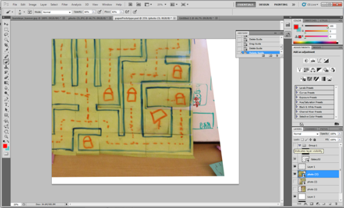
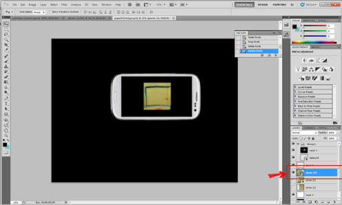
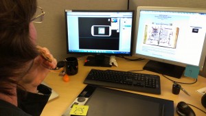
The players each had an individual workstation to control their characters. I placed two layers in Photoshop.

First, I placed a photo the dungeon map.

Second, I put a fake cell phone mask on top of the map layer.

The player can control the map layer using the arrow keys on the keyboard, allowing them to simulate movement through the maze. We played the prototype as a turn-based game, and whenever each player moved their character I (as game master) would update the main screen as well.

Jaewan operates the “TV”

Objectives

My goals with the paper prototype were:

  1. First, to design a map in a short amount of time.
  2. Second, to let us iterate quickly and solve problems through iteration.
  3. Third, I expected the total time of the paper prototype test would be about eight times more than a digital prototype. We used this assumption to estimate how long it would take players to find one another and advance to the boss room.

I was able to design the map quickly because I did not rely on any other technology, so I only focused on the design. It was easy to iterate with the paper prototype, but it had the disadvantage that it took a very long time to finish a playtest. Therefore, we are moving on to digital prototyping because that technology is almost ready.

Romain ponders his next move.


I was proud of my own work on this prototype because I’ve never made a paper prototype before so this was unknown territory. I learned a lot about map design in a short amount of time.

Playtest Results

Here are some notes from our playtest:

Round 0 – Rich points out that the map is too big. We redesign the map.

Round 1 – We have four playtesters. Failure. Players spent five minutes wandering around before I discovered a problem with the map – it needed to be mirrored on the computers, since the players were seeing the back of the acrylic screen instead of the front. We took a break and I corrected the problem.

Round 2 – We have three players, and corrected the flipped-board issue. Having no torch makes people frustrated. Players spent about five minutes and they did not find any treasure boxes at all. There were 10 treasure boxes on the board, but it still took a long time. We take a break and I updated the map so that all players are guaranteed to find an item within their first few steps.

Round 3 – One person playtest. Bang! The player found the boss room in 8 moves. What?

Round 4 – Two players, on a fixed map. The players were given one torch at the beginning of the game and asked to find each other. They looked at the main screen (acrylic board) right away and checked back frequently. They reported the experience was interesting.

General feedback

  • Sometimes it is frustrating because we have to wait a long time between turns, and it feels like there are not many options of different paths to follow.
  • Maybe having rooms instead of just hallways would give more variation to players in the dungeon.
  • On the other hand, maybe we should just consider changing the number of intersections in our maze to adjust its difficulty/variety.
  • It takes too much time to move with the paper prototype, which makes it hard to judge how much time the overall game will take.

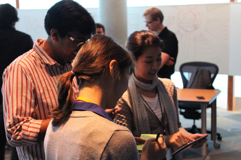
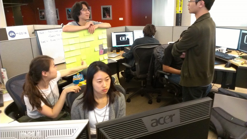
The team playtesting together.