Currently viewing the category: "Playtests"

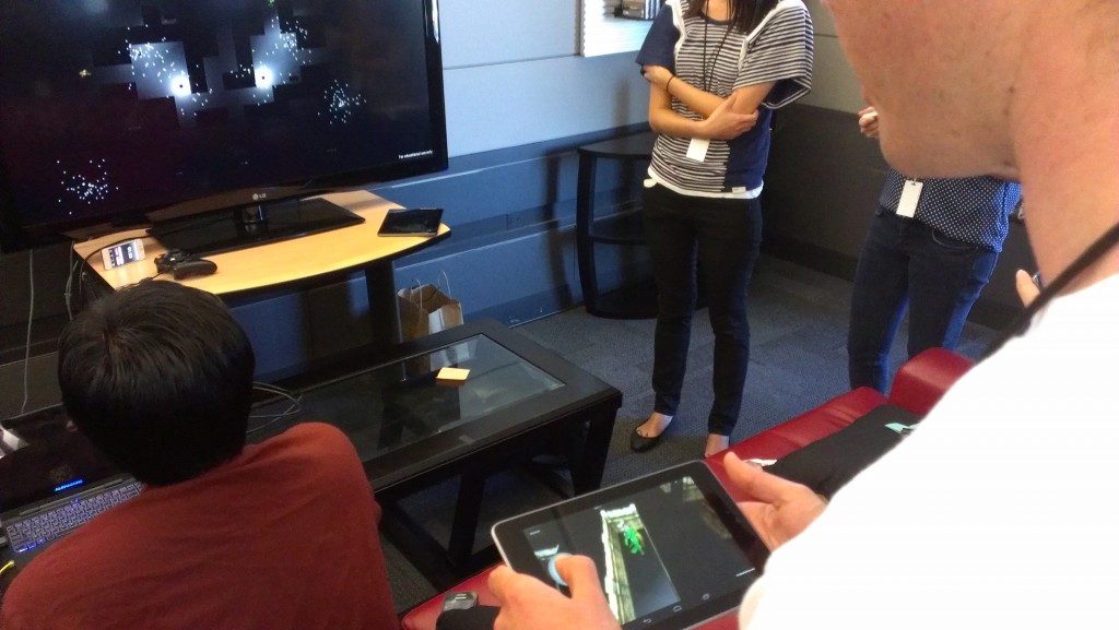
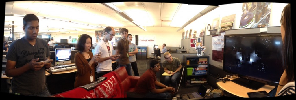
No, it’s not the only internal test we’ve had so far, but it is the most official! On October 2nd our team packed up our “test kit:”

  • One laptop with our Unity/server build
  • Three mobile devices with our Android/client build
  • One HDMI cable
  • One wireless router

…and we hauled everything over to the ETC project space in another building, set up on their TV and couch, and had our playtest in their space. We intended to test the game ourselves but our advisors and fellow students are awesome and happily tested our game with us!

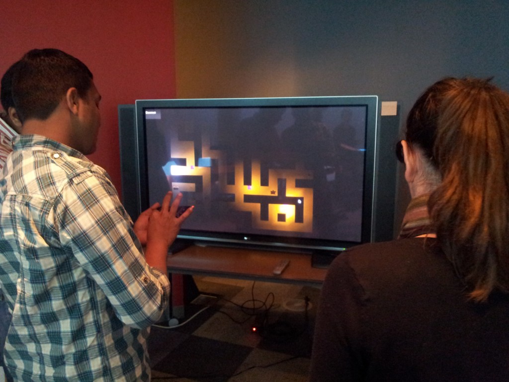
We made big improvements to our prototype since our last playtest, and it was obvious in this test. In some ways, players had the opposite experience that they had last time. The biggest improvement was that we added an objective for the players – there are now three keys hidden in the maze, and we challenge them to find the three keys as fast as they can!

Here were our biggest takeaways from the playtest:

  • Everyone wants the characters to move faster! And since they’re taking too long to find the keys, that would be a good idea.
  • People keep asking about other ways to control the character, whether with tap-to-move or tilt controls. We may have to revisit this just because it’s a requested feature.
  • We need to loudly broadcast the event any time somebody picks up a key – players were often uncertain how many keys they had collected. Audio will help with this too!
  • Players reported not feeling lost at all – in fact, our lights on the TV are revealing the maze a little too much!
  • Players also reported looked at the TV more than they looked at the phone. This is reversed from last time… good progress!

It was nice to have an informal playtest, just to keep the team focused on the user experience. Our next one will be a more formal guest test. It’s not far away!

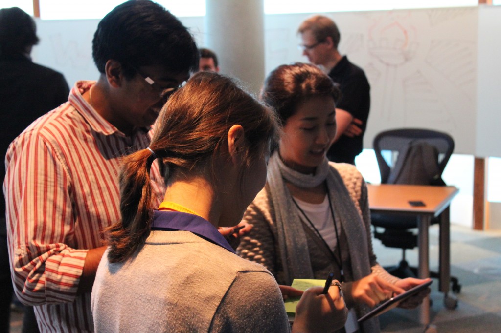
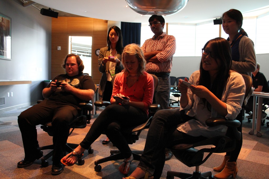
On September 21st we invited several EA employees and our fellow ETC students to try out our first prototype of Torch. We had sixteen people test the game in groups of two or three, and we received lots of great feedback!

We set up in a large conference room, using a Unity PC build of the game as our server (connected to the TV by HDMI) and a Unity Android build on four different mobile devices, which connected to the server wirelessly.

We invited our guests to first try out the game. Since this is our first prototype we only had a handful of features in and no real objective, so we asked players to go find an item and then meet up in the largest room. Right away we knew our experience was going to have some unique challenges – it wasn’t obvious to players at first that they could look at the TV for more information!

We treated each play session as an observation study, timing how long players took to explore the space and developing a sense of how they became familiar with the game and interacted with one another.

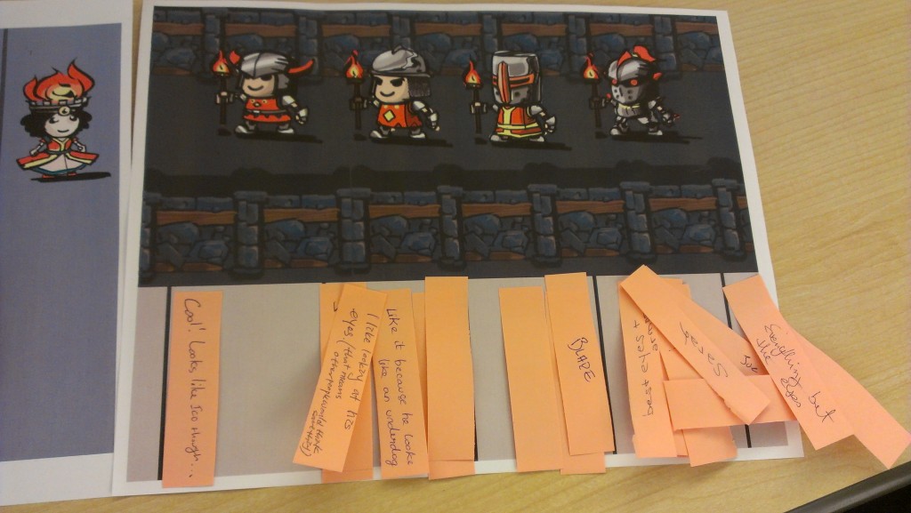
After trying the game, we had our guests take a survey about their experience with questions about whether they felt lost, how much they looked at each screen, and how they interacted with other players. Finally, we asked them to help us by giving feedback on some of our character concept art.

The amount of feedback we got from this playtest was overwhelming – our guests requested dozens of possible features and improvements to our game, from camera improvements to a rule about getting eaten if you’re in the dark too long. Naturally we can’t take all of the recommendations, but we’ve integrated many of them into our design and used all of the feedback to pinpoint the biggest issues with our game right now.

Our biggest concern after this playtest was that 100% of players spent most of their time looking at the mobile device screen, and not up at the TV. We feel that for the experience to really show off the technology, players need to look at the TV at least 50% of the time, and we were nowhere near that target after this test. Therefore, some of the first changes we made to our prototype after the test were lighting and camera changes that would get players to rely more on the television. Future playtests will reveal if our strategy has worked!

On Friday September 14th we tested out a “paper prototype” using an ingenious system devised by our level designer, Jaewan Park. What follows is his description of the prototype and the playtest itself. -Brad

Main Screen – Transparent Acrylic

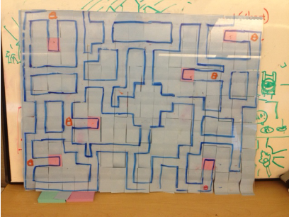
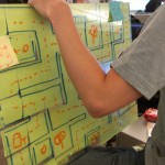
We used a transparent acrylic board as the main screen. On the back of the board I drew a map with a marker, and on the other side I hid the map with post-its so that players cannot see the entire map at the beginning.

Dungeon map version 1 (36×28)

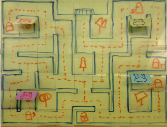
Before we playtested, I got feedback from Rich [Hilleman] that the map is probably too large for a two-minute experience. So I scaled it down to about a quarter of the original map size.

Dungeon map version 2 (19×15)

As gamemaster, I move paper characters manually on the back side of the board. The players don’t see their characters on the front unless they have a torch, in which case I move the post-its to reveal that part of the map.

Individual Screen – Workstation with Photoshop
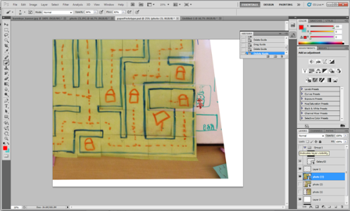
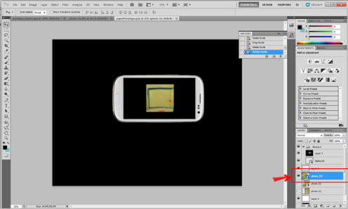
The players each had an individual workstation to control their characters. I placed two layers in Photoshop.

First, I placed a photo the dungeon map.

Second, I put a fake cell phone mask on top of the map layer.

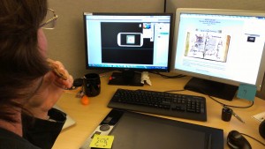
The player can control the map layer using the arrow keys on the keyboard, allowing them to simulate movement through the maze. We played the prototype as a turn-based game, and whenever each player moved their character I (as game master) would update the main screen as well.

Jaewan operates the “TV”

Objectives

My goals with the paper prototype were:

  1. First, to design a map in a short amount of time.
  2. Second, to let us iterate quickly and solve problems through iteration.
  3. Third, I expected the total time of the paper prototype test would be about eight times more than a digital prototype. We used this assumption to estimate how long it would take players to find one another and advance to the boss room.

I was able to design the map quickly because I did not rely on any other technology, so I only focused on the design. It was easy to iterate with the paper prototype, but it had the disadvantage that it took a very long time to finish a playtest. Therefore, we are moving on to digital prototyping because that technology is almost ready.

Romain ponders his next move.


I was proud of my own work on this prototype because I’ve never made a paper prototype before so this was unknown territory. I learned a lot about map design in a short amount of time.

Playtest Results

Here are some notes from our playtest:

Round 0 – Rich points out that the map is too big. We redesign the map.

Round 1 – We have four playtesters. Failure. Players spent five minutes wandering around before I discovered a problem with the map – it needed to be mirrored on the computers, since the players were seeing the back of the acrylic screen instead of the front. We took a break and I corrected the problem.

Round 2 – We have three players, and corrected the flipped-board issue. Having no torch makes people frustrated. Players spent about five minutes and they did not find any treasure boxes at all. There were 10 treasure boxes on the board, but it still took a long time. We take a break and I updated the map so that all players are guaranteed to find an item within their first few steps.

Round 3 – One person playtest. Bang! The player found the boss room in 8 moves. What?

Round 4 – Two players, on a fixed map. The players were given one torch at the beginning of the game and asked to find each other. They looked at the main screen (acrylic board) right away and checked back frequently. They reported the experience was interesting.

General feedback

  • Sometimes it is frustrating because we have to wait a long time between turns, and it feels like there are not many options of different paths to follow.
  • Maybe having rooms instead of just hallways would give more variation to players in the dungeon.
  • On the other hand, maybe we should just consider changing the number of intersections in our maze to adjust its difficulty/variety.
  • It takes too much time to move with the paper prototype, which makes it hard to judge how much time the overall game will take.

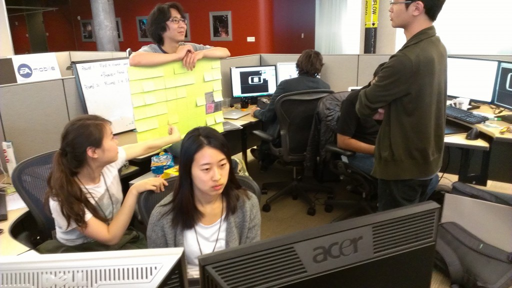
The team playtesting together.