Reaching Out
After a week of planning, the team started in on our next phase of development with enthusiasm. We began by making as many improvements to our Unity prototype as we could, so we would have something more impressive to show later in the week. In addition to small changes to our camera and control scheme we made big strides by implementing a player objective, adding 3D models for characters and some of our props, and moving several of the game attributes into a config file that our designers can modify directly.
At the same time, we launched into a deeper exploration of the TV and its capabilities. Our engineering group had huge scope concerns about building a game engine on top of Marmalade, so we started looking for tools that would get us started. We discovered IwGame, a free game engine built on top of Marmalade that has just the basic features we need to get started. Our team tested an IwGame sample on the TV and started to get familiar with the system so we can benchmark its performance next week.
Even with IwGame, we discovered that our workload was too great to create the alpha we wanted to by October 24th. So we approached our client now and asked for an additional week – a new alpha deadline on October 31, two days before our mid-semester presentation. They happily agreed, glad that we were planning ahead and wanting us to produce our best-quality work rather than cut features and rush the game. The schedule is still going to be tight, but it’s now within our reach.
With that in mind, we’ve been more proactive this week about reaching out to the OCCO for help. We’ve enlisted the assistance of Roger Powell to help us with our game audio. He asked us to provide him with a small sample program that would work on the TV, then started exploring that audio capabilities of the platform on his own time. We’ll be working with Roger sometime next week to start putting audio into our test program. We’ve also spoken with Joe Sutton about our networking strategy for the game; he advised us to show that Unity can talk to Marmalade before we get too far into our network plan.
In keeping with the plan we outlined at Quarters, we arranged a small playtest on Tuesday in the ETC space. This was an internal test without specific guest testers. Our own team tested the game at first, but it didn’t take long for our advisors and fellow students to jump in. It was encouraging to discover that our small changes to the game had drawn people’s attention to the TV more, which was one of our goals. Players also expressed a desire for the game to move faster, and for us to explore alternate control systems. We left the playtest with a small set of action items. Though quick and casual, we hope these informal playtests will keep our team focused on the player experience.
On Wednesday we had another informal playtest, this time with Rich Hilleman (Chief Creative Officer) and Jeff Skalski (Producer, BioWare Mythic). They were both pleased with our progress so far. Rich reminded us that we must create a dense experience out of necessity, and challenged us to reconsider a few of our design decisions from that point of view. He also emphasized the value of making the player feel silly, both in the context of the show floor and for players standing side-by-side. Jeff echoed this, reminding us to play with the social dynamics our game creates.
The rest of the week rushed by. We adjusted the Unity prototype in preparation for a playtest on Monday, and had a chance to show Drew Davidson our progress. We also kept exploring IwGame, putting together a load-test app to find out how many animated sprites the TV can render before we run into performance issues. Finally, several members of our team were out on Friday to attend IndieCade, the International Festival of Independent Games. We’ll start next week with a guest playtest and by the end we’ll be into our third sprint. Now it’s back to work at BarrelEye…
Photo © Eren Song.
Quarters Presentation
On September 26, team BarrelEye gave our quarter-semester presentation to an audience of EA employees and ETC alumni. You can see video of our presentation on the ETC Silicon Valley blog!
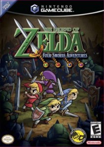
Four Swords Adventures
One game that bears some similarity to Torch is The Legend of Zelda: Four Swords Adventures for the Nintendo GameCube. We haven’t had the opportunity to play this one yet, but we have studied it a bit to see what they do right and what we could improve upon.
LoZ:4SA takes the classic Zelda formula and turns it into a four-player cooperative experience. The game depends on a special link cable that turns a Game Boy Advance into a controller for the GameCube, granting each player their own local screen, while the television is used as a shared screen for all players. This allowed individual players to wander off from the group, with gameplay transitioning from the TV to their local screen and back.
In terms of hardware setup alone, this might be the closest thing we’ve seen to the game we are creating. It gives us a whole set of multi-screen design decisions to compare our game against.
The first thing one notices when watching videos of the game is how rapid and chaotic it seems. It’s very difficult for one person to follow the action on all five screens. However experience with the game will reveal that each player only ever needs their attention in one place unless they really want to check other screens. When a player character is on the main screen, their local screen only shows a message saying “Look at the TV!” (There are occasional callouts on the main screen to alert a player to a message on their local screen.) When they leave the main screen the only need look at their local screen. Thus, there is not much need for divided attention in this game.
The designers also made an interesting choice by giving each player a “picture-in-picture” bubble on the main screen when their character is out of sight. This gives players a clue to each other’s activities without looking at one another’s screens, and it makes it easy to tell if an ally has gone indoors or is just hiding behind a tree.
The game contains lots of small puzzles and obstacles that require a synchronized effort to overcome, such as rocks that must be pushed as a group or pressure plates for all four players. For now, we’ve decided that these challenges are not appropriate for our game, because we want it to be drop-in drop-out friendly. We may take this design into account for the boss encounters though.
It also features a ranking system after each level that scores players on several game statistics (it’s very transparent about it). It also lets players secretly vote each other up and down according to how nice they were, which influences the final score for each player a bit. It’s a nice touch that encourages friendly play.
While there are many key takeaways from this game for us, it’s a more open experience than we intend to create. Torch is designed with a different feel in mind, so that while we want the game to be fast and fun, the constrained dungeon setting is essential to our experience. That also means limiting the items that we have in the game, and thinking about our controls in a whole different way – Zelda would be very different on a touchscreen. Finally, we want to get the players using both screens as much as possible rather than only moving between one and the other. It’s a tough design challenge – which is why we’re looking for good examples like this one to solve some of the challenges for us.
Categories


