With our alpha deadline rapidly approaching, BarrelEye is near the outer limits of our productivity. With everyone working a little late each day and a busy weekend ahead of us we are watching Torch take shape at incredible speed. All of the work we’ve done separately is finally starting to connect!
Last week our engineers had just gotten the phone and TV versions of the game talking, but they weren’t doing much else. This week, they’ve been putting all of the game behaviors onto the TV so that now, the game is actually playable on the final hardware! There’s been a major push to get features out of our prototype and into the TV build, so that at halves we can show everything working at or above the level of our most recent playtest. We’ve also put a lighting system on the TV, to create the light/dark effect that is so central to the gameplay. This was harder than we expected, and we tried three different strategies before we found one that would work on the TV. We’re not 100% happy with our current solution but it is working, and we’re seeking help from outside the team to improve it after our presentation next week.
Our artists are working like crazy to prepare all of the game assets for us to include in the game. Even if we don’t have finished art into the game at halves, we need it to be ready to because our next sprint is dedicated to content and making sure we’re showing everything we’ve got. Art has had an extra challenge on this project because we are using 2D graphics for the TV screen and 3D graphics for the phones, so every asset has to exist in each form! From dungeon tilesets to 3D character models, everything has to work for both perspectives. For now it seems to be working well – we’ll see how the art team feels in a couple of weeks!
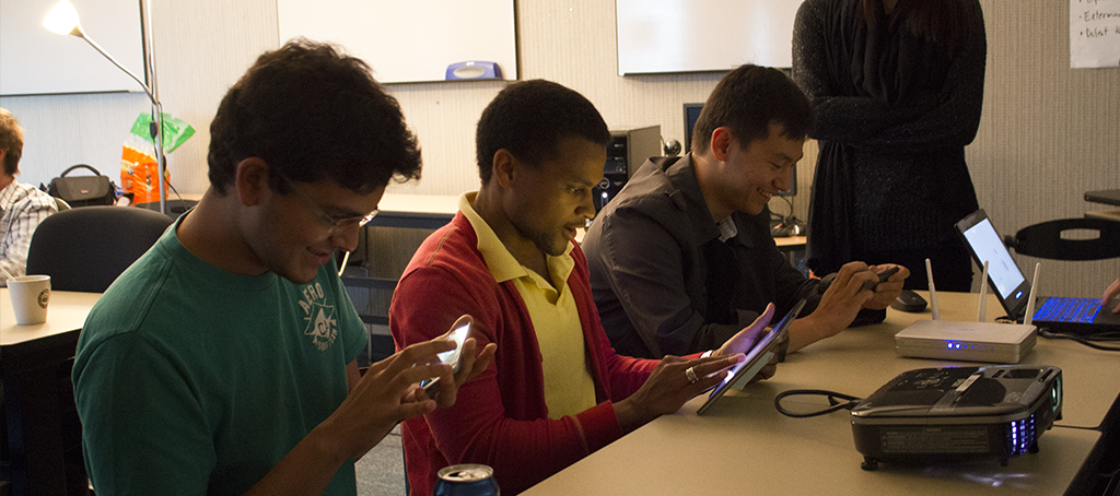
We had a focused playtest on Tuesday with seven guests, including Ralph Vituccio from ETC-Pittsburgh. Most of our guests had never seen the game before, and they gave us all sorts of new feedback about the game. The clearest message for us was that our game’s visual feedback is severely lacking right now. Much of the content and polish that we were going to save until after alpha is actually critical to our user experience, so we are pulling some items from our backlog into this sprint and trying to make gameplay feel better.
Another takeaway from the test is that we are trying to teach too many things to the player in our game. One of our testers suggested that we write out a list of things a player has to learn during the game (torches provide light, bats attack you) and then make that list as small as possible. So we’re continuing to simplify certain features – for example, before the playtest we required the player to find a sword before they could fight. Players would consistently try to fight first and then go looking for a sword, which costs us precious seconds of experience time. So we’ve cut the sword pickups entirely and now everybody can always fight; one less thing to learn.
On the other hand, we were very pleased with the response to our game’s controls this time around. We had two comments: “The character is moving too fast,” and “these are some of the best touch controls I’ve ever used.” We’re going to tune the character speed down a bit (people still run into walls while going around corners) but overall nobody has to ask how to control the game. Our control instruction “drag to move” was enough for everyone to figure it out, and they worked well both for players looking up at the TV and down at the phone. Our iteration is paying off!
Next week is going to be our busiest yet and we prepare to show the alpha build to our client, and then to everyone else at our mid-semester presentation. No time to waste! Back to work!


