Month January
-
Week 3
Jan 26 – 30
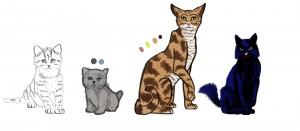
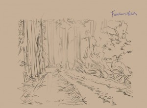
Week 3 has come and gone. We’ve made some significant progress, the most tangible being the art produced by our in-house artist Hannah as well as Fiona Yu, who’s contributing art all the way from California. Hannah and I collaborated on character design, and she crafted the above illustration. It really brought the characters to life in a new way, providing details about their size and patterns. Fiona provided some concept art last week, and has also been working on environment art.
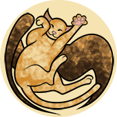
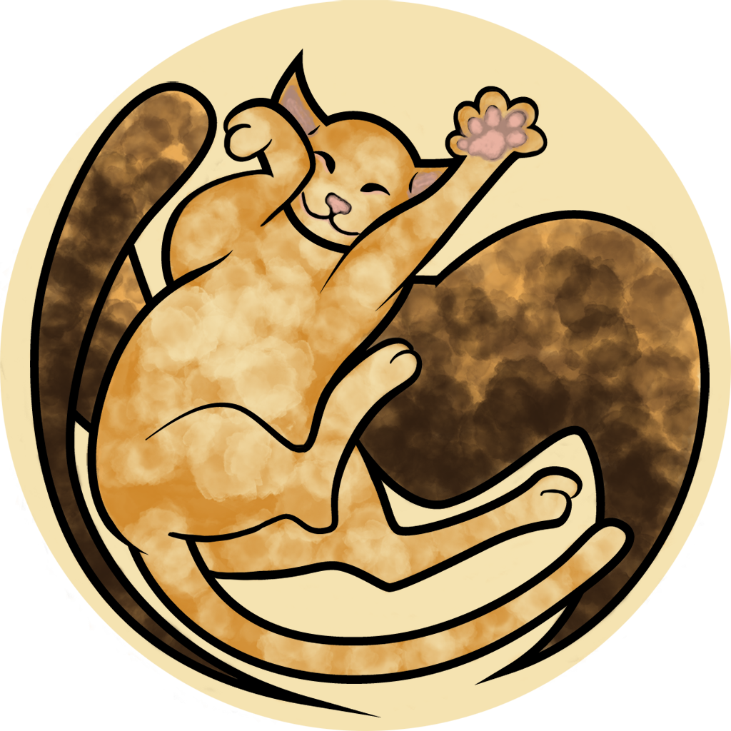
The team also prepared for the upcoming formal branding review, finalizing the poster, half-sheet and logo (below).
The story draft keeps progressing, with chapters four, five and six drafted, and an epilogue to come. On Tuesday, Jane Bernstein and I met and reviewed her edits for the first three chapters. Among her feedback was advice on how to best invite readers into the story with a compelling inciting incident.
Meanwhile, Allyn had created a prototype with Awesomium, where tapping on an html doc rendered in Unity turned to the next e-page. However, as a team we decided against html in favor of pdfs in order to give artists more control over page composition using inDesign. So, Allyn got another page-turning prototype running on our Fire using CoCos2D.
We also had our first design meeting! We met as a team, each of us coming in with ideas, and then made decisions about core design (and Will was happy that the meeting clocked in at under an hour). The guiding agreement was that the primary interaction of reading should be as undisturbed as possible, unless there is a justified story-reason to interrupt it. Here is a sampling of the choices we made:
- Page turning, instead of scrolling through text.
- Choppy, flip-book like animations.
- A chapter index and bookmarking feature.
-
Concept Art and Quotes
“The scratches are not unlike typical cats. They’re fiercely proud animals – a pride derived from innate hunting skills, carefully preened coats of fur, unnatural balance and a healthy awareness of those traits.”
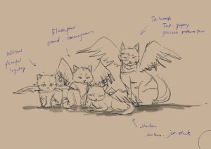
“In the mornings, the sun’s rays filtered through the forest ceiling, and made every surface appear dusted with a golden light. Flashpaw often prided herself that her home must be the most beautiful place in the world.”
continue reading -
Week 2
January 19th – 23, 2015
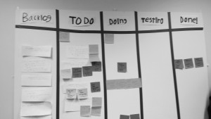
This week marked our first official sprint planning session. On Thursday, Will lead the team through sprint processing and planning, and we all contributed SCRUM stories – pieces of the product framed within the perspective of a specific person, like a user or a developer – and prioritized them on our SCRUM backlog. These stories spawned specific tasks that teammates were able to claim. We’ve got about 120 hours of work planned for this sprint!
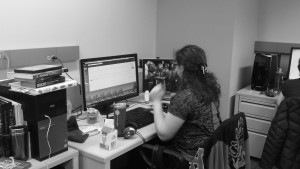
Laura has been making progress on the website, implementing our style choices and formatting the mobile version of our site. Hannah has been generating art content for the logo and the poster, which we were able to show to John Dessler, Shirley Yee and Ruth Comely. Allyn has been testing an HTML UI engine, Awesomium in anticipation of rendering our text over a 3D scene. And the textual content is still in progress! The portion that is, as of yet, written will be sent to Jane Bernstein, a professor at the CMU English Department, for her review over the weekend. We’ve also got a big design meeting planned, where we’ll brainstorm features we want to include in our digital story experience.
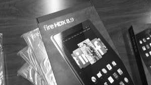
And last but not least, we received these beauties today:
continue reading -
Week 1
January 12-16, 2015
It’s week one here at the ETC. Team Cat Scratch met for the first time on Monday, January 12th. The project description: creating an interactive story for the new Amazon Fire Tablet. The ambition is to take a text-based story that would normally be presented in print and transform it into a digital format, augmented with different types of media that don’t detract from the process of reading. Our five teammates are: Laura Weber, Hannah Turner, Allyn Chen, Shirley Park (me) and Will Hagen.
This week, we have been able to look at precedents for the type of app we want to produce. Prominent examples include Device 6 and Motion Comics, both of which are applications that present text-based stories using a variety of creative UI methods. Looking at these sparked discussions about the possible directions we want to take the story – do we want to make a dynamic “fishbowl” 3D scene, do we want to publish on the Amazon Appstore, are we sure we want to use the Fire?
We definitely want to use the Fire. You heard it here first. However, the other questions will have to be answered after we start making prototypes. Our programmer, Allyn, is looking into tool research. As of now, he’s proposed overlaying an html layer of text over any 3D or moving parts within Unity. Our artists, Laura and Hannah, met with Professor Shirley Yee to consult over design and were able to make some stylistic decisions. I (Shirley) am plugging along with writing the story, and Will’s been diligently equipping the team.
P.S. We also attended the Playtest Explore Workshop, and brainstormed for two hours with some people from HCI. We got some good feedback by asking the exploratory question: “What would make your reading experience better?” with responses ranging from comics to sound.
continue reading
