Day 4:09 pm
-
Week 3
Jan 26 – 30
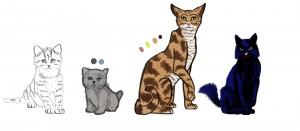
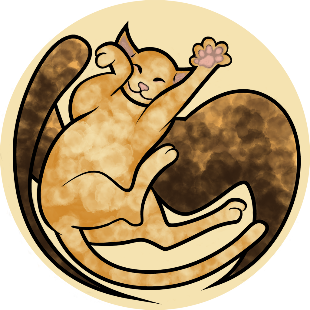
Week 3 has come and gone. We’ve made some significant progress, the most tangible being the art produced by our in-house artist Hannah as well as Fiona Yu, who’s contributing art all the way from California. Hannah and I collaborated on character design, and she crafted the above illustration. It really brought the characters to life in a new way, providing details about their size and patterns. Fiona provided some concept art last week, and has also been working on environment art.
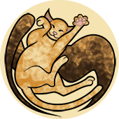
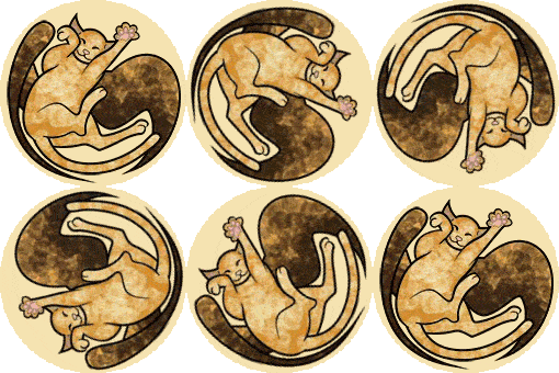
The team also prepared for the upcoming formal branding review, finalizing the poster, half-sheet and logo (below).
The story draft keeps progressing, with chapters four, five and six drafted, and an epilogue to come. On Tuesday, Jane Bernstein and I met and reviewed her edits for the first three chapters. Among her feedback was advice on how to best invite readers into the story with a compelling inciting incident.
Meanwhile, Allyn had created a prototype with Awesomium, where tapping on an html doc rendered in Unity turned to the next e-page. However, as a team we decided against html in favor of pdfs in order to give artists more control over page composition using inDesign. So, Allyn got another page-turning prototype running on our Fire using CoCos2D.
We also had our first design meeting! We met as a team, each of us coming in with ideas, and then made decisions about core design (and Will was happy that the meeting clocked in at under an hour). The guiding agreement was that the primary interaction of reading should be as undisturbed as possible, unless there is a justified story-reason to interrupt it. Here is a sampling of the choices we made:
- Page turning, instead of scrolling through text.
- Choppy, flip-book like animations.
- A chapter index and bookmarking feature.
