Month April
-
Anatomy of a Scratch
-
Meet Shadow
-
Week 14
April 20 – 24
Monday morning began at 9AM. This is early for us, because when given the choice, work days are instead work nights.
We started early because Monday was softs presentations, which was the last formal opportunity to show the faculty our product. We tried to showcase the team’s design choices – what was included, whether or not it worked, if it did, why, and then how we would push the book if we had more time. (Answer: We’ve found it’s the atmosphere-building content that is the most special.)
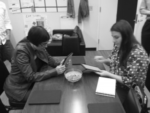
So, faculty and special guests visited the room in shifts, just like quarters, but this time seeing a complete product. On top of getting graded, we were also using this as a way to test and observe. It proved useful! Another use case emerged. Our standing list: 1) reading, 2) find all the things and play. During quarters, I saw for the first time someone go through with the volume on high without reading or focusing on images, and just activating and listening for sounds. 3) Sound palette.
Part of our feedback from softs was to improve the instruction page. In fact, we were already focusing on that.
The UI and instruction page were some of the last things to get added. As such, we know we have to test them. So, when the team had the opportunity to participate in another playtest day, we took it. We got groups of 4-5 kids for twenty minutes each, not unlike the first playtest day. We learned from the first playtest that getting kids in groups for short periods of time is not conducive to use case number one, reading. Adults need about an hour to read through the book. So, Will had the idea to exploit use case number two and make a scavenger hunt of features. This would give us feedback on the usability of UI and navigation.
Most users skipped over our instruction page unless explicitly asked to read it. Even when they did read it, and learned how to use the menu or parallax, their expectations about the interactions weren’t informed – they expected sound from everything and were tilting for non-parallax images. Based on these results, we know we need an instruction page that prompts an action, and teaches categories of content (animation, parallax, sound, and text-sound).
Observations from playtesting scavenger hunt style:
1) Competitive Reading
“Oh, I found the worm in the sign!”
“Hah, I’m beating you!”
And thus, a fourth use-case was born: 4) competitive reading.
2) Real Reading
Despite our scavenger hunt presentation, I was delighted when one girl started our book by reading from the beginning. She kept reading until she saw her friends skipping through the book.
3) Turtle Death
Tapping on turtles startles them, and they jump into the water. Or so we thought.
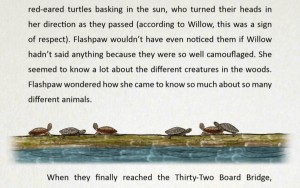
Some playtesters assumed they were killing the turtles, and gleefully proceeded to click on and kill every last one.
Next, the team is going to focus on polish items. After that, we’re going to have to make decisions about what to do with the final app. At the moment, we’re planning on distributing it on the Amazon Appstore.
Tonight, Team Cat Scratch will be attending an arcade put on by the new Bit Bridge Indie Community (BBIC). The arcade/demo is part of the art crawl, a monthly event in downtown Pittsburgh. And of course, we’re bringing our cat ears.
continue reading
-
Week 13
April 13-17
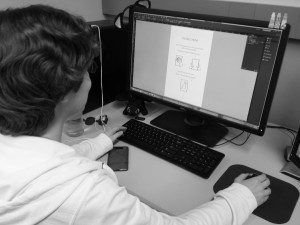
Right now, Laura is sitting at her desk, getting the final Chapter Six art assets from Hannah. Hannah, who has just exported an illustration of Flashpaw moving through an underground tunnel, has moved onto the second and final pass of all the art. Soon, Laura and I will sit down and layout the final chapter. Allyn’s worked out our buggy UI, and is taking on the “if we have time, we should” list. Will recorded a 30 second promo video, and is storyboarding our three minute vid.
What I’m trying to say is we’re almost done.
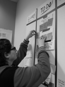
But it’s not over yet. We’ve had to make tricky design decisions. Two of the most recent issues were 1) page sensitivity, and 2) formatting for the text-plays-sound feature.
We talked to faculty member Jesse Schell about page sensitivity. His advice: look at what people have already done. We sat down in his office and looked at a PDF reader, which limits tap-to-turn to the margins of the pages, and a horizontal press and drag will turn the page regardless of location on the page. So, Allyn and Laura worked together to make some tweaks.
We’re also re-thinking one feature: activating a sound effect by pressing words. This is not too novel of a feature, but it gives us a way to use sound, and sound is powerful, so we’re keeping it (example: when Summer thinks about ripping paper, you can click “raw rip of paper” to hear the sound).
However, we’re struggling with how to indicate that a phrase is activate-able. The current state is that this special text looks like a hyperlink, and in playtesting, universally, readers have known to click the word. Recently it’s been brought to our attention that this style breaks the immersion of our fantasy space. On the one hand, that’s true: having something that looks like a hyperlink in the text, while you’re reading, may work against a consistency of content we’ve been trying to preserve (hyperlinks go to external places, right?). On the other hand, children have known how to use it. We haven’t needed to use instructions, they know it intuitively. The good news is that we’re playtesting one more time. Results from that should help inform our decision.
I’m also working on a “logic pass” of the writing – going through and making sure there’s consistency in the plot and rules of the world. Also grammar/spelling. Because it stings to have your spelling corrected by a 13 year old.
Softs are on Monday! We’ll be here over the weekend.
Weekend Work
continue reading -
Week 12
April 6-10
This week, Team Cat Scratch finished Chapter Four and worked on content for Chapter Five. Our UI has been added to the app, and even though there are still bugs, readers can now navigate through the book with a scroll bar summoned from the top of the page. It’s for usability, for the readers’ convenience – now they don’t have to furiously tap on the margins in order to move through chapters. (A happy side effect: this has reduced the amount of carpal tunnel amongst developers.)
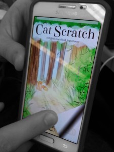
(Cat Scratch is designed for the Amazon Fire 8.9, but the mini-version for mobile devices is kind of cute.)
Dave Bossert, from Special Projects at WDAS, was able to stop by and give us some good advice. Among the many projects he’s got going, he co-authored the app Disney Animated. It won Apple’s App of the Year in 2013. Going through it, you get an immediate sense of how deliberate the design is, with user experience being a priority. It’s rich with content, and users can summon pictures, videos, etc. to the foreground with a simple tap. Content is interwoven, making exploration easy. This is something that had to be on a tablet.
We were really lucky to have him sit down and give us feedback. His advice was on point – asking for things we’ve already been asked for from our primary demographic (wow moments, pushing interactions farther). Hopefully we can deliver for a climactic moment in Chapter Six.
We also responded to the design flaw in user experience of “I’m clicking and it’s not doing anything”, there are now sounds attached to all our static images, so there is at least one form of feedback. Originally, we thought this sound would be uniform (I imagined something like a “pock” sound, or the click of a typewriter). But Laura went through and found diegetic sound for all of them, which is in line with our design vision of having everything relate back to the story.
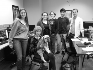
Jane Bernstein, our client and story editor, stopped by the ETC on Friday to get the most recent build. She delivered notes on the last half of the story, which I’m implementing. There’s not that much time for more iterations, so the writing is almost solidified. At this point in production, any changes to the writing have to be made with the condition that it won’t effect the structure of the page – an endlessly interesting writing constraint.
continue reading
-
Week 11
March 30th – April 3
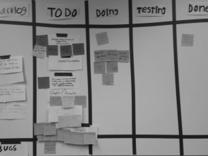
Playtesting with children is not for the faint of heart. Last Saturday, we conducted our A/B testing with more structure than the method we used in previous playtests. We added an instruction page so we didn’t have to prime them in person. We didn’t introduce ourselves. We let them go.
Results: In my opinion, we learned three strong things from the playtest. First: page sensitivity. Users use different taps for when they’re trying to turn a page and when they’re trying to activate an animation, and having one happen when you’re expecting the other is the worst. Second: Cuing the interaction (readers know when something is interactive) needs to happen. We already knew this.
The last thing was maybe the most radical. Before I get to it, let me say that we lost our JSON files, so we’re missing the quantitative data to back this up. We also got several groups late and didn’t have the time to let them read through the experience, causing us to miss whole chunks of potential data. However, we A/B tested, and Will and I got to watch certain testers read through the “enhanced” version while others got a PDF version of the book – just text. Through observation, I noticed that the kids with the PDF ‘B’ version were much more fidgety (looking at the screens of their friends, messing with their feet, shifting in their chairs).*
When we pitched our concept during quarters, a lot of faculty assumed we were trying to cater to a demographic of readers who have difficulty committing to reading through a book. “No,” we responded, “We’re just trying to make new things work within the frame of a beloved format.” However, these observations were a strong validation of those faculty members’ instincts
If we had more time in the semester, I wish we could conduct another A/B test without missing our quantitative data.
We also had a take-home playtester volunteer to give us feedback. We got expert advice from Schell Games employee, Sabrina Culyba, who gave us high quality feedback. She picked up on things we’ve been noticing ourselves – one of those being how incredibly effective sound is. Forget illustration and animation, sound does massive amounts of storytelling work. I’d like to see a future ETC project do what we’re doing, using just a richness and variety of sound.
Faculty member Dave Culyba walks into our project room, the team sits down to talk. “Have you guys ever seen The Never Ending Story?” he asks. We chortle, because after our playtest on Saturday, in an effort to do team building we all sat down to watch a movie – and yes, it was The Never Ending Story. The film deals explicitly with the boundaries of the human imagination (spoiler: there are none). The takeaway though was that the never-ending-story book is different because it exists both on and out of the page. The narrative on the page breaks out into real world space.
At Cat Scratch, our mission is to make a story that builds off things that can only be done in a digital space. We mention this on our ‘about’ page – using sound, structure, style and illustration to support a story. These features have mostly been used as a part of the page, but it is unique to digital that we can suggest something out of the page.** For example, one of the more popular additions- a feather that floats away – suggests real world space. If we had more time, it’d be nice to go back and build more of these things into our story. We have 3D space (see below), why not play with it?
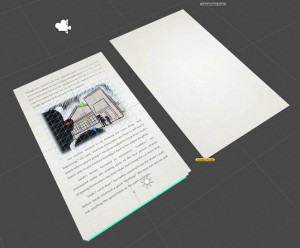
This week, we finished content for Chapter Four, and we’re working on Five. Allyn’s implementing UI, and Laura changed some things to help with page sensitivity.
*This is a strong result for team Cat Scratch, but perhaps a tragic result for the writer.
** Actually, it’s not unique to digital – you could do that with a physical installation. An enhanced reading nook. Drew, look at all these project ideas.
continue reading
