Week 11
-
March 30th – April 3

Playtesting with children is not for the faint of heart. Last Saturday, we conducted our A/B testing with more structure than the method we used in previous playtests. We added an instruction page so we didn’t have to prime them in person. We didn’t introduce ourselves. We let them go.
Results: In my opinion, we learned three strong things from the playtest. First: page sensitivity. Users use different taps for when they’re trying to turn a page and when they’re trying to activate an animation, and having one happen when you’re expecting the other is the worst. Second: Cuing the interaction (readers know when something is interactive) needs to happen. We already knew this.
The last thing was maybe the most radical. Before I get to it, let me say that we lost our JSON files, so we’re missing the quantitative data to back this up. We also got several groups late and didn’t have the time to let them read through the experience, causing us to miss whole chunks of potential data. However, we A/B tested, and Will and I got to watch certain testers read through the “enhanced” version while others got a PDF version of the book – just text. Through observation, I noticed that the kids with the PDF ‘B’ version were much more fidgety (looking at the screens of their friends, messing with their feet, shifting in their chairs).*
When we pitched our concept during quarters, a lot of faculty assumed we were trying to cater to a demographic of readers who have difficulty committing to reading through a book. “No,” we responded, “We’re just trying to make new things work within the frame of a beloved format.” However, these observations were a strong validation of those faculty members’ instincts

If we had more time in the semester, I wish we could conduct another A/B test without missing our quantitative data.
We also had a take-home playtester volunteer to give us feedback. We got expert advice from Schell Games employee, Sabrina Culyba, who gave us high quality feedback. She picked up on things we’ve been noticing ourselves – one of those being how incredibly effective sound is. Forget illustration and animation, sound does massive amounts of storytelling work. I’d like to see a future ETC project do what we’re doing, using just a richness and variety of sound.
Faculty member Dave Culyba walks into our project room, the team sits down to talk. “Have you guys ever seen The Never Ending Story?” he asks. We chortle, because after our playtest on Saturday, in an effort to do team building we all sat down to watch a movie – and yes, it was The Never Ending Story. The film deals explicitly with the boundaries of the human imagination (spoiler: there are none). The takeaway though was that the never-ending-story book is different because it exists both on and out of the page. The narrative on the page breaks out into real world space.
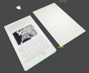
At Cat Scratch, our mission is to make a story that builds off things that can only be done in a digital space. We mention this on our ‘about’ page – using sound, structure, style and illustration to support a story. These features have mostly been used as a part of the page, but it is unique to digital that we can suggest something out of the page.** For example, one of the more popular additions- a feather that floats away – suggests real world space. If we had more time, it’d be nice to go back and build more of these things into our story. We have 3D space (see below), why not play with it?

This week, we finished content for Chapter Four, and we’re working on Five. Allyn’s implementing UI, and Laura changed some things to help with page sensitivity.
*This is a strong result for team Cat Scratch, but perhaps a tragic result for the writer.
** Actually, it’s not unique to digital – you could do that with a physical installation. An enhanced reading nook. Drew, look at all these project ideas.


