Week 4
-
February 2 – 6
The week before quarters: our team has an e-reader prototype running on the Fire, implemented design features from last week’s meeting, finished our branding, and have a working draft of the story, chapters 1-6.
We had a visit from ETC alum Emmanuel Eytan on Monday. He had a lot of great advice and was a wealth of resources about interactive stories. He specifically held Monkey Island up as one of the best uses of interactivity moving a story forward, crediting storyteller Ron Gilbert.
As a team, we struggled with how to communicate the design challenge of our story effectively – it’s really all about reading. Anything extra (sound effect, animations, etc.) are built on top of the existing structural breaks of a book (page turns, chapter beginnings). Dave Culyba helped us refine that idea later in the week, see below. We decided to try and use the phrase “reactive” instead of “interactive” as a way of explaining the mechanics of the digital experience. Epiphany for us, but this immediately caused problems:
On Wednesday, the whole team attended the playtest refine workshop. We had put “reactive, not interactive” on our composoition box, and the first comments we received from our peers on that particular part were “what?” and “this doesn’t make sense”. Fair. We knew we had to come up with a better way to communicate, especially with Quarter* reviews on the following Monday.
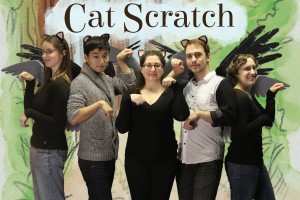
The workshop also gave us a great opportunity to think about what role playtesting will take on in our project and what we want to get out of our playtesting questions. It helped refine the Major Design Question (MDQ) about the tension between the experience of reading and the extra ways we want to enhance the story. We also took our team photo!

Ears by Hannah, Editing by Laura
We had a meeting with Dave Culyba on Friday that was very enlightening for the whole team. We told him about our primary decision to incorporate page breaks into the book, and how we only wanted to build reactive features around those natural stops in the story. “I would really think about ways to incorporate your own breakpoints into the book,” he said, “Have you thought about breaking up the pages into paragraphs that become visible as you tap?” He also pointed us to other mediums like radio dramas, stage performances and audio books as an inspiration. The performers here need to know the intent behind the written word, and often use music, sound effects and timing to enhance the message.”This is an interesting design space, and I’ll be really angry if I see you making easy decisions.” Roger!
Cocos2D is out, and we’re back on good old Unity! Allyn has both taps and long-presses working as a method to turn pages on our virtual book, and a beautiful shaded animation accompanying it. Feels really good to turn the pages. Reminded me of past ETC-project, the Ben Franklin Synthetic Interview on display on the first floor of our building.
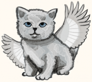
Hannah has invested a lot of time in getting the characters to look cohesive, and to decide on a style. We’re using water colors and pencil, and opting for a more realistic feel, taking inspiration from Beatrix Potter, Jan Brett, and our stand-by: E.H. Shepard’s Winnie the Pooh. My personal favorite Hannah-creation of the week is this rendering of Willow (custom cat-ears a close second):

Heart of Gold, Wings of Chickadee
And finally, Cat Scratch is on Pinterest! If you’re interested in the character and style inspirations, follow our board.
*For non-ETC’ers, Quarters mark a quarter of the way through our production timeline. At this point, the whole faculty goes on rotation around all the ETC projects to learn about what we’re doing and to give advice. It’s a project’s first impression to most of the faculty.


