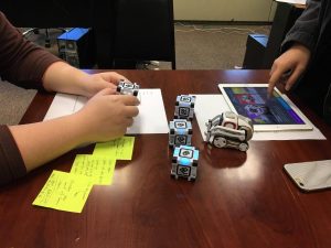
More progress! We have been working on a few complex experiences this week and we have three finished prototypes. Many more interesting ones to come soon!!
math game: https://youtu.be/M_fMJC65tgs
where is the color: https://youtu.be/PXcH-C
rearrange the cubes: https://youtu.be/QQXza44Bqck
Our UI/UX team started to do the UI/UX research by doing an analysis for competitive products. We looked at some educational AI robots products including Ozobot, MIP, and Dash. We compared the features of those robots to Cozmo, tried to find something we can use to improve Code Lab. We also looked into some popular visual programming tool, including Scratch, Hopscotch, and Alice. The visual interface (art style )of Hopscotch is perfect, we may want to study the way which Hopscotch do the interface because they are both iPad-based platform/tool.
We also arranged more than 10 ETC students interview. We let them to try Code Lab, providing some feedback by coding with Code Lab. After the interviews, we got some useful information. Here are several points we want to improve Code Lab:
1)Straightforward and high-usability graphic interface is needed
2)Some controls of Code Lab are ambiguous .( When player want to change the number of the variable, they will trigger the play function)
3)Information is overwhelming.( Code Lab has too much function, which can be confusing for young learners sometimes)
4)Visual instruction and tutorial can be helpful ( We found that visual tutorial can be more efficient than text instruction).
5)Social sharing function is motivative.(Most of the players would like to share their projects after finishing the game coding)

