Overview
Over the past week based on feedback from faculty and playtesters from the ETC showcase we have made steady improvements and have polished our game.
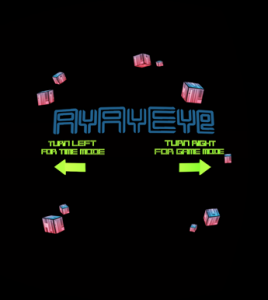
At this point we have also implemented a time attack game play feature along with the previously present progressive fixed number of turns feature.
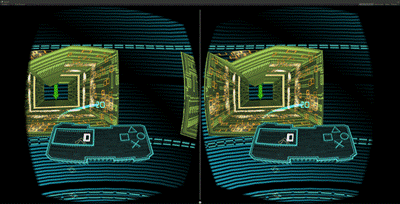
We have also cleaned up our feedback and interface to be more visually stylized and to meaningfully convey whether or not what the player was doing was right or wrong.


Some of the changes we made include
- Feedback on tunnel for right.
- Reduction of red tones from the game.
- The arrows are now either green or red, not blue.
- Got rid of the cubes behind the symbols.
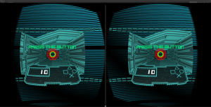
- Feedback for the button presses.
- A better score combo system.
- Feedback on the virtual controller.
- Added background feedback as the player succeeded or failed.
- Added music feedback as the player succeeds or fails.
- Added a trail for the score as it popped up and moved to the score on the virtual controller.
- Changed the End scene to be more vibrant and to have the score follow your head movement.
- Added textual instructions, but kept them to the minimum.
The color scheme we began to use was based on the below image that our artist chose to be our base colors:

This Friday we submitted the build to our client who received it positively.
The build can be downloaded here – Click on the link to Download
Moving Forward
We have our final presentations on Wednesday, 5th May and will be preparing our slide deck and presentation for it.
