Hello everyone!
As mentioned The Path Taken was more of a prototype and not a finished game. We had a couple of concepts and mechanics in there and not all of them made the cut. I thought I’ll like to share some the art that didn’t (and some that did) make it through and talk a bit about our art direction.
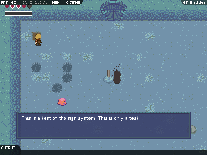
So if it isn’t obvious Zelda played a big part in the visual style. We thought a dungeon crawler was a good genre to explore the feeling of regret and I looked at various Zelda games as a reference. However there are some design choices in the game that made a bit different. Let’s take a look at this process shot:

Color choices. So because the main character (He is named Ward) in this game is always in the dungeon, I went ahead and made the sprite with warm colors and decided the dungeon to be cool colors. Usually I thought browns and reds might not work well because dirt is brown… but in this case I made the dungeon blue. So anything basically warm colored is important or “friendly.” So Ward is red, brown, and yellow and recognizable against the blue background of the dungeon. The grave marker is brown because the graves are important to the character. The smiling slimes are pink because they’re just monsters hanging out with real no bad intentions (unless you keep attacking them…!). Anything cool colored is background. The dungeon is some kind of temple and probably underground. The cool colors hopefully give more of the feeling that Ward is alone and that this dungeon is a place where he should be thoughtful and careful.
There were also more choices we made about Ward. You can see him carrying everything (the sword, the shovel, and the shield on his back). This is because I felt it was important to know that Ward doesn’t somehow magically carry everything. He is a mortal and very kill-able. He also takes some time to shovel holes. We wanted to make sure shoveling felt substantial – it takes time to do, especially if you’re burying the skeletons of the ghosts.
Anyway, moving on to the sprites.
So here is Ward and a some of his animations with all of his equipment:

walking

sword slashing
shoveling

light sword slashing (not in game)

death or resulting in death animations (some not in game)
Jelly and their sorry progression animations:
I tried going for happy>sad>angry surprised>anger>crazy mad
Jelly death: you are supposed to feel bad for killing the nice jellies.
Shadows animations: They are based off of Ward so I’ll just have the death/respawning animation here.

So when the shadows enemy revives the skeleton floats a bit, but Mike programmed that in.
Other sprites:
![]()
Doors
A whole bunch of other items, some which didn’t make it in.
That’s it for the art update!

