Week 14 in Review

April 21 – 25 2014

We dedicated this week to preparing for the premier of the beta of our game, both online and in person at Electronic Arts’ headquarters.

To prepare for our live demo, we first focused on fixing the bugs that made the game unplayable and adding features that were absolutely necessary. We fixed a crucial function that let players preview where their ball would go, decreasing how taxing this was on on our system. After watching our playtesters last week, we also added a feature that let players re-start their shot, hoping this would reduce player frustration.

In terms of art, we pushed to give players a sense of the near final experience. We replaced the traditional golf flags with our own strange and colorful ones, added better clouds and skyboxes, and finally addressed low-priority features, including the load screens.

We also implemented our third and final level. This level had more holes and more complex gameplay than other levels and immediately revealed the limits of our system. While this level wasn’t nearly polished, we hoped it would show how far our concept would go.

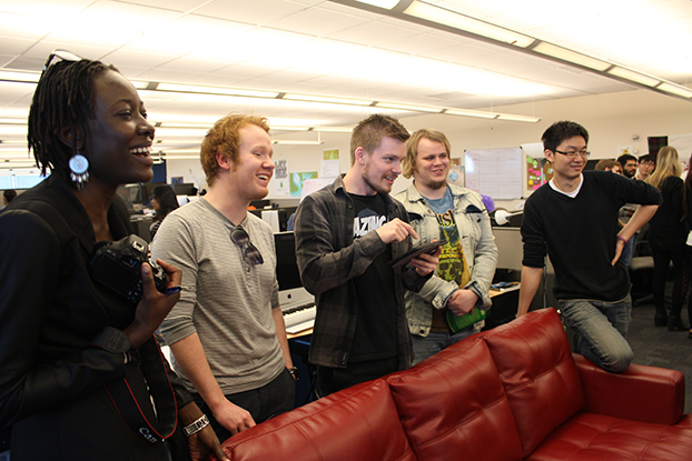
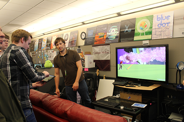
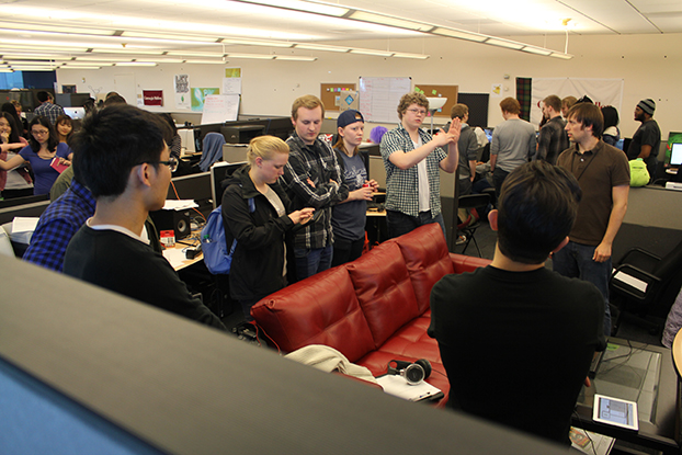
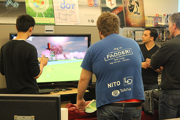
On the day of softs, we were excited to show our game off to EA employees. Standing alongside our ETC classmates in the main atrium of EA’s headquarters, we hosted another championship of our first level and posted a leaderboard with the testers’ best scores. These tests reminded us of the bugs we will need to fix and features we will need to add before finishing the game.

For our online opening, we polished our website, adding more information about our game, the technology underneath it, and our design goals. We created two videos, a 30-second introduction to our game and a longer 3-minute overview of our work to date.

In our last two weeks, we’ll focus on a handful of critical bugs and features. Once again, this will likely mean scaling back our ambitions. Finalizing our third and final level will have to take a back seat to making our first two levels look and feel amazing and ensuring that the EA team has what they need to publish our game later in the year.
Our Promo Videos

As part of our soft opening, we’ve released two videos about our game and our project:

a 30-second promo…

…and a 3-minute explanation of our work to date.

Week 13 in Review

April 14 – 18, 2014

This was a week of big steps that ended with our most proud achievement: finally being able to prove that our audience likes our “golf meets MC Escher” game in two separate tests.

This week we finished the first pass at our third and final level and began setting it up to be playable. This was much later than we had planned, but we were able to produce it far more quickly than anything we had previously built, since we had finally begun to understand our pipeline. The level is weird, challenging, and a lot of fun to play.

For the first time we both implemented our game across the catalogue that will launch the rest of EA’s connected TV titles and added our own scorecard.. These small tasks helped us feel like we were making real progress towards our goal of having a game ready for a planned launch later this summer.

As we took these big strides, we also continued to take the small technical steps that will make our game a more polished, easier to play experience. We improved our preview system, which allows players to see where their shots will go by adding custom cameras that let them see wider shots. We improved the club selection process, eliminating yet one more unnecessary club and creating a system that defaults to players’ last club.

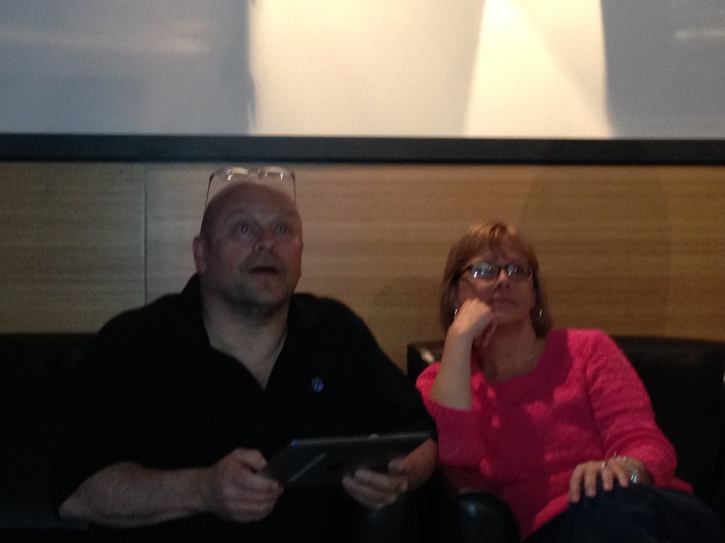
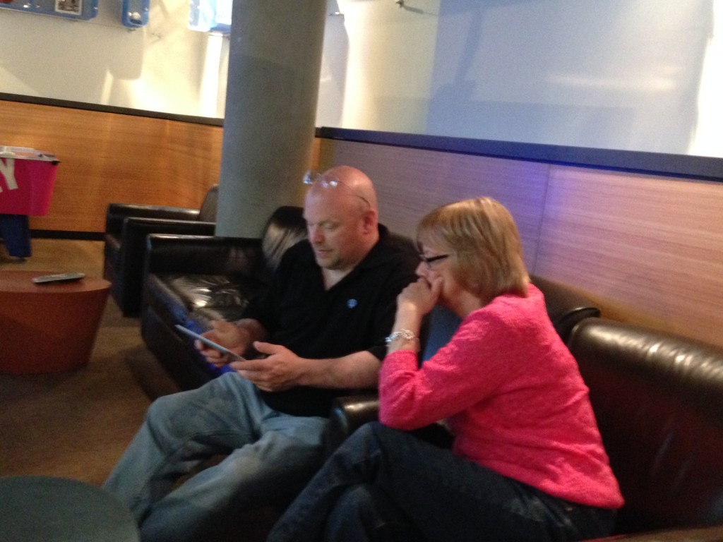
But our most exciting developments were a pair of playtests. The first was with one of our developers’ parents, who happened to be in town for the weekend. They were exactly our audience: people like casual games and who might like a game in their living room, but aren’t keen on buying a console. We watched as they sat together on the couch in one of Electronic Arts’ lounges, teaching each other how to play, hooting with each great shot, and gasping with each near miss. We were thrilled.

The next day we had a much broader playtest, as we invited our advisors, friends, mentors, and any stranger we could grab to join us for a “championship” of our first level. As players completed the course, we posted their names on a leaderboard.This both gave us some critical objective data, including how long it takes new players to complete one level, and essential subjective data, most importantly whether people thought our game was fun.

They did and we move into the week leading up to softs with renewed energy. We’ll spend the next few days implementing and finalizing our third and final level. We’ll dedicate our limited tech time to removing  some the most egregious bugs and implementing “low hanging” features based on our playtests. Our artists will continue to work on original assets, including flags and tee-markers. These will help better define our surreal world and ready us to show of something truly beautiful next week.

 Download as PDF

Week 12 in Review

April 7 – 11. 2014

The pressure is on: by this time next week, we aim to deliver a rough version of all three courses to our client, Electronic Arts’ Office of the Chief Creative Officer. To meet our deadlines, we focused this week on how to make the most of our limited resources.

As we mentioned previously, we have decided to deliver three, rather than four, courses. We decided to go big with a more complicated, more surreal final course. To get this done quickly, we developed an accelerated pipeline, with our artists and level designer working in parallel to build courses with as few new assets as possible and our producer picking up low-level, time-demanding Unity world building work and testing.

This week we were also able to solve two of our most vexing problems. The first was a game design challenge we had faced since we first landed on our “golf with sticky walls” premise. Until this week, this novel part of our game was fun, but confusing: most of the time players were able to launch their ball and stick it wherever it landed, but sometimes it would bounce.

Under the hood, the game was obeying a simple rule: any time the ball switched between meshes, the ball would stick; any time the ball was on the same mesh it would bounce. But players shouldn’t need to understand “meshes” to play. Eliminating bounces entirely meant taking out something that felt great. Instead, we realized we could make “stickiness” a choice the player could make.

Our second solution was slightly more technical. Since we began developing our game, we had been hampered by an anti-cheating system built into our inherited system. We knew the system was finding the code we’d layered on top of the existing game to make our game, seeing this as cheats, and ending our games prematurely, but, despite days of work, we couldn’t figure out how to stop it.

The answer, which we discovered in a flash, was simple: stop counting strokes. Killing this function stopped the system from being able to punish us for “cheating” and only required a small layer of code.

This weekend we head to the Silicon Valley campus Spring Carnival celebration, which will give us an opportunity to put the game in front of players who have never seen or heard of our work. While this is later than we might have liked, it will let us know what changes we absolutely must make before shipping. Next week, we’ll push to deliver a rough and ready version of our last course for delivery at the end of the week.

Download as PDF

Week 11 in Review

March 31 – April 4, 2014

As we enter the final month of development, we’ve narrowed our ambitions so we can deliver the most polished experience we can. Along these lines, we decided to deliver three, rather than four, courses, tackling our most pressing bugs, and improving the core experience.

When we first pitched our concept, we proposed delivering four courses, assuming we could complete two each week.  As we began building new courses and new assets for them, we discovered all that we didn’t know about our pipeline and realized that was unrealistic. Case in point: it wasn’t until this week that we were able to implement our second course into the game.

As our artists and level designers worked on adding an additional level, our engineers worked on continuing to eliminate our biggest technical problems. As we’ve mentioned previously, our game is built on top of an existing code base, which means every feature we add creates bugs in a system that wasn’t built for it.

The features we have added are not the “wouldn’t it be cool if…” features we initially brainstormed, but small improvements that make the game easier for novice players. We introduced a rough version of feedback that displays when players have gone out of bounds, landed in the rough, or changed the world orientation. A preview arc now shows player where their ball will go. These should help players think less about what is happening and why it’s happening and more what they should do next to get  a great score.

In the middle of the week, we were able to show off the latest build of our game off to students from the University of Agder in Norway. While unexpected bugs prevented us from using this as an opportunity for a playtest, we took the opportunity to discuss our technology and our methodology. This was great practice for our soft opening, now three weeks away.

In Week 12, we will put our third and final course into an accelerated pipeline so we can meet our target date of delivering rough versions of all courses by April 18. This will let us use our remaining weeks tracking and removing bugs and polishing our courses.

Download as PDF

The Great Norwegian Playtest

Yesterday we hosted a group of digital students media students from University of Agder in Norway and got a chance to show off the latest build of Par Zero. Check out the photos!


Playtest_Norway_2_Med Playtest_Norway_4_Med    

Playtest_Norway_3_Med Playtest_Norway_1_Med

Week 10 in Review

March 24 – 28, 2014

Returning from the Game Developers Conference and nearly two weeks without the full team, we turned this week to making improvements that move our “golf meets MC Escher” game from a rough prototype to an experience that reflects what we hope to launch with.

Some significant improvements came from a more advanced camera systems. One system follows the ball as it sails through the air, helping players appreciate their hits. Another shows the world turning as what was a wall becomes a floor when players land their ball on the wall. We believe this will help address the potentially confusing orientation changes inherent in our game..

Other improvements included an updated version of our gravity system, which now allows balls to stick on walls of arbitrary angles, rather than just 90 degree angles. We also wrote and recorded a rough version of a voice over explaining the course. Like the camera system, this should help players navigate and understand our strange and potentially confusing world. We’ll use the sample to test the idea before we actually use any recording studio time.

Importantly, we also changed our art pipeline. While we had planned on baking light maps of our levels in Unity, we found the results to be too low quality to use. Consequently, we shifted to baking light maps in Maya. This demanded rebuilding courses that had been built in Unity in Maya, baking light maps, preparing these for placement in Unity, and re-importing these into Unity for gameplay. While this has set us back, we hope for the superior look of the game to be worth the time invested.

Amidst this work, we also presented at Halves, a half-way point presentation in front of our classmates and Electronic Arts’ employees about the work we have done to date. For those who attended, we made one noteworthy mistake while answering questions during the Q&A that followed: HTML5 and our controller does not, as we stated, limit the gestures we can use for hitting the ball in our game. Rather, we are limited by the base version of the game we are building from, which recognizes simple mouse clicks and keyboard events only.

With only four weeks to go before our Soft Opening, in Week 11 we’ll continue to realize improvements to our core features. We’ll implement the improved art pipeline on the two courses that have been designed. An improved version of user feedback that should help players make more accurate shots. A series of playtest should let us know whether this and ideas we put into place last week are working.

Download as PDF

Week 7 in Review

February 25-28, 2014

Where we spent last week planning, this week we put plans into action, running our first playtests, building our first level, implementing an original user interface, and revising everything.

We started the week with a playtest of a prototype level we had shown at softs. We hadn’t designed this to be a real first level, but a vertical slice that would help us understand our process. Actually putting this in front of players—two fellow students and one faculty member—helped us understand the game itself.

We noticed the difference in play styles between players familiar with golf and golf games, and more naive players. We found our course took almost three times as long as we had hoped. We saw players smile when they figured out how to get a ball into a hole using the quirks of our “golf meets MC Escher” design. We heard players hold their breaths as they tapped their ball off of one island, hoping it would land on an island below and not roll into the abyss that surrounded it. For us, these moments verified that while we had a lot to fix, we had something like a good idea.

A mid-week meeting with our client enforced these themes. If naive players were confused by having to choose from seven types of shots 25 types of clubs, reduce this decision making, they said. Focus, they reminded us, on the few things that were exciting and new. Think about what it means to be good at this kind of game and build the game and its puzzles around this.

We did just that as we built and revised our first true level. Our course became simpler and shorter, easier to play quickly. Each of the three holes taught just one idea. We reduced the number of decisions a player needed to make, combining the idea of short types and club selection to have just one club for each of six shot types. At the same time, we fixed some of the bugs and quirks that lengthened our playtimes.

If we were going to combine hit type and club type function to players, we needed a way to visually communicate this. Our UI/UX artist drew two icon mock ups. One used the existing visual metaphor of simple lines to show the angle a ball would take when first hit. Another more complex icon represented the full path a ball would take if hit with full power. We tested these, showing testers both icons (alternating which they saw first) and asking them to draw the path they thought the ball would take. Illustrations for the first were erratic, we found, while illustrations for the second were consistent, if not accurate.

As we move into the second week of our planned two-week production cycle for each level, we’ll internally playtest a rough version of our first level for gameplay as we finalize the art. We’ll implement a simplified user interface and features that helps players better predict where their ball will go. At the same time, we’ll begin sketches for our second level, which is schedule to go into production the week after next. With these tasks complete, we’ll be in a good position to have an Alpha release ready by the halfway point in our project.

Download as PDF

Week 8 in Review

March 3 – 7, 2014

At best, we will have three minutes to sell our player on the our game.

This is what our client (Electronic Arts’ Office of the Chief Creative Officer) reminded us when we showed them our first complete level at about the halfway point in its production cycle this week. Since they will not have paid and will not have waited to download anything—our game is designed to stream over set top boxes and will likely be free to play for initial trials—they’ll have little invested and little reason not to toggle over to another game or a TV show. To this end, we spent the past week focusing gameplay on the most novel gameplay elements and look more immediately engaging.

Focusing on the most novel element of our gameplay—finding the shortest path through a golf course where you can play on floating walls and ceilings—means making everything else as simple as possible. To help achieve this, our engineers implemented a simplified user interface and a shot preview. Both should make it easier for players to hit the ball where they want so they can think about where they want the ball to go, instead of whether it will go there.

As our engineers worked on features that made our world easier to play in, our artists worked on making our MC Escher-inspired world easier to understand visually. Players need to instantly know that this is not like a traditional golf game. Given our limited man-hours, we knew we couldn’t afford to remake the hundreds of assets we had inherited. We could, however, make fast gains by playing with the color palette of the world. And so our green golf-like world developed pink and white hues, something more like a cherry blossom dreamland and less like the back nine of your local country club.

As we head towards weeks of interrupted work (Spring Break, followed by the Game Developer’s Conference), we better understand three of our biggest challenges. First, we must ferret out and remove a recently-discovered piece of inherited code that is apparently causing our game to crash frequently. Second, we must develop an improved camera system, since the one we have is built for traditional golf on one plane. Finally, we must learn to design levels that let players take advantage of our premise, rather than merely impeding them.

If we can solve these three problems, we’ll be in a strong place for Halves, our halfway point presentation. We should by then be able to hand our game to a truly naive player and get their feedback. With this, we’ll be able to spend the rest of the semester iterating, designing additional courses, and polishing.

Download as PDF