As part of our soft opening, we’ve released two videos about our game and our project:
Category Archives: Uncategorized
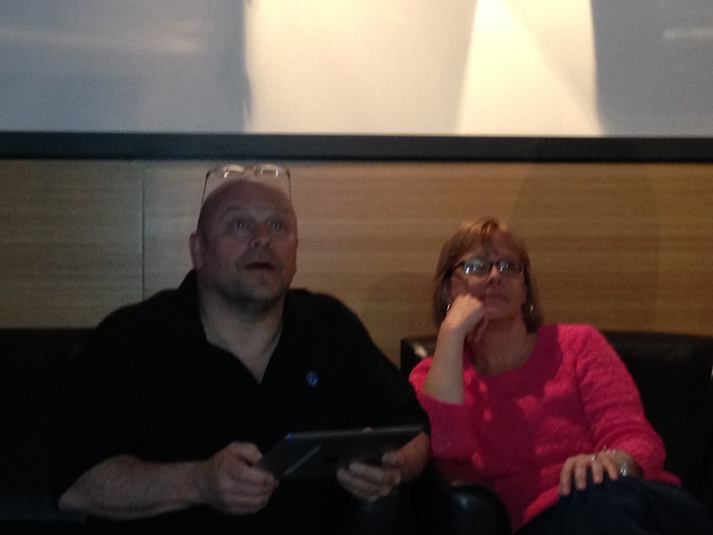
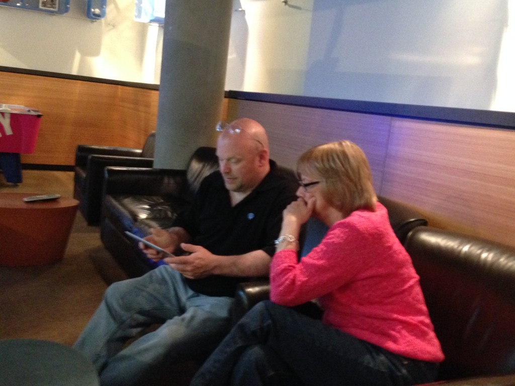
Parental Playtesters
Today one of our developers’ parents dropped by and had a chance to test our game in a living room setting.
Week 11 in Review
March 31 – April 4, 2014
As we enter the final month of development, we’ve narrowed our ambitions so we can deliver the most polished experience we can. Along these lines, we decided to deliver three, rather than four, courses, tackling our most pressing bugs, and improving the core experience.
When we first pitched our concept, we proposed delivering four courses, assuming we could complete two each week. As we began building new courses and new assets for them, we discovered all that we didn’t know about our pipeline and realized that was unrealistic. Case in point: it wasn’t until this week that we were able to implement our second course into the game.
As our artists and level designers worked on adding an additional level, our engineers worked on continuing to eliminate our biggest technical problems. As we’ve mentioned previously, our game is built on top of an existing code base, which means every feature we add creates bugs in a system that wasn’t built for it.
The features we have added are not the “wouldn’t it be cool if…” features we initially brainstormed, but small improvements that make the game easier for novice players. We introduced a rough version of feedback that displays when players have gone out of bounds, landed in the rough, or changed the world orientation. A preview arc now shows player where their ball will go. These should help players think less about what is happening and why it’s happening and more what they should do next to get a great score.
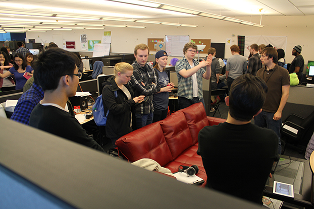
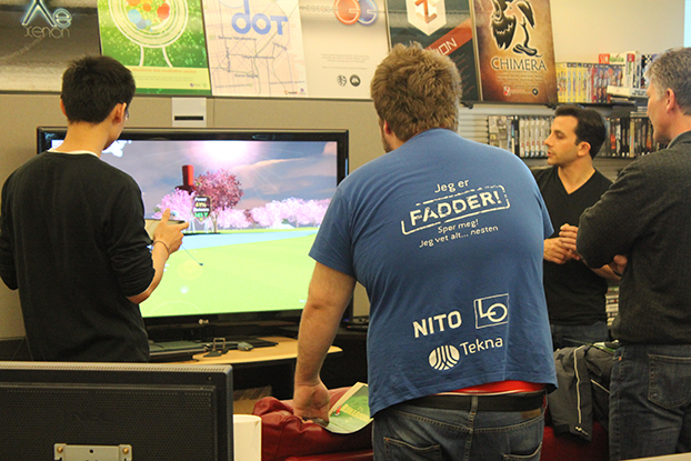
In the middle of the week, we were able to show off the latest build of our game off to students from the University of Agder in Norway. While unexpected bugs prevented us from using this as an opportunity for a playtest, we took the opportunity to discuss our technology and our methodology. This was great practice for our soft opening, now three weeks away.
In Week 12, we will put our third and final course into an accelerated pipeline so we can meet our target date of delivering rough versions of all courses by April 18. This will let us use our remaining weeks tracking and removing bugs and polishing our courses.
Download as PDF
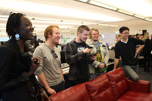
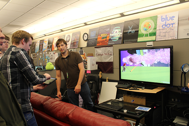
The Great Norwegian Playtest
Yesterday we hosted a group of digital students media students from University of Agder in Norway and got a chance to show off the latest build of Par Zero. Check out the photos!
Week 7 in Review
February 25-28, 2014
Where we spent last week planning, this week we put plans into action, running our fi rst playtests, building our fi rst level, implementing an original user interface, and revising everything.
We started the week with a playtest of a prototype level we had shown at softs. We hadn’t designed this to be a real first level, but a vertical slice that would help us understand our process. Actually putting this in front of players—two fellow students and one faculty member—helped us understand the game itself.
We noticed the difference in play styles between players familiar with golf and golf games, and more naive players. We found our course took almost three times as long as we had hoped. We saw players smile when they figured out how to get a ball into a hole using the quirks of our “golf meets MC Escher” design. We heard players hold their breaths as they tapped their ball o ff of one island, hoping it would land on an island below and not roll into the abyss that surrounded it. For us, these moments verified that while we had a lot to fix, we had something like a good idea.
A mid-week meeting with our client enforced these themes. If naive players were confused by having to choose from seven types of shots 25 types of clubs, reduce this decision making, they said. Focus, they reminded us, on the few things that were exciting and new. Think about what it means to be good at this kind of game and build the game and its puzzles around this.
We did just that as we built and revised our first true level. Our course became simpler and shorter, easier to play quickly. Each of the three holes taught just one idea. We reduced the number of decisions a player needed to make, combining the idea of short types and club selection to have just one club for each of six shot types. At the same time, we fixed some of the bugs and quirks that lengthened our playtimes.
If we were going to combine hit type and club type function to players, we needed a way to visually communicate this. Our UI/UX artist drew two icon mock ups. One used the existing visual metaphor of simple lines to show the angle a ball would take when first hit. Another more complex icon represented the full path a ball would take if hit with full power. We tested these, showing testers both icons (alternating which they saw fi rst) and asking them to draw the path they thought the ball would take. Illustrations for the first were erratic, we found, while illustrations for the second were consistent, if not accurate.
As we move into the second week of our planned two-week production cycle for each level, we’ll internally playtest a rough version of our fi rst level for gameplay as we finalize the art. We’ll implement a simplified user interface and features that helps players better predict where their ball will go. At the same time, we’ll begin sketches for our second level, which is schedule to go into production the week after next. With these tasks complete, we’ll be in a good position to have an Alpha release ready by the halfway point in our project.
Download as PDF
Week 8 in Review
March 3 – 7, 2014
At best, we will have three minutes to sell our player on the our game.
This is what our client (Electronic Arts’ Office of the Chief Creative Officer) reminded us when we showed them our first complete level at about the halfway point in its production cycle this week. Since they will not have paid and will not have waited to download anything—our game is designed to stream over set top boxes and will likely be free to play for initial trials—they’ll have little invested and little reason not to toggle over to another game or a TV show. To this end, we spent the past week focusing gameplay on the most novel gameplay elements and look more immediately engaging.
Focusing on the most novel element of our gameplay—finding the shortest path through a golf course where you can play on floating walls and ceilings—means making everything else as simple as possible. To help achieve this, our engineers implemented a simplified user interface and a shot preview. Both should make it easier for players to hit the ball where they want so they can think about where they want the ball to go, instead of whether it will go there.
As our engineers worked on features that made our world easier to play in, our artists worked on making our MC Escher-inspired world easier to understand visually. Players need to instantly know that this is not like a traditional golf game. Given our limited man-hours, we knew we couldn’t afford to remake the hundreds of assets we had inherited. We could, however, make fast gains by playing with the color palette of the world. And so our green golf-like world developed pink and white hues, something more like a cherry blossom dreamland and less like the back nine of your local country club.
As we head towards weeks of interrupted work (Spring Break, followed by the Game Developer’s Conference), we better understand three of our biggest challenges. First, we must ferret out and remove a recently-discovered piece of inherited code that is apparently causing our game to crash frequently. Second, we must develop an improved camera system, since the one we have is built for traditional golf on one plane. Finally, we must learn to design levels that let players take advantage of our premise, rather than merely impeding them.
If we can solve these three problems, we’ll be in a strong place for Halves, our halfway point presentation. We should by then be able to hand our game to a truly naive player and get their feedback. With this, we’ll be able to spend the rest of the semester iterating, designing additional courses, and polishing.
Download as PDF
Week 7 in Review
February 25 – 28, 2014
Where we spent last week planning, this week we put plans into action, running our first playtests, building our first level, implementing an original user interface, and revising everything.
We started the week with a playtest of a prototype level we had shown at softs. We hadn’t designed this to be a real first level, but a vertical slice that would help us understand our process. Actually putting this in front of players—two fellow students and one faculty member—helped us understand the game itself.
We saw the difference in play styles between players familiar with golf and golf games, and more naive players. We saw our course took almost three times as long as we had hoped. We also saw players smile when they figured out how to get a ball into a hole using the quirks of our “golf meets MC Escher” design. We heard players hold their breaths as they tapped their ball off of one island, hoping it would land on an island below and not roll into the abyss that surrounded it. For us, these moments verified that while we had a lot to fix, we had something like a good idea.
A mid-week meeting with our client enforced these themes. If naive players were confused by having to choose from seven types of shots twenty five types of clubs, reduce this decision making. Focus, they reminded us, on the few things that were exciting and new. Think about what it means to be good at this kind of game and build the game and its puzzles around this.
We did just this as we built and revised our first true level. Our course became simpler and shorter, easier to play quickly. Each of the three holes taught just one idea. We reduced the number of decisions a player needed to make, combining the idea of short types and club selection to have just one club for each of six shot types. At the same time, we focused on fixing some of the bugs and quirks that lengthened our playtimes.
If we were going to combine hit type and club type function to players, we needed a way to visually communicate this. Our UI/UX artist built two icon mock ups. One used the existing visual metaphor of simple lines to show the angle a ball would take when first hit. Another more complex icon represented the full path a ball would take if hit with full power. We tested these, showing testers both icons (alternating which they saw first) and asking them to draw the path they thought the ball would take. Illustrations for the first were erratic, we found, while illustrations for the second were consistent, if not accurate.
As we move into the second week of our planned two-week production cycle for each level, we’ll internally playtest a rough version of our first level for gameplay as we finalize the art. We’ll implement a simplified user interface that helps players better predict where their ball will go. At the same time, we’ll begin sketches for our second level, which is schedule to go into production the week after next.
Week 6 in Review
February 18 – 21, 2014
In this truncated week, much of our effort went towards preparing for and delivering our Quarters presentation. With our remaining hours, we looked to improve our prototype and production cycle ahead.
During our presentation, we explained the goal our client had tasked us with—developing a golfing game for connected TVs—the genesis of our work, a sample of our game so far, and a plan for going forward. The alumnus of our program and Electronic Arts employees attending the 15-minute talk and Q&A session seemed to respond well. This was thanks in large part to our advisors, who had offered strong words of advice on a rough version of our presentation the Friday prior.
Our presentation delivered, we went back to improving our prototype. We also looked at how we could take the lessons we learned from building our sample level into production. We focused on both how to best use limited resources and how to design levels that made our “MC Escher meets golf” idea easier to understand quickly.
To this end, we developed a potential pipeline for our designer and environmental artists that minimized idle resources. We looked at how we might design levels based on modular environmental pieces. Instead of building hundreds of unique islands over the course of the semester, we considered how sixteen basic shapes might snap together to make anything.
We also began sketching out first levels that might teach basic gameplay. Inspired by a video praising the level design in Mega Man X, we sought to make levels that didn’t require lengthy textual or video tutorials, but taught the players indirectly how to use each gameplay element. To help the players orient themselves (something critical in a world where walls turn into floors), our animator began creating “fly-by” cameras that could be called on to offer perspective.
In the week ahead, we’ll move from pre-production into production. We’ll build our first level designed to be placed in game and improve on the core features we assembled for our prototype. Within two weeks, we hope to have our first fully-playable, just in time for Alpha.
Interested in watching our presentation? Watch it and three other presentations from Silicon Valley teams here.
Download as PDF
AWESOME THING OF THE WEEK: Tutorial-less Tutorials
As we look at creating our first tutorial level, we wanted to share a video that inspired us. Egoraptor gushing about the amazing thing that is Mega Man X:
Week 5 in Review
February 10 – 14, 2014
After seeing a proof of concept for our “golf meets MC Escher” game for connected TVs last week, our client pointed out that we had missed the emotional core of the game. Our sample demonstrated the most novel aspect of our idea—a way to turn what was a wall into a floor—but lacked the excitement, hope, or disappointment of a good golf game.
This week, we attempted to develop a true sample level that delivered emotionally and technically. Our first step was to improve the scale of the level design. Our proof of concept was little more than three intersecting planes imposed over a golf course from the base game we’re modifying to make our game. The walls were so close together that the player never had a chance to watch his ball sail through the air or nearly miss getting into the cup. Little wonder that we were missing the emotional core of the game.
To quickly correct this, we decided that our first true course needed to approximate the proportions of a real golf course. If a real golf course is at least 250 yards and a real golfer is around roughly two yards tall (roughly), we knew the course we built in Unity needed to be about 175 units at it’s greatest length (if the player were one unit tall).
With a scale in mind, our level designer set about building a three-hole course. This course was decidedly not a Level One. It featured impassable gaps, out of bounds chasms to all sides, vertical walls, and waterfalls as hazards. It was far too hard, even for developers familiar with the concept of our surreal physics game.
In this case, too hard was a good thing. It game our team a vertical slice of what we wanted to do. Watching his fellow developers struggle with what he hoped was a simple puzzle—learn to cross this gulf by driving your ball into a wall and using it as a bridge—gave our designer a sense how just how much we had to teach our player.
Hacking together approximations of the features needed to make this level work revealed the limitations of our starting code base and the features they would need to write to make the game function smoothly. Building even rough versions of the floating islands on which our game is played helped our artists develop a style and understand the pipeline under which they would work. All of this helped our producer get a better sense of what the team could accomplish in the course of the remaining 11 weeks of the semester.
As we wrap up the week, we know we have a long way to go. We’ve improved greatly and the prototype is on it’s way to being fun, but we still haven’t hit the emotional core of our game. Moving into next week, we’ll prepare for our Quarters presentation (a 15-minute introduction to our work to date and Q&A) and polish a demo we hope to show alongside it. With this complete, we can begin working on our first level.
