Week 7 in Review

February 25 – 28, 2014

Where we spent last week planning, this week we put plans into action, running our first playtests, building our first level, implementing an original user interface, and revising everything.

We started the week with a playtest of a prototype level we had shown at softs. We hadn’t designed this to be a real first level, but a vertical slice that would help us understand our process. Actually putting this in front of players—two fellow students and one faculty member—helped us understand the game itself.

We saw the difference in play styles between players familiar with golf and golf games, and more naive players. We saw our course took almost three times as long as we had hoped. We also saw players smile when they figured out how to get a ball into a hole using the quirks of our “golf meets MC Escher” design. We heard players hold their breaths as they tapped their ball off of one island, hoping it would land on an island below and not roll into the abyss that surrounded it. For us, these moments verified that while we had a lot to fix, we had something like a good idea.

A mid-week meeting with our client enforced these themes. If naive players were confused by having to choose from seven types of shots twenty five types of clubs, reduce this decision making. Focus, they reminded us, on the few things that were exciting and new. Think about what it means to be good at this kind of game and build the game and its puzzles around this.

We did just this as we built and revised our first true level. Our course became simpler and shorter, easier to play quickly. Each of the three holes taught just one idea. We reduced the number of decisions a player needed to make, combining the idea of short types and club selection to have just one club for each of six shot types. At the same time, we focused on fixing some of the bugs and quirks that lengthened our playtimes.

If we were going to combine hit type and club type function to players, we needed a way to visually communicate this. Our UI/UX artist built two icon mock ups. One used the existing visual metaphor of simple lines to show the angle a ball would take when first hit. Another more complex icon represented the full path a ball would take if hit with full power. We tested these, showing testers both icons (alternating which they saw first) and asking them to draw the path they thought the ball would take. Illustrations for the first were erratic, we found, while illustrations for the second were consistent, if not accurate.

As we move into the second week of our planned two-week production cycle for each level, we’ll internally playtest a rough version of our first level for gameplay as we finalize the art. We’ll implement a simplified user interface that helps players better predict where their ball will go. At the same time, we’ll begin sketches for our second level, which is schedule to go into production the week after next.
Week 6 in Review

February 18 – 21, 2014

In this truncated week, much of our effort went towards preparing for and delivering our Quarters presentation. With our remaining hours, we looked to improve our prototype and production cycle ahead.

During our presentation, we explained the goal our client had tasked us with—developing a golfing game for connected TVs—the genesis of our work, a sample of our game so far, and a plan for going forward. The alumnus of our program and Electronic Arts employees attending the 15-minute talk and Q&A session seemed to respond well. This was thanks in large part to our advisors, who had offered strong words of advice on a rough version of our presentation the Friday prior.

Our presentation delivered, we went back to improving our prototype. We also looked at how we could take the lessons we learned from building our sample level into production. We focused on both how to best use limited resources and how to design levels that made our “MC Escher meets golf” idea easier to understand quickly.

To this end, we developed a potential pipeline for our designer and environmental artists that minimized idle resources. We looked at how we might design levels based on modular environmental pieces. Instead of building hundreds of unique islands over the course of the semester, we considered how sixteen basic shapes might snap together to make anything.

We also began sketching out first levels that might teach basic gameplay. Inspired by a video praising the level design in Mega Man X, we sought to make levels that didn’t require lengthy textual or video tutorials, but taught the players indirectly how to use each gameplay element. To help the players orient themselves (something critical in a world where walls turn into floors), our animator began creating “fly-by” cameras that could be called on to offer perspective.

In the week ahead, we’ll move from pre-production into production. We’ll build our first level designed to be placed in game and improve on the core features we assembled for our prototype. Within two weeks, we hope to have our first fully-playable, just in time for Alpha.

Interested in watching our presentation? Watch it and three other presentations from Silicon Valley teams here.

Download as PDF

Week 5 in Review

February 10 – 14, 2014

After seeing a proof of concept for our “golf meets MC Escher” game for connected TVs last week, our client pointed out that we had missed the emotional core of the game. Our sample demonstrated the most novel aspect of our idea—a way to turn what was a wall into a floor—but lacked the excitement, hope, or disappointment of a good golf game.

This week, we attempted to develop a true sample level that delivered emotionally and technically. Our first step was to improve the scale of the level design. Our proof of concept was little more than three intersecting planes imposed over a golf course from the base game we’re modifying to make our game. The walls were so close together that the player never had a chance to watch his ball sail through the air or nearly miss getting into the cup. Little wonder that we were missing the emotional core of the game.

To quickly correct this, we decided that our first true course needed to approximate the proportions of a real golf course. If a real golf course is at least 250 yards and a real golfer is around roughly two yards tall (roughly), we knew the course we built in Unity needed to be about 175 units at it’s greatest length (if the player were one unit tall).

With a scale in mind, our level designer set about building a three-hole course. This course was decidedly not a Level One. It featured impassable gaps, out of bounds chasms to all sides, vertical walls, and waterfalls as hazards. It was far too hard, even for developers familiar with the concept of our surreal physics game.

In this case, too hard was a good thing. It game our team a vertical slice of what we wanted to do. Watching his fellow developers struggle with what he hoped was a simple puzzle—learn to cross this gulf by driving your ball into a wall and using it as a bridge—gave our designer a sense how just how much we had to teach our player.

Hacking together approximations of the features needed to make this level work revealed the limitations of our starting code base and the features they would need to write to make the game function smoothly. Building even rough versions of the floating islands on which our game is played helped our artists develop a style and understand the pipeline under which they would work. All of this helped our producer get a better sense of what the team could accomplish in the course of the remaining 11 weeks of the semester.

As we wrap up the week, we know we have a long way to go. We’ve improved greatly and the prototype is on it’s way to being fun, but we still haven’t hit the emotional core of our game. Moving into next week, we’ll prepare for our Quarters presentation (a 15-minute introduction to our work to date and Q&A) and polish a demo we hope to show alongside it. With this complete, we can begin working on our first level.

Download as PDF

AWESOME THING OF THE DAY: Talking to your golf ball

Last week our client pointed out to us that our prototype was missing a key emotional component of golf: the moment when watch your ball arc and beg it to go into the hole. Ben Crane, a video produce for golf explains how golfers talk to their balls:

We talk to the ball in two or three ways […] One is we kinda know what the ball is going to do so, ‘Be good, baby,’ we’re kinda just affirming it was a really good shot. Then there’s the time where you’re like, ‘Catch that slope and roll down.’ You really don’t know what’s going to happen. And then there’s that time when you’re begging. The ball is heading to a 50-50 place and you beg, ‘Please stay up.’

Hat tip to Salvador for sharing this.

AWESOME THING OF THE DAY: Switchamajig

While researching UI for tablets, we came across this very cool interface that lets you control almost anything with an iPad. It’s designed as an adaptive interface to let the motor impaired play with toys they wouldn’t otherwise be able to use, but there are a lot of possibilities for hacking together cool toys.

Week 4 in Review

February 3 – 7, 2014

Last week our client surprised us: instead of asking us to work on the idea for a modified golf game for connected TVs that we thought was a sure winner or the idea that seemed safest, they asked us to pursue our most ambitious idea—a kind golf meets Inception, where players tee off of walls and ceilings.

This week we assembled a rough proof of concept, something to give us a sense of what our core mechanic would feel like and what it would take to build. A tight schedule and a clear goal afforded us the opportunity to implement Agile and Scrum practices more deeply. Up went the scrum board and each morning we “stood up” to discuss the previous day’s progress.

Throughout the week, our programmers worked on modifying a code base we inherited from an older golf game to demonstrate a new core mechanic. Actually putting our proposed mechanic on screen gave us a better sense of how our levels need to be designed.

Our artists defined a look for our game that would support its gravity-defying feel. They explored three different styles—one surreal, another science fiction-oriented, and a third light-hearted—all of which conveyed that this wasn’t going to be a normal golfing game.

Meanwhile, our UI/UX designer considered how a user might actually execute this mechanic. This was particularly challenging because while our game is controlled on a tablet, the program runs in a browser, vastly limiting the touchscreen gesture vocabulary.

We ended the week with another presentation to our client. After demonstrating our proposed art styles and a PowerPoint animatic of our user interface, we showed them a prototype, driving from the green into a wall, getting the ball to stick to the wall, and then putting from the wall into a hole on the side of the wall. Our clients quickly (and kindly) pointed out that we had missed the emotional core of the game of golf: the anticipation the player feels as the ball soars and the dashed hopes of a near miss. Still, they gave us the green light to go further with the idea.

In the week ahead, we’ll continue exploring our strange golf game, designing our first courses and building our first original assets. Our overarching goal: to see if we can’t get the game feel right.

Download as PDF

Week 3 In Review

January 27-31, 2014

After a nod of approval from our client representative for three rough concepts for a golf game for connected TVs, we spent much of the past week polishing each concept and assessing its feasibility.

We began to understand that while each game design could achieve some of our client’s goals—design for quick, casual play, increased engagement,
options for multiplayer—they targeted dierent audiences. An arcade combat golf variant attracted a broad audience that might not be interested in traditional golf. A physics puzzle variant served an audience that was looking for a novel experience or an addicting Angry Birds style challenge. Improving a traditional game of golf appealed to existing fans of golf and golf games.

Since our client wants an alpha deliverable by mid-semester, we scrutinized each idea to see what we needed to do to realize the concept and what could actually get done in less than five weeks of production. We drafted user stories for all the possible features we imagined, sorte these by priority, and for each design selected the handful of stories that were the minimum viable product—the fewest number of features the game needed to be the game we wanted to create.

With a sense of what we needed to create, we translated each of these core stories into discrete and quantiable tasks for each team member. We added up the total number of hours and measured them against our goal of delivering a gold spike—in this case, a roughly playable version of the game—in the next few weeks.

At the end of the week, we presented our polished ideas and plans for execution to the team from the Oce of the Chief Creative Ocer. While they liked each idea and praised our focus on the player, they surprised us at the end of the meeting: instead of asking us to work on the idea we like the most or the idea that seemed to appeal to the existing audience, they asked us to pursue the most ambitious idea for just a week and see where we could get.

We move forward into the week ahead with a plan: get something working. Assemble the roughest possible version of the physics puzzle game we want to create and have it ready to show o for Friday. Anything else is gravy.

Download as PDF

Week 2 In Review

January 20-24, 2014

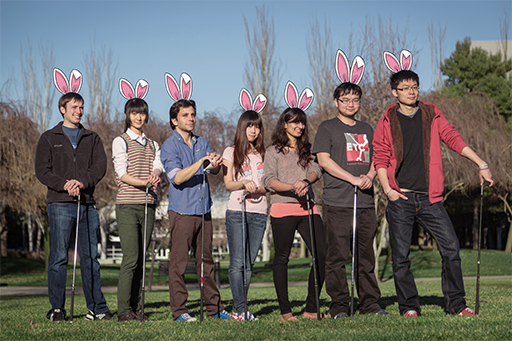
We are SeptoBunny, a team working with Electronic Arts’ Office of the Chief Creative Ocer to create a golng game for Connected TVs. Our team includes designer and artist Lucien Chen, programmer Davis Dong, gameplay programmer and designer Frank Hamilton, animator Momo Jiao, character and environment artist Sahana Vijai, producer David Wegbreit, and UI/UX artist Key Wu.

In our first week we began learning about our platform—a system that streams games from a server to set top box and uses a tablet as a controller and our game genre. We brainstormed over sixty different ideas for gofing and connected TV games and refined these down to five best ideas, which we consolidated into three core ideas.

In the second week we presented these ideas to one of our client representatives. One centered around arcade-style action, something casual players could learn easily and get excited about. Another centered around strange physics and challenging puzzles. We pitched it as “Inception golf”. Our final idea was a series of features we could add to or improve on in a traditional golf game.

Following our presentation, we began a kind of pre-production, digging into a code and art base we would be building upon. At the same time we began refining our three core ideas, drafting and sorting potential features for each game.

In the week ahead, we will present our three concepts to the Office of the Chief Creative Officer. By mid-week, we hope to know which of the three games (or which combination of their features) our client would like. From here, we will establish a plan for an Alpha release in week seven or eight.


Download as PDF

Introducing: SeptoBunny

Our Team

We are SeptoBunny, a team working with Electronic Arts’ Office of the Chief Creative Officer to create a golfing game for Connected TVs. Our team includes designer and artist Lucien Chen, programmer Davis Dong, gameplay programmer and designer Frank Hamilton, animator Momo Jiao, character and environment artistSahana Vijai, producer David Wegbreit, and UI/UX artist Key Wu. Look for more info here as we explore this exciting new platform.