Problems and Solutions
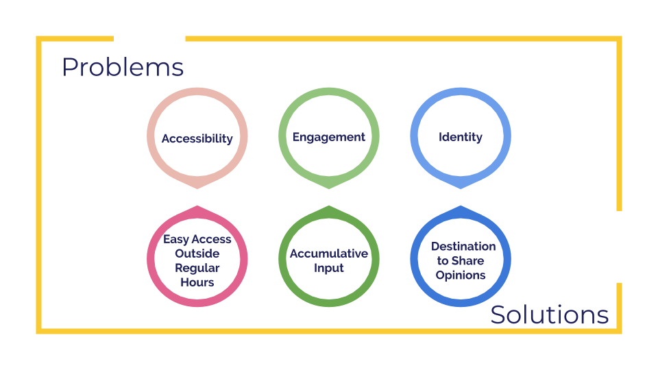
To solve these challenges, we have designed corresponding solutions.
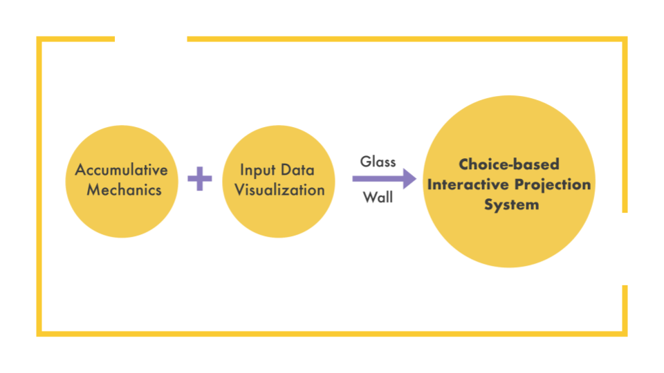
To solve the accessibility problem, we considered the installation locations that allow more availability outside the regular hours. To engage students’ interactions, we designed this installation to ask for student inputs that will be accumulated and visualized.To give this room an identity, we defined this room as a destination where students can share opinions about languages and cultures.
Media Choices
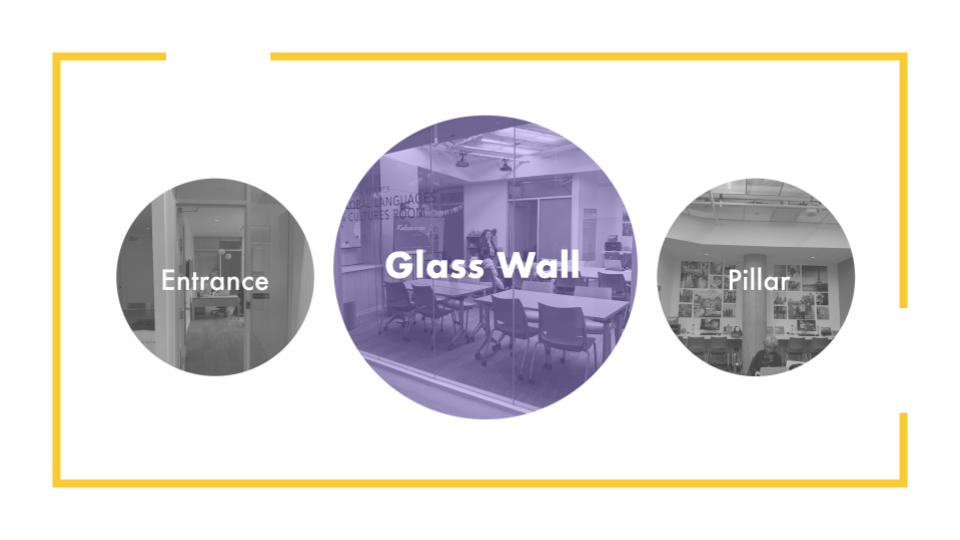
We had a few location options for this installation, glass, pillar and entrance. We chose the glass wall since it is accessible outside the room that is observable for walk-bys regardless of the room schedule.
After talking to faculties and the client, we found huge design opportunities of both innovative interactions and content options on the glass surface.
Concept Design
Design Iterations
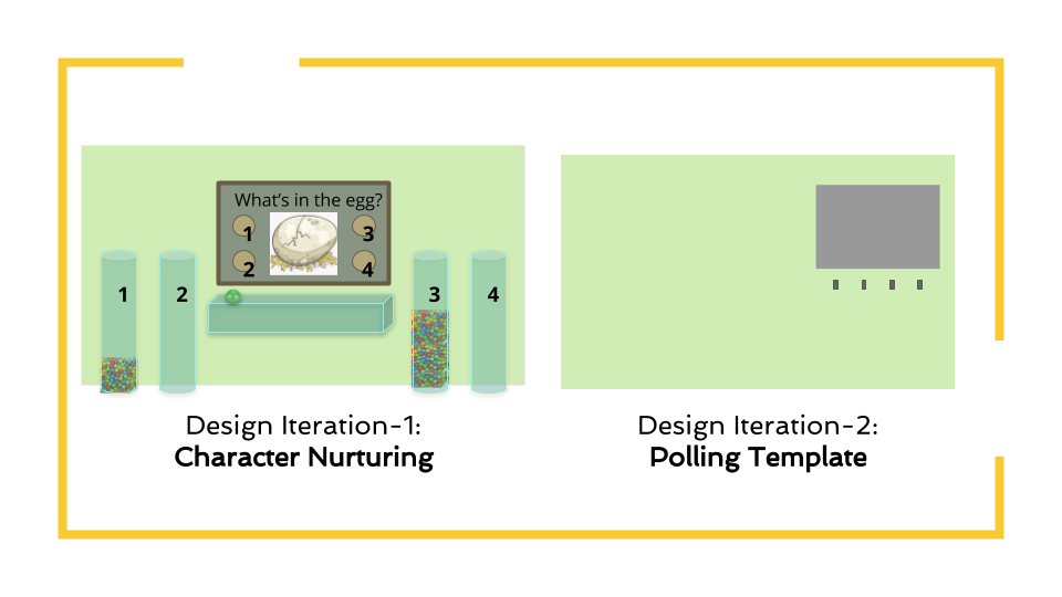
So here we had our first design iteration. In this design, the users will nurture a creature that is curious about languages and cultures. By voting on weekly topics, the creature will change its lifestyle as feedback to the dominant option from last week. We perceived scope, flexibility and maintenance problems. 1) Branching into story line weekly with four new visualizations could be out of scope. 2) Polling with physical objects is not flexible for future extension and maintenance. 3) Our client required us to avoid using too specific characters and fantasy cliche.
Thus, in the second iteration, we kept the polling mechanic while redesigned to a more abstract art style using text, shapes, and colors. The polling questions and visual feedback will be displayed on rectangular projection film on the glass wall. Instead of indirect voting using physical objects, the users will now interact directly on the wall.
Basic Mechanics
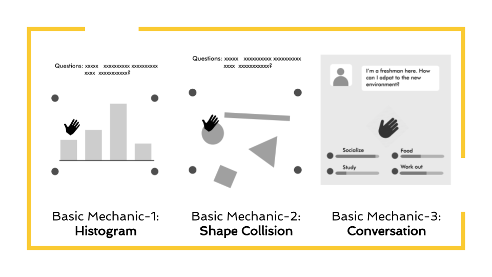
To avoid being too specific into certain types of contents, we designed templates so that more contents could fit in and the client can customize the contents. We came up with three basic mechanics. The first one, histogram. It’s a direct way to visualize the growth of data when users vote for some options. The second, abstract shapes collision to stand for options and interact with each shape. The third one is to simulate the interface of some chat applications on the phone to bring up the questions and receive the replay.
As for this iteration, the client suggested that the projection films should look appealing even without the contents projected.
Exploring Display Layout
In order to make the film look beautiful on the glass wall, we chose several circles being distributed on the glass wall. The first reason is that, the circle can give people a feeling of welcoming that fits our goal well. Besides, we decide on the final three templates: showcase, polling system and conversation. So we designed the hierarchy of the circles. The right big one is the main space for the showcase video or questions. The other two small circles and two semicircles are designed to show options. The height of the main circle is good for people to read the information or description of the room. The height of others is good for people to interact with.
Final Display Design
Showcase
For the showcase, the main circle shows the promotion video or poster of the upcoming events. Other shapes will display students’ feelings towards the room or the event, such as I’m definitely going, or I’m interested, which is a good way for hosts to know the students’ attitudes. When a student chooses a response, it will trigger the water in the circle growing
Polling system
For the polling system, the main circle has two functions, one is to show the questions and the other one is containing ‘tokens’. As the video shows, there are some shape icons around the sensor representing four options, which is easy for users to know what option they are voting for. After a user makes a selection, the shape will move from the main circle to its option container.
Conversation
For the conversation, we will simulate the scenario of two students talking with each other. The main circle is the interface of the student who needs help. When users select one, the message will be sent to the main circle. When getting the suggestions, the student who needs help will reply something, which is a complete chat on the real phone.
Guest Input
The sensor will be movable to adapt to different mechanics design. Besides, we designed two ways to realize the selected behavior. One is the single touch to select, the other is to hold for 2-3 seconds to select. We picked the latter for two reasons. One is to avoid mis-selecting because mis-selection is very frustrating. And it will lead to the wrong data collection. The other reason is to make students stay in front of the room for a while to digest the information and to have more time to observe the room. We design the bar to visualize the progress and students will be aware of when they will finish selecting.
Back-end Editor
Having all the design templates the Lu mentioned before, since we also want to keep the content adaptive and dynamic. We’ll provide an editing tool as in addition to the front-end display application with a tech and design manual.
The Tech Manual will provide installation and development instructions.
The Design Manual will include template mechanics and content as inspirations. The target users for this editing tool are admin and future designers and developers.
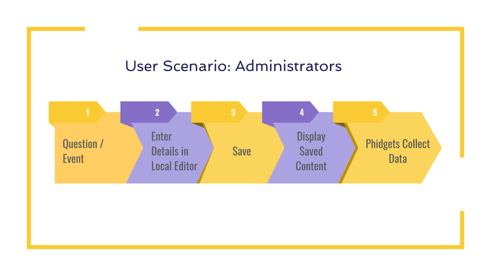
For the administrators, currently would be our client, they’ll first have a question or event in mind. Then they’ll enter the details in the local editor. After saving the work, they can switch the content in the display program. The phidgets will collect the voting data and save it back to the local files.
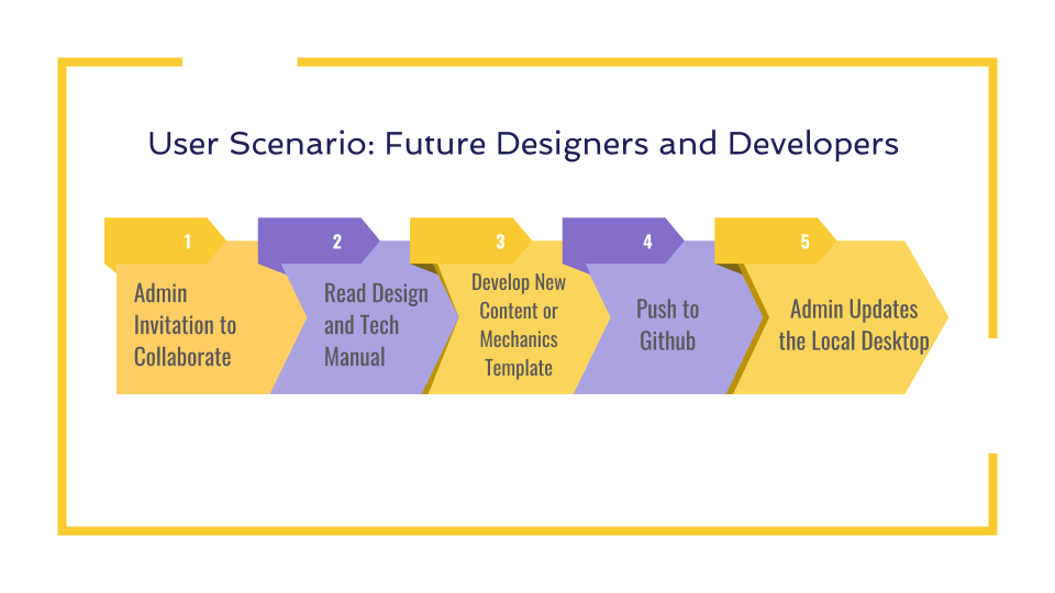
For future designers and developers, the admin will invite them to collaborate. They’ll read the tech manual for development instructions and the design manual for inspirations. Develop their own content or mechanic template, and push them to github repo. The admin will then update the local desktop .
Playtest Progress
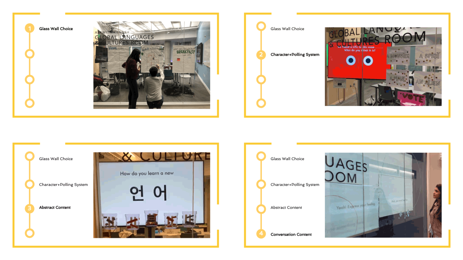
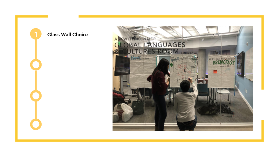
At this stage, we are exploring if the glass wall is a good place to attract people to stop by and interact with it. So we stick three posters to let students draw something on it according to the topic. We found people started paying more attention to the room. But they usually hesitated and didn’t know what to draw. So we changed our design to give users limited options.
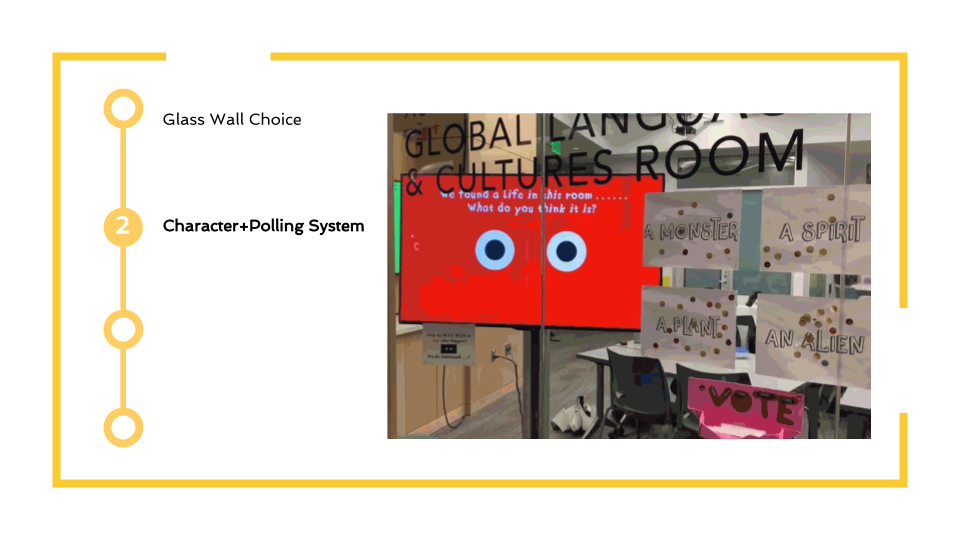
This playtest is to check the design 1, the character and the physical polling system. We changed the poster to the animation and people could use stickers to express their opinions within the limited options. We collected 100 stickers, which means the polling system works.
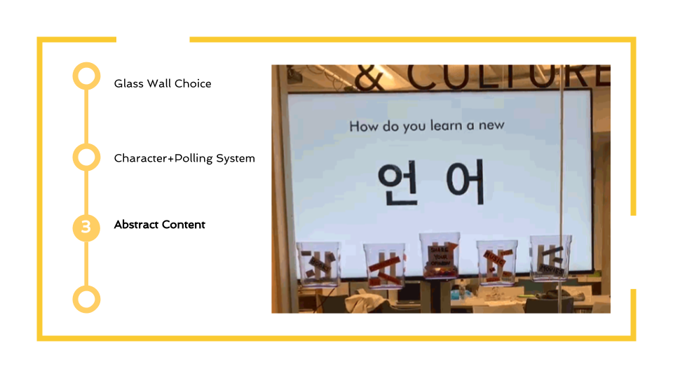
Due to the clients’ requirements, we are exploring the way to design abstract feedback. So for this playtest, we tried to test if reassembling different languages is interesting to our target users.
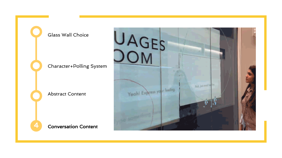
For this week’s playtest, we want to focus on testing users’ feedback towards the conversation content. Compared with shapes animation, we need to test if users want to take more time to read the conversation. Besides, we tried to install the sensor to test users’ behavior of touching .to help us decide single touch or press the sensor for a while.
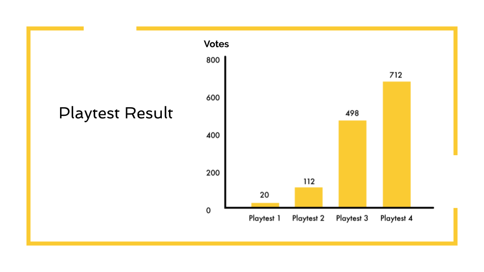
This is the diagram that shows the number of data we collect from each playtest. The number of people who are willing to interact with the glass wall is growing. These playtest helped us to make the design decision to push our design forward.
Comments are closed