This week we finished up development on the Solar System and Fractal Magic/Boom Fractals/Cute Fractal prototypes (the second one went through a few name changes). We also pitched another set of ideas to our client and selected the two we’ll work on next week.
Solar System
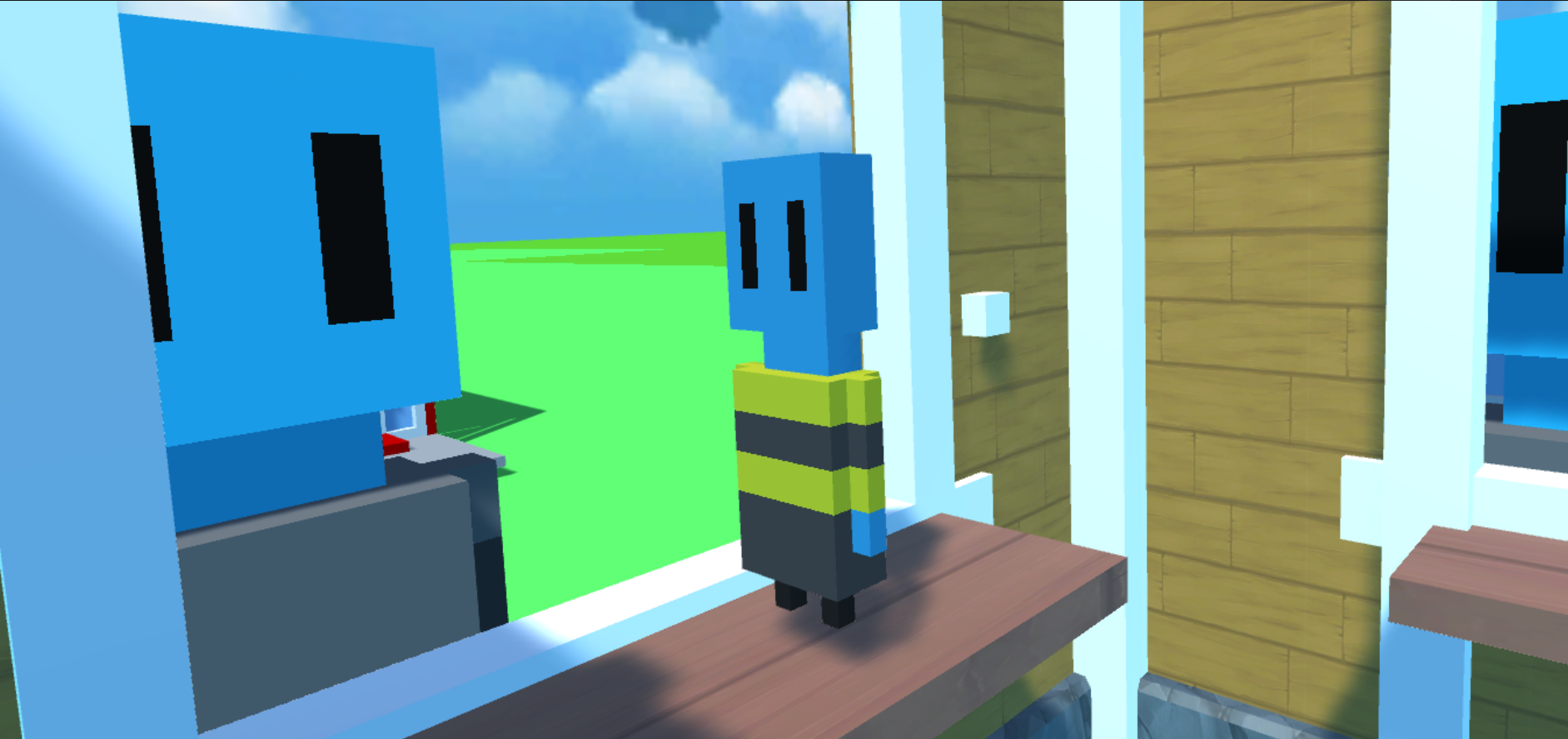
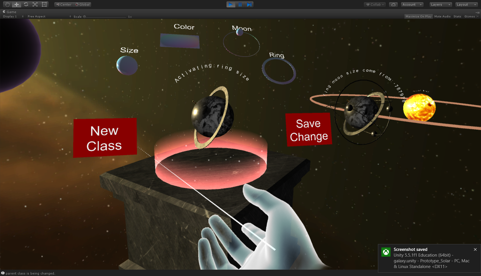
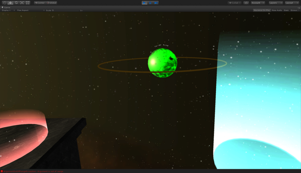 The aim for this week was to make the structure and user interface of the Solar System prototype more accurately reflect the relationships between classes and objects, as well as making them more intuitive in general. To do that, we made several major changes:
- Split the editing interface into two distinct space, one for modifying classes by adding and removing attributes and one for modifying objects by changing the values of their attributes.
- Have one consistent interaction for selecting and modifying instead of a different interaction for each attribute.
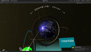
- Add introductory steps. Now instead of directly modifying planets, guests first need to instantiate the solar system, modify and instantiate the sun, and add attributes to a planet class.
- When a class is changed after objects have been instantiated from it, the existing objects also change.
- Make the left hand responsible for only the inventory to reduce accidentally opening and grabbing things from it.
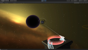
- Add a “black hole” to send unwanted planets to instead of a laser beam that gets rid of them to prevent accidentally destroying planets.
We also made many small changes to improve the look and feel of the experience. Overall, we and our client are quite satisfied with this prototype. We learned a lot about designing for virtual reality and designing around a concept, and we look forward to playtesting with teachers and students to learn more about how we did from an educational perspective.
Lessons Learned
 As the primary designer for this prototype, Miriam learned that it is necessary to be intentional about balancing what would make a fun and interesting experience with what would best convey the information that needs to be conveyed. Ideally the answers are the same, but not always. It is important to plan out what you think are the most important things to understand about the concept and design around those. She found it most effective to start with simply presenting the information and then find ways to make the presentation more interesting. In fact, generally if Miriam planned out the interactions and essential structure of the experience, Joe and Luna could fill in the details that would make it more exciting. Joe found this an excellent way to collaborate in a way that enables everyone to make significant creative contributions, and we learned that taking the time to plan things out and have everyone on the same page before developing makes us all more productive.
When it came to the interactions for the prototype, we were trying to make the experience as engaging as possible, so we had been using all kinds of different gestures. However, after some informal playtesting we realized that it was hard for guests to figure out how all the gestures work by themselves and that it is frustrating to need to remember all of them. After checking documentation and talking with people from Oculus Research about their Touch design choices, we decided to change our interactions to be more consistent. We removed the fancy “stretch to shrink” and rotate your hand to rotate the object and instead implemented the more common “point and press trigger” for selection and confirmation and moving the joystick to change values.
For the user interface, each of the new spaces for modifying classes and values have their own unique interface that guests can interact with. Luna also chose to add each class’ hash code to its name and its children’s name to that classes are easier to tell apart and it is easy to see which planets come from each planet class. This way, when a guest changes an existing class, they can see that any planets that have been made based on that class also change.
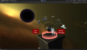
We think that this prototype also has the potential to represent memory management because there is a limit on how many orbits and planets the solar system can support. Once that limit is reached, guests can only add new objects by sending some of the existing ones to the black hole to be destroyed.
Fractal Magic/Boom Fractals/Cute Fractal
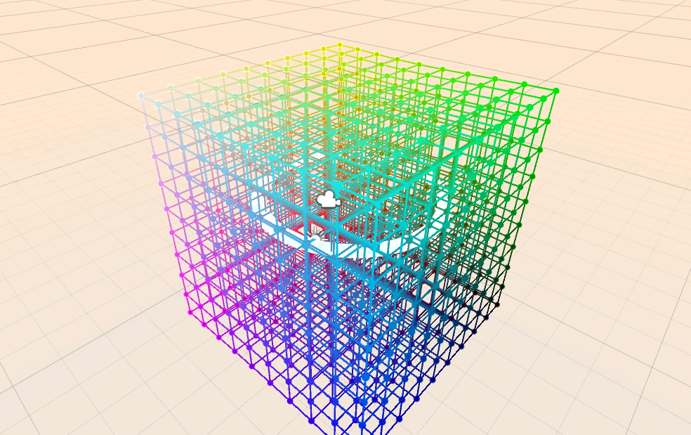
 This week Jiawen, Nick, and Zach got the interactions and effects of the fractal prototype working. The guest can create a spell to conjure a pyramid or cube by grabbing either shape and putting it in the central space, which represents the main function, and then grabbing the spell from the center and releasing it. If they want a more complex effect, they can instead put the shape in one of the two function spaces, represented by the blue and yellow spheres. They can also put the functions themselves in each other or themselves so that they call each other or themselves. They they can put the function in the center, grab the spell, and release it to see the fractal bloom.
Lessons Learned
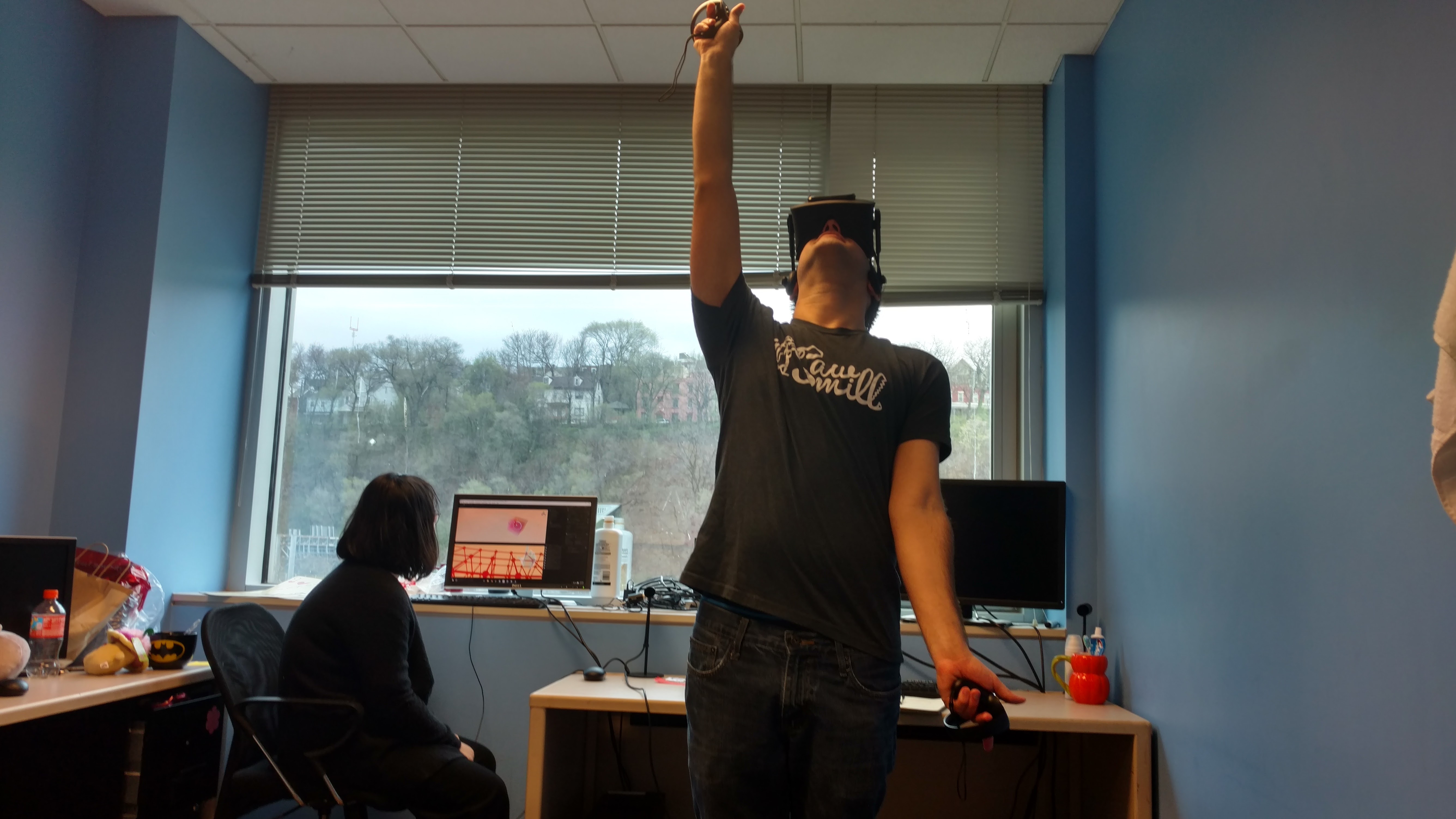
On the technical side of things, Jiawen discovered that both Oculus Touch controllers must be used together, otherwise neither of them will work. She also realized that the way we are currently representing functions makes it easy to have infinitely recursive functions and due to technical limitations the resulting shapes will not show up, which may make things more confusing. However, the experience itself was still quite fun to play with and explore.
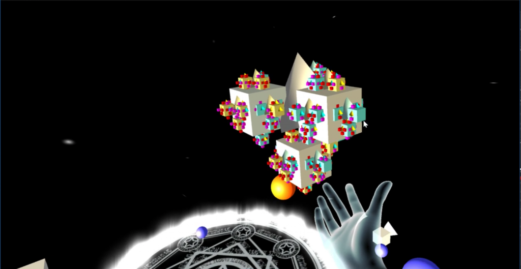 Nick found that in the future it will be necessary to limit the time spent on any given feature. He ended up spending several days attempting to make the fractals look like what we originally had in mind, which involved quite a bit of complicated mathematics that took a long time to figure out. In the end, he had to settle for an approximation that looked good enough.
The team also realized that we need to improve our internal communication so that we stay on the same page and are aware of each other’s expectations for each prototype. If we work to have more effective communication, we can make sure that each person is doing the job they are best suited to and keep the process efficient.
Pitches
 Zach, Nick, and Miriam brainstormed and pitched new ideas to the client for us to start working on next week. We based our brainstorming on the incoming results of a survey we sent out to local computer science and technology teachers, so we focused on debugging, data structures, flow of execution, and print vs return. In the end, we pitched three ideas to our client.
- Understand the benefits of systematic, modular programming by designing and building a skyscraper floor by floor.
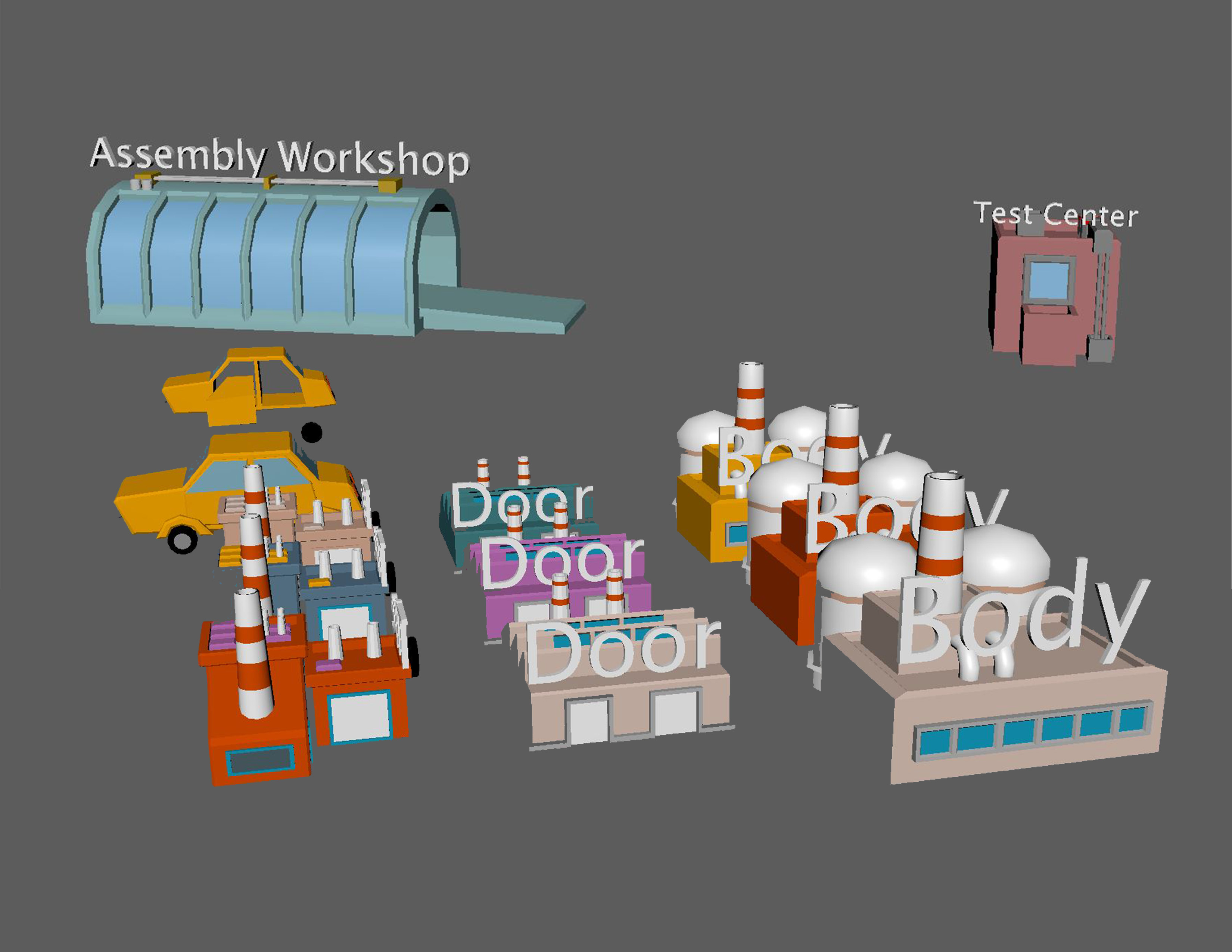
- Learn the process of debugging by tracing warning messages from the control room of a factory to room they are coming from and the machine that is not working.
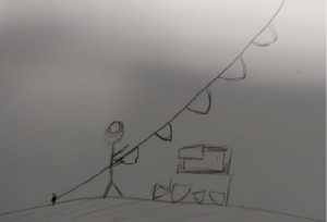
- Learn to traverse and insert into a linked list by modifying a banner of individual flags tied together and blowing in the wind, so that the flags must be pulled closer one at a time until the correct one is reached, and if the flags are disconnected in the wrong order they will fly away.
These pitches were much stronger and more detailed than our past ones have been. Based on feedback from our client, we’ve decided to build the linked list prototype and combine the other two into one that emphasizes modular programming as a way to make debugging more efficient.
Lessons Learned
 The biggest lesson we learned this week was how helpful it is to get feedback on pitches before we deliver them. Our faculty instructors listened to our pitches on Wednesday and gave us a lot of valuable suggestions, including better ways to present the ideas themselves. Thanks to that, we were able to make clear and detailed pitches.
We also learned that it is more effective for us to brainstorm together than individually. 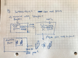 The past couple rounds we have worked independently until our internal pitches on Wednesdays when we gave each other feedback, and then refined the pitches independently until we showed them to our client on Fridays. This week, we brainstormed together on Monday until we had the basic premise of several ideas we all liked, then worked individually to build on those.
  On Tuesday we met again to discuss what we had come up with and improve them together. At the end of that meeting, we split the ideas we felt were solid enough to pitch between us and created the corresponding presentations independently. Thursday, after getting feedback from our instructors, we worked together again to modify the pitches and make them more specific until we all felt that we understood exactly what would happen in each. Then we split up again to write the new presentations before rehearsing them together on Friday before showing them to our client. We were much more confident in this process and we ended up with stronger ideas than we had been coming up with individually.
