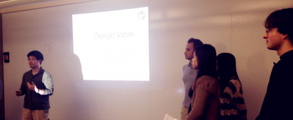
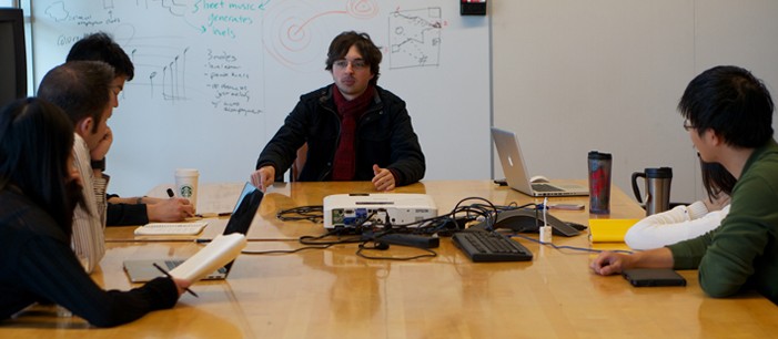
A glimpse of our first prototype.

Putting Things Together
Our steady progress is paying off in visible and exciting ways: we have art assets to iterate on, different parts of the programming framework are working, and our basic interaction is running on the iPad. Most of all, though, is that we have begun integrating all of these to build the complete experience.

Design
Last Friday, Nate, Cheng, and Romain met with Jiyoung to discuss the preferred musical style for our app; they settled on a classically-influenced and approachable pop style. With this decision, we have been able to make amount more forwards progress: Now, the programmers have a sense of what instruments our sequencer needs – for our style, those would be piano, patch strings, bass, drums. More so, Nate now knows what types of design to give our “levels”, and he has already started creating some level prototypes that Meng has begun to lay out.

Art
We have iterated on art, and have designs that we like aesthetically. A picture of a potential level layout in our art style can be seen above. We hope to create a visually simple universe, while allowing each chord structure to still keep its own unique aesthetic. Moreover, we are still iterating to make sure that the right parts draw the player’s attention (i.e. the little people that need to be picked up).

From a technical angle, we’ve also begun addressing questions about how to make sure the art intimately connects to the music and programmatic framework in the background. We are investigating how to allow levels be procedurally generated based on music data while still keeping artistic flair and variety amongst similar chords. At the moment, we like the idea of using a system of layers and building tiles that can be procedurally stacked and rearranged.

Tech
The tech prototype is a sight to see, and almost a sight that’s ready for our playtesters to see.

Cheng has built our own file system for storing data now, and moreover, the sequencer that Mike and Pei-Lin having been working on is playing those sounds at the correct tempo. Romain’s framework for drawing lines on screen now has “hit areas” for playable notes. And Cheng is integrating voice input/processing into the project, though that is something we will not be testing just yet.

While the team is excited to see our work in one piece, we are also aware of what is still incomplete at the moment: Our engine is not yet able to handle and construct with our visual elements so we will be testing our prototype over a large pre-made image of a musical level. Moreover, we are still only testing our mechanic and aesthetic, and have yet to begin designing the user interface. However, these are all things that the team is confident in being able to achieve once we know that the foundation of the experience is solid.

Looking Forwards
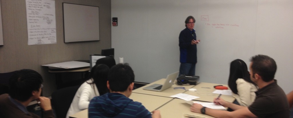
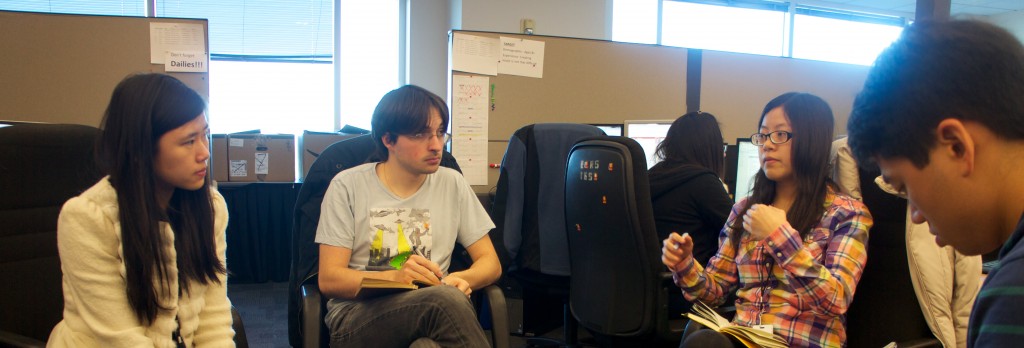
We will have an internal playtest next week on Monday with our fellow Silicon Valley ETCers to hear their professional feedback about our design. Nate has also been speaking with a local school, and we hope to test with young kids as well in the near future. In response to this feedback, we will continue refining our design next week in preparation for Half-Semester presentations.

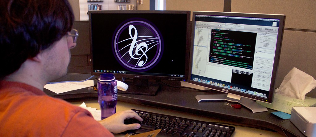
Romain working on our app's code.

This Week
This week, the team has made steady progress on all aspects of the project, from design to art to code. We have entered our first production cycle post-Quarters and are pushing forwards to have a testable prototype in two weeks.

Design
The team discussed our design direction last week and, early this week, confirmed it with our client, Jiyoung.

Up to this point, we have been explaining our app analogously as a maze-like experience that funnels players towards “correct” notes. However, this negative reinforcement does not fit well with the message of creative freedom that we want our experience to have, and our new design reflects positive reinforcement. The line-drawing should occur in an open environment but with attractive “goal areas.” We also know that to engage our primary demographic of young kids and non-musicians, the experience should also contain an interesting visual story. That concern combined with our new line-drawing mechanic has led to our current experience design: As a visual side story to the musical and audio feedback, the experience will involve a flying train that must pick up passengers; the passengers will be waiting on different types of tall structures that signify the different types of chords in the music. The player can harmonize their melody with those chords by drawing the train-line to pick up those passengers. The premise is straight-forward, and we hope that it will add that extra layer of engagement to our app.

Art
However, the visuals for our story are not the main focus of the experience and should not detract from the musical learning. The team has also therefore decided to create a very clean art style like in Hohokum or LocoRoco by using solid colors and shapes. Meng has begun drawing concept art for possible structures and we are in the process of defining the visual universe that the music inhabits.

Tech
Unfortunately, there is still not much to show visually for our tech progress unless readers want to look at code. However, our programmers ARE making good progress on things that will eventually become showable.

Romain has done a lot of work within our Sparrow framework, writing code for creating an on-screen keyboard as well as for our uni-directional line-drawing mechanic. Cheng worked on midi file-parsing for our audio data, Mike worked on the timer, and Pei Lin has been investigating data structures for our sequencer. Together, they hope to have not only something for everyone to look at but also to listen to next week.

Looking Forwards
Next week will be very exciting for the team. As we refine the work that was begun this week and moreover, begin to put all of it together, we will have a lot to demo even at a basic level. We plan to have concept art for our visual aesthetic, and more importantly, to begin deploying our audio line-drawing tool to devices. Next week will be an important stepping stone to a complete prototype of Bravura’s eventual app.

As we’ve moved past our quarters presentation, and the design of our experience is becoming more concrete, we’ve decided that what it was lacking is a theme and story.  We got together and came up with a world to base the application in, and we decided to add an objective for the user that goes beyond just creating a nice melody.

Our story begins on an unnamed musical planet in an abstract world far away from earth.  The inhabitants of this planet live in different apartment structures and all like to sing certain notes. The higher in the sky they live, the higher the notes they like sing.  They all need to catch the magical flying tram to get to work, and when the trip is complete, everyone sings their notes to create a melody.   You’re job is to lead the tram through all the buildings and pick up the inhabitants whose notes make up the melody you like best.  Some of the inhabitants are stuck on clouds in between the buildings, too.  Be sure to listen to them, as their notes can make your melody even more beautiful!  You can even go back and change the tram’s course if you don’t like your melody.

The tram company needs more help from you, as they are looking colonize a new part of the planet.  Now you can create the melodic tram line with your voice or finger first, and then create apartment buildings that fit around it.  Only certain buildings and people fit with certain tram lines, so find the one that works and sounds best to you!

The Bravura team presenting at Quarters.

Quarters and Onwards
This week, the team prepared thoroughly for our quarter-semester presentation on Wednesday, which went very well. Then, we began looking forwards to discussing the visual and experience design for our first prototype.

Quarters
The team was very anxious about our quarter-semester presentation and about making sure that our vision for the project could be made clear in 10 minutes. Rehearsals with our advisors showed us that many changes and revisions needed to be made to our presentation on Monday and even on Tuesday, the day before Quarters. However, all the feedback from Carl and Jiyoung that we did receive meant that we ended up having a strong presentation and that the team was able to feel confident on Wednesday. The audience, which consisted of over 30 EA employees, asked insightful questions about features and decisions we had made, and the team was able to answer them clearly. For example: Why do we say iPad and not just iOS devices in general? The answer: We are leaning towards a larger screen for more precise line-drawing, but this does not technically exclude building out to the iPhone. Quarters went well, and the team feels better for all future presentations as well.

Design
The team met on Friday to solidify design directions. The wireframe of colored blocks that we have used to explain our experience up to this point will hopefully soon be replaced by more accurate images of what the experience will be like. In terms of art direction, the team has discussed the pros and cons of concrete versus abstract art styles, and has looked at things like Eufloria and Hohokum for inspiration. In terms of the experience, the team has discussed the appeal of having a visual “story” that happens as an added dimension to the auditory story of melody creation. We have some new concepts that we are excited about and are looking forward to discussing with our client.

Looking Forwards
The programmers are continuing with implementation of important systems such as a basic sequencer that we can begin prototyping with. With our new found design direction, though, the team is looking forwards to our weekly client/advisor meeting next Tuesday. We would love to get feedback so that we can begin production of a rough prototype of the experience – a prototype that we hope will help show us what may need further iteration and also what is possible.

image

Investigating and Prototyping

The team has been pushing forward with more setup and confidence-building with tech during the past few days. We plan to have basic functional components to show for quarters next week before we begin integrating everything together into a single plan of design / execution.

Design

The team had a big design meeting this week to help solidify our direction as we head in to quarter-semester presentations next week. With the help of this meeting we outlined an ideal experience that we want users to have. However, there are of course decisions that can’t yet be made until we test with the tech, and we have been working hard to get to that point. Continue reading

SONY DSC

This week, the team finalized branding and began laying down the foundations for the project.  The programmers are in a comfortable place in terms of knowing what can be achieved this semester and we are preparing to finalize our design around the tech’s capabilities.

In terms of branding, our color scheme, poster, half-sheet, and general branding elements have all been finalized.   Moreover, if you remember our old logo, the G-Clef was on the wrong line of the staff, and that has been fixed.  The team cares about music and it is important that we know that it is important to show that in all the things we create. Continue reading

Greetings from team Bravura!

We wanted to fill you all in on some of the design directions and ideas that we’ve been discussing.  As mentioned in our newsletter last week, we pitched four different design ideas to our client and faculty advisor, Jiyoung Lee.  These ideas included a user friendly voice-to-sheet music digital audio workstation (DAW), a ball dropping game utilizing physics and time to connect to music, a maze-like line drawing activity exploring elements of musical harmony, and a node based design where the distance between shapes creates musical input.  The team and Jiyoung were interested a design direction that combined the DAW and maze ideas.

As our goal is to allow anyone to create music, we wanted as little barrier to entry into our experience as possible.  While some people may want to use their voice to share melodies in their head, some people may be more comfortable using their hands or a musical instrument.  We want to accommodate both of these input methods, allowing our guests to sing or draw on the iPad to control a pitch graph line of their melody.

We are considering two different modes for our application.  One of which is a structured level-like experience where preset chordal patterns and level designs guide a user to create their own melody that fits within these harmonic constraints.  This mode will be used to introducer users to our way of visualizing music, and have them see how melody fits into larger harmonic structures.

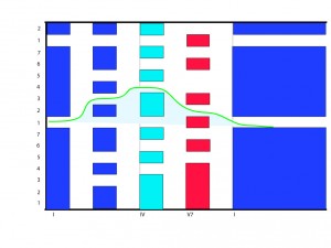
The maze-like level design

Pictured above is a sample “level” and melody using the first mode of the maze design.  The y-axis represents pitch of the melody (note: the number on the left side is the scale degree, though the guest may not see this).  The x-axis is time, so as you can see, our level design is essentially a pitch graph with obstacles.  Those obstacles, colored by their musical function, are the constraints of a harmonic structure we chose for this level.  The above design represents the most basic classical harmonic paradigm.  If the guest creates a melody that goes between these obstacles, it will sound pleasant to the ear .

The above mode is definitely limiting, especially compared to the original DAW pitch idea.  So for the second mode,  we want to make a sandbox style interaction space, where the user is not constrained by the maze shapes and harmonies we decide upon, but can avoid them all together or create their own.  Though they’ll still be restricted to notes within a certain key, they can now sing or enter any melody they like and choose the appropriate chord/maze structures.  They’ll be able to do all of this without needing to know a single thing about music!

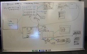
A whiteboard wireframe of a potential full experience.

Above is a possible basic flow chart of the experience.  Another feature included are the ability to pinch and zoom between small parts of the song/level and more macro level parts.  Also, play back in both modes will be accompanied by sheet music for the melody that they have written.  The guest will be able to see the connection between the line that they drew and actual music being written on the page.  Additionally, automatic audio accompaniment will be generated to fit the melody and harmony to further enhance the experience.

An important final note about design, is that none of these ideas are set in stone.  As you may know, things change down the road based on technical requirements, play testing, and the possibility of new and better ideas entering the fold.  While the experience described may be an effective one, it is only a broad template for what we are trying to accomplish and is open for change.  In the end, we want to create a musical application for guests ages eight and up encouraging them that composing music is something that they can do and be proud of.

Albert presenting our pitch ideas to Jiyoung.

This week, Bravura began reviewing our various design ideas. We presented to our client, spoke with Roger Powell, began investigating tech, and have also begun work on team branding.

Having spent our first week researching and brainstorming, on Tuesday, we presented various design proposals to our client and advisor, Jiyoung Lee. The team pitched 4 ideas: 1. a simplified digital audio workstation, which used voice as input; 2. a mechanical bouncing ball contraption that was a physical analogue to sheet music; 3. a line-drawer that would be translated to a pitch graph; 4. a node-based tool that combined distinct visual shapes with pathing. Jiyoung expressed her preferences for ideas #1 and #3, particularly the features of voice input, the ability to arrange samples, the ability to generate accompaniment, and a function to output and share the final product. After speaking with Jiyoung, the team compiled a more detailed feature list to investigate as we move forward in determining the final design. Continue reading

The Bravura team brainstorming design ideas.

Hello from Bravura! We are a seven person team at the CMU Entertainment Technology Center’s Silicon Valley campus, and our client is Jiyoung Lee, an ETC faculty member. This semester, our team will be working on a challenge that has fascinated us as well as Jiyoung since before we came together: We will be investigating and creating an app that can help people become comfortable with and encouraged to make music, in short, to show people that “creating music is not that difficult.”

This first week the team has gotten off to a quick start. After meeting with Jiyoung on Monday, the team quickly organized our internal roles and overall identity. Our team name, “bravura,” is Italian for “boldness”, and to play music “con bravura” is to play it in a brilliant manner. We have a strong team with a producer, art lead/associate producer, lead designer, and four programmers, and hope to show brilliant work throughout the semester. Continue reading

We are excited to begin our musical, technological, and collaborative journey this semester in Silicon Valley.      We’ve got a team of programmers, designers, artists, and producers, both new to and veterans of projects at the ETC, and we’re working on a project that is very meaningful to all of us.

The team is looking to create an application that makes the process of creating music fun and easy for everyone old enough to be interested in music.  Our tool will be targeted towards everyone ages 8+ who may be completely unfamiliar with music or even those who are; regardless, we want them all to be able to use our app to create good music that they can be proud of.

We know that we will be straddling a tough market space.  On the one hand, there are powerful musical composition tools that are fully controllable but complex, and on the other hand, there are casual toys that allow one to create rhythms effortlessly but with limited variety. Our product will have to be something that can be easily accessible, but which also carefully grants the player true musically creative freedom.  It’s not an easy problem, but we hope to approach it con bravura.