The Bravura team at finals!

al Fine

The semester is over and Bravura is done with TuneTrain! …or are we? Find out!

Final Presentations
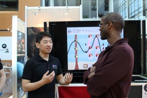
Final presentations went really well. People seemed very impressed with our product, or at least the people that nodded when we talked about things we discovered. (e.g. some of the EA guys when we said that a tile-based level select is more user-friendly than a swipe through level select).

Otherwise, we got really good questions about specific choices we made (Why is sheet music hidden by default? Because it can get in the way of the main screen, and not all kids wanted it), questions about development (How close are we to releasing and is it all native? Very close and yes, Xcode / Sparrow), and questions about playtesting (Were we able to measure learning? Not specifically because we designed for incidental and gradual learning but we did notice that some kids were able to draw connections when we explained the underlying music theory in our app).

Finally, we got a lot of great feedback during the post-presentation demos. EA folks, ETC alum, current ETCers on co-op, and even people from other companies all stopped by to try our app. In particular, we would like to thank ETC faculty Jessica Trybus for flying out from Pittsburgh to SV just for today to see the ETC-SV finals. Bravura appreciated your encouraging comments.

Wrapping Up
The semester is officially over. The team is archiving our work; we’ve written our post-mortem and self-assessments; we shot and edited final footage of our app for promo videos. It looks like we are ready to move on.

But we’re not done yet. Some team members will be around until the end of May to put finishing touches on TuneTrain in preparation to release it on to the app store by June. We’re really excited about TuneTrain, Jiyoung and Carl are really excited about TuneTrain, and a few of our playtesters and their parents have been exciting about TuneTrain. While there are many features we did not complete, we see a wonderful opportunity to showcase what we have made this semester.

We would like to thank each other, Jiyoung, Carl, the other ETC-SVers, and everyone who helped us this semester for a wonderful 16-weeks, and we wish the best of luck to everyone wherever they may go from here.

The new tutorial in action!

This week between Softs and Finals has been a busy one as the team began wrapping up loose ends as well as pushed to put final touches on our app. We’ve made a lot of exciting improvements in content as well as interaction polish and our app is almost done.

Development
Many new features happened this week as we have been clearing off our backlog.

First and foremost, our app has a final name, TuneTrain. We had been considering a variety of names, but playtesters and even some EA folks passing by our work area have really liked the concise alliterativeness of TuneTrain. TuneTrain is official!

Up until recently, only levels that had been written in the key of C were able to be played, but, now, all ten of our levels have been successfully implemented. TuneTrain now has levels in various keys and of musical flavors (some happy and some a bit more eerie). We have also tweaked the levels for appearance and flow by changing some note placement as well as by adjusting horizontal spacing for notes that occur very close together.

Further polish this week included: adding a parallax effect to the background of our levels; adding sounds to our menus; as well as creating a symbol/button for the accompaniment style-changing UI.

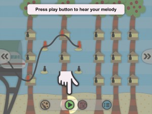
The other most exciting thing that happened this week was the successful implementation of the tutorial framework. We now have a basic tutorial that isolates and guides players through specific UI elements and interactions, and we can add/remove steps as needed. Most amazingly, the code merged with our main branch in Git with no conflicts. It was a good week for development.

Feedback and Playtests
Last weekend, Nathan tested our app with CMU design alumni as well as students at the San Francisco Conservatory, and this week, we also had two playtests scheduled with families.

These last few opportunities for feedback before finals have been very helpful for refining our interactions just a bit more. Level scrolling had been changed from a two-finger gesture to scroll buttons in response to softs. However, feedback over the weekend showed that what people really wanted was one-finger scrolling so we implemented that. The playtests during the week then further helped us balance the variety of functions that now need to react to one-finger gestures, which include placing notes, editing, de-selecting, and scrolling.

Looking Forwards
Next week will be a time to tie up remaining loose ends: Getting TuneTrain ready for the App Store; updating promotional media to reflect the final app; writing post-mortems and archiving our work. Moreover, next week is final presentations, and the team is really excited to share our final results with the ETC alum and EA employees who have been following us throughout the semester.

Mike explaining our app to Greg Dismond

This week the team polished our game and prepared for soft opening on Wednesday. Soft opening at EA went extremely well, and we have spent the rest of the week continuing to polish and playtest.

Soft Opening at EA
The ETC Silicon Valley campus held our Soft Opening within the Atrium of Electronic Arts at Redwood Shores, California. We demoed our product and answered questions to interested EA employees.

We got a lot of valuable results: Our current level selection system which uses scrolling is difficult to use and we are considering switching to a traditional tile-based level select. The current method of removing notes from the melody by tapping above or below is also not consistently intuitive. Finally, we found that most of our UI is intuitive, even if one skips the tutorial, all that is, except for the accompaniment style.

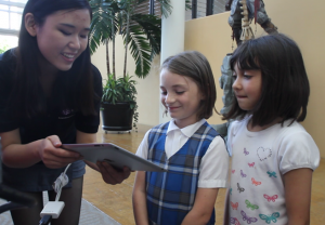
In addition, in the afternoon, a group of Girl Scouts who were touring EA also stopped by to visit the project teams. The 11 girls and 1 boy were all within our target demographic of 8 to 12. Using two finger scroll to navigate the levels is a stumbling point, even sometimes with the tutorial. We will most likely implement actual UI for level-scrolling.

Cheng showing TuneTrain to Girl Scouts

Polish
Polish was the big theme of this week, from polishing in preparation for soft opening to polishing in response to feedback from soft opening.
Going in to softs, our programmers did an amazing job cleaning bugs and memory leaks. While previous builds of the game would occasionally crash if one tried the exact wrong combination of actions, our build for softs was robust enough that we did not experience a single crash the day of.

After Softs, with the system proven sturdy, the team began to add polish to our content. The people now change to a very visible red color when selected so that you know whether or not they are part of the melody, especially when the line seems to go through them. And in support of the story of our universe, there are now train terminals at the beginning and end of each level and people disappear when the train drives by and “picks them up.”

Looking Forwards
Next week is the last week before finals. We will be putting the final touches on our game, and implementing our other levels as well as the latest tutorial, which will reflect changes made to our final UI. In addition, we will have two more individual playtests next week to confirm changes that we have made since softs.

Playtesting

Almost There
This week, the team picked up the pace for a one-and-a-half week sprint into Softs next week. Merging and troubleshooting are the current state of affairs, and the frequency of bugs, memory leaks, and inter-team communications has increased.

Content
Since converting our intro level into an xml file that we successfully read last week, this week, the rest of our already designed levels have also been converted to xml files. During the week, testing revealed some discrepancies between how our program was reading the files and how our designer had written them, but once revealed, this was quickly resolved. We are now in the process of implementing the level select menu to access all of the levels, but otherwise, the levels look promising and fun. Even the team hasn’t tried all of them, yet!

Programming
The importance and frustration of last week continued this week for our programmers.
The menu/UI, in-game line-drawing, and musical notation conversion systems in their individual Git branches were all merged on Monday. Bugs and communication both resulted out of necessity.

Through diligent individual work as well as cooperative work, our programmers have been tackling many issues that have been open since last week or that had just cropped up this week:

  • an outstanding issue with irregular smoothing of our drawn line
  • problems with the level selection system’s subview release
  • extra lines, showing time signature, problems with ties in our musical notation
  • sequencer moving too quickly and calling channels too soon
  • memory leaks

Fire-fighting has been a stressful process, especially since both the causes and solutions to a problem can be completely unclear; however, our programmers consistently solve a great deal of them and the team is supportive.

Playtesting
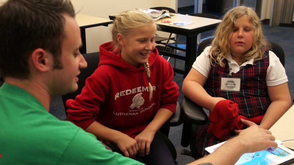
he team had a playtest this Wednesday with guests – girls, 9 and 11-years-old. We were excited to showcase a new level design as well as all of our features together for the first time. They enjoyed the ease of use and figured out our UI, even though we had not yet implemented our interactive tutorial. In addition, we had internal testing with a couple of our peers here at ETC-SV as well, and they were able to promptly discover a new bug.

Looking Forwards
This Saturday, some members of the team will attend CMU’s Carnival West where we hope that CMU alumni and their families will give us more feedback about our app.

Next week, the team will lock down our current build and debug all current functions in preparation for Soft Opening on Wednesday. After that, we will look ahead at adding the other planned features such as the interactive tutorial.

The Bravura team live on camera!

The Past Week
This week, the team tightened up the work done last week in preparation to wrap up this sprint. Systems that had already taken shape were being cleaned and adjusted in preparation for building out a new prototype for testing.

Content
We have completed designing eight different music levels with three accompaniment tracks each, including our introductory level, where it is possible to create the melody for “Mary Had a Little Lamb” as well as any other melody that fits within that chord structure. Even more exciting though is that our xml-file reading is working, and after a bit of manual conversion from sheet music to xml, we have been able to load our introductory level into the app. Next week, we hope to have a variety of levels implemented that we can begin testing with.

Programming
This was an important and sometimes frustrating week for our programmers.

As we have been merging various branches of our project in preparation to make our next test-ready build, conflicts and memory issues have arisen that our coders have worked hard to squash. Memory leaks in particular had been crashing the app when deployed onto the iPad, and there was an unusual bug with our line-drawing system getting tied up in knots – both of which have been significantly addressed. Memory issues with images are also being resolved by creating texture atlases.

Otherwise, we are continuing to build the menu / level selection interface as well as to move our music notation rendering function into Xcode.

Overall, the team is in a place where we would like the current functions to be less buggy before we move forwards. While bug-fixing is a necessary part of polish, it has made progress this week feel a little slower.

Marketing
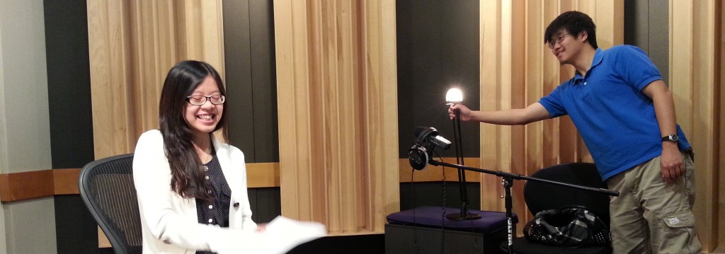
The fun highlight this week was that the team has begun filming our project’s promo video. EA was kind enough to let us use their recording studio, and we’ve shot everyone on the team’s talking portions. Now, we still need to film with Jiyoung as well as need more footage of playtests and of gameplay.

Looking Forwards
Next week, the team plans to test our current build to discover any necessary changes needed before Soft Opening the week after. Beyond that, everyone will continue working on implementing our levels / tutorial and making sure the various systems are fully functional.

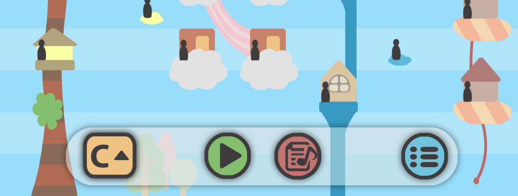
The new UI!

A Tempo
Bravura has returned to work from another one-week break – this time, the team was off at GDC from March 25 to 29. This past week, the team has gotten right back to work and is making steady progress to complete our app in the next three weeks. Our main priorities for the current sprint are to bring in the last pieces of our core experience: UI, level generation, sheet music conversion, and accompaniment.

UI
The team’s pipeline is really flowing in terms of completing UI. We had a UI design meeting on Monday to finalize the look of our interface, and with that settled, we were able to create our UI graphics early in the week for the programmers to begin implementation. As of now, the in-game UI is in and just needs to be linked to the correct functions. Menu and title screens are also being designed and the whole system should be functional by next week.

Levels
Our procedural level generation system is coming together as well: the building art has been cut into tile-able pieces, and our app is already able to generate structures with a few of those building styles.

Moreover, the file-reading system for the level generation is something we’ve begun to think about. We’ve started designing different possible levels, and being able to get them in to the app will be important for testing. A particular level that we are giving attention to is the tutorial, which we might make to be “Mary Had a Little Lamb.”

Menu UI
Menu UI

Accompaniment and Sheet Music
The accompaniment system is going to be efficient. Because we are designing the levels anyway, we have decided that the accompaniments for those will be pre-recorded as well; this is as opposed to relying on the app to generate the rules for a multitude of music al styles. For the free-play mode, we are considering having the phrasings be simpler, perhaps even just block chords. All-in-all, we’ve decided to make the accompaniment system only as complex as it needs to be.

As to the sheet music system, we’ve made great progress in rendering our data to musical notation, and are also tackling rhythm analysis which will be important for converting data in free-mode into regular notation.

Cleaning
Otherwise, the team is continually cleaning up small tasks from our backlog as well to polish the experience. The train now tracks with playback so that people can see what note is currently playing while listening to their melody. We’ve also made the hitboxes of the people a little larger so they aren’t so frustrating to connect. And general bug-squashing is going on as well; the memory leaks that used to cause the app to crash occasionally are fixed, though new bugs continue to arise from the new systems being built.

Looking Forwards
We anticipate even more great progress next week. With all four of these systems coming together, our core experience can expand in to a complete experience, and we anticipate that we can even begin the implementation of our free play mode.

Idan from IncidentTech trying out our app.

Playtests and gTars
Team Bravura had a very exciting week; we got to conduct our first playtest on Monday and on Wednesday we met with Incident Technologies for information about what they’re doing and feedback on our application. We’ve been busy integrating all of this feedback into our current application build.

Internal Playtest
We had a blast showing our progress so far to our fellow ETC-SV students. The test consisted of a preliminary build of the application on an iPad and a “paper-prototype” where Nate simulated a more full experience. Above all, people really enjoyed the application! With no prior musical experience, they DID feel like they were composing music.

The playtest provided useful feedback about features we are considering integrating into the application. We learned that people were in fact interested in looking at how their melody can become music notation, that they wanted to continue to explore a level even after creating a melody, and even if they were not fond of their melody at first, when they added accompaniment, they were unanimously impressed. They enjoyed trying different accompaniments, with the added educational bonus of learning about the differences in musical style that we didn’t even anticipate. In sum, the playtest was extremely successful and rewarding; it was encouraging to find we’ve been moving in the right direction towards our goal of allowing everyone to create music.

IncidentTech
A visit from the creators of the gTar, Idan Beck and Josh Stansfield of IncidentTech, to ETC-SV proved to be just as encouraging. Their product is a digital guitar designed so that anyone can pick it up and start playing. After docking an iPhone into the gTar, you can pick your song and difficulty level, and the notes you need to play light up on the frets of the instrument. The goal of the gTar is very similar to ours; to show people that anyone can create music.

After their demonstration, we showed them our current version of our application. As they have experience designing a music product for non-musicians, they had a lot of valuable feedback. They really liked our application, notably the overall design and art style. Idan pointed out that our way of visualizing music is perhaps even more effective than traditional sheet music! He also gave us interesting feedback on voice as input and the art specifics.

Looking Forwards
Next Tuesday, Nate, Cheng, and our advisor, Jiyoung, are going to conduct another playtest with students visiting Electronic Arts from Markham Elementary school. We will also be spending the next week and a half preparing for our halves presentation and demonstration. As we make small refinements to the application from our testing results, Mike will compile these changes into a build to show at halves.

A glimpse of our first prototype.

Putting Things Together
Our steady progress is paying off in visible and exciting ways: we have art assets to iterate on, different parts of the programming framework are working, and our basic interaction is running on the iPad. Most of all, though, is that we have begun integrating all of these to build the complete experience.

Design
Last Friday, Nate, Cheng, and Romain met with Jiyoung to discuss the preferred musical style for our app; they settled on a classically-influenced and approachable pop style. With this decision, we have been able to make amount more forwards progress: Now, the programmers have a sense of what instruments our sequencer needs – for our style, those would be piano, patch strings, bass, drums. More so, Nate now knows what types of design to give our “levels”, and he has already started creating some level prototypes that Meng has begun to lay out.

Art
We have iterated on art, and have designs that we like aesthetically. A picture of a potential level layout in our art style can be seen above. We hope to create a visually simple universe, while allowing each chord structure to still keep its own unique aesthetic. Moreover, we are still iterating to make sure that the right parts draw the player’s attention (i.e. the little people that need to be picked up).

From a technical angle, we’ve also begun addressing questions about how to make sure the art intimately connects to the music and programmatic framework in the background. We are investigating how to allow levels be procedurally generated based on music data while still keeping artistic flair and variety amongst similar chords. At the moment, we like the idea of using a system of layers and building tiles that can be procedurally stacked and rearranged.

Tech
The tech prototype is a sight to see, and almost a sight that’s ready for our playtesters to see.

Cheng has built our own file system for storing data now, and moreover, the sequencer that Mike and Pei-Lin having been working on is playing those sounds at the correct tempo. Romain’s framework for drawing lines on screen now has “hit areas” for playable notes. And Cheng is integrating voice input/processing into the project, though that is something we will not be testing just yet.

While the team is excited to see our work in one piece, we are also aware of what is still incomplete at the moment: Our engine is not yet able to handle and construct with our visual elements so we will be testing our prototype over a large pre-made image of a musical level. Moreover, we are still only testing our mechanic and aesthetic, and have yet to begin designing the user interface. However, these are all things that the team is confident in being able to achieve once we know that the foundation of the experience is solid.

Looking Forwards
We will have an internal playtest next week on Monday with our fellow Silicon Valley ETCers to hear their professional feedback about our design. Nate has also been speaking with a local school, and we hope to test with young kids as well in the near future. In response to this feedback, we will continue refining our design next week in preparation for Half-Semester presentations.

Romain working on our app's code.

This Week
This week, the team has made steady progress on all aspects of the project, from design to art to code. We have entered our first production cycle post-Quarters and are pushing forwards to have a testable prototype in two weeks.

Design
The team discussed our design direction last week and, early this week, confirmed it with our client, Jiyoung.

Up to this point, we have been explaining our app analogously as a maze-like experience that funnels players towards “correct” notes. However, this negative reinforcement does not fit well with the message of creative freedom that we want our experience to have, and our new design reflects positive reinforcement. The line-drawing should occur in an open environment but with attractive “goal areas.” We also know that to engage our primary demographic of young kids and non-musicians, the experience should also contain an interesting visual story. That concern combined with our new line-drawing mechanic has led to our current experience design: As a visual side story to the musical and audio feedback, the experience will involve a flying train that must pick up passengers; the passengers will be waiting on different types of tall structures that signify the different types of chords in the music. The player can harmonize their melody with those chords by drawing the train-line to pick up those passengers. The premise is straight-forward, and we hope that it will add that extra layer of engagement to our app.

Art
However, the visuals for our story are not the main focus of the experience and should not detract from the musical learning. The team has also therefore decided to create a very clean art style like in Hohokum or LocoRoco by using solid colors and shapes. Meng has begun drawing concept art for possible structures and we are in the process of defining the visual universe that the music inhabits.

Tech
Unfortunately, there is still not much to show visually for our tech progress unless readers want to look at code. However, our programmers ARE making good progress on things that will eventually become showable.

Romain has done a lot of work within our Sparrow framework, writing code for creating an on-screen keyboard as well as for our uni-directional line-drawing mechanic. Cheng worked on midi file-parsing for our audio data, Mike worked on the timer, and Pei Lin has been investigating data structures for our sequencer. Together, they hope to have not only something for everyone to look at but also to listen to next week.

Looking Forwards
Next week will be very exciting for the team. As we refine the work that was begun this week and moreover, begin to put all of it together, we will have a lot to demo even at a basic level. We plan to have concept art for our visual aesthetic, and more importantly, to begin deploying our audio line-drawing tool to devices. Next week will be an important stepping stone to a complete prototype of Bravura’s eventual app.

The Bravura team presenting at Quarters.

Quarters and Onwards
This week, the team prepared thoroughly for our quarter-semester presentation on Wednesday, which went very well. Then, we began looking forwards to discussing the visual and experience design for our first prototype.

Quarters
The team was very anxious about our quarter-semester presentation and about making sure that our vision for the project could be made clear in 10 minutes. Rehearsals with our advisors showed us that many changes and revisions needed to be made to our presentation on Monday and even on Tuesday, the day before Quarters. However, all the feedback from Carl and Jiyoung that we did receive meant that we ended up having a strong presentation and that the team was able to feel confident on Wednesday. The audience, which consisted of over 30 EA employees, asked insightful questions about features and decisions we had made, and the team was able to answer them clearly. For example: Why do we say iPad and not just iOS devices in general? The answer: We are leaning towards a larger screen for more precise line-drawing, but this does not technically exclude building out to the iPhone. Quarters went well, and the team feels better for all future presentations as well.

Design
The team met on Friday to solidify design directions. The wireframe of colored blocks that we have used to explain our experience up to this point will hopefully soon be replaced by more accurate images of what the experience will be like. In terms of art direction, the team has discussed the pros and cons of concrete versus abstract art styles, and has looked at things like Eufloria and Hohokum for inspiration. In terms of the experience, the team has discussed the appeal of having a visual “story” that happens as an added dimension to the auditory story of melody creation. We have some new concepts that we are excited about and are looking forward to discussing with our client.

Looking Forwards
The programmers are continuing with implementation of important systems such as a basic sequencer that we can begin prototyping with. With our new found design direction, though, the team is looking forwards to our weekly client/advisor meeting next Tuesday. We would love to get feedback so that we can begin production of a rough prototype of the experience – a prototype that we hope will help show us what may need further iteration and also what is possible.