2/18 – 2/22 Week 6: One small step
- yunhaol
- March 4, 2019
- Development Blogs
- No Comments
As a continuation of week 5, week 6 is the second half of our first production sprint. In a glance, the week is full of challenges and “mission accomplish”s. We had our first art package, tested our story, built more necessary features, completed the world layout design… let’s dive in!
Production
While we were sparing no effort in developing the game, we didn’t leave off the branding. This week we spent some decent time on making some detail improvements on our website, based on the feedback we got from the faculty. Also, we have our team page on.
On the game side, we were glad to be able to merge the tech build and the game build, so we now have a demo version of the game, although we know it is still far from our idea. We had several ETC fellows visit and checked out the build, mainly left some comment on how did the whole scene feel, how did the control feel and how did the art style look to them. Good news is most of the feedback were positive, bad news is we know our classmates are always kind and nice. So our next step is to have our real target audience – high school students, to test out the demo. As the half presentation is reaching, we also have to clean up a little and think of how are we going to present our work to people.
Lastly, as we got the half presentation schedule(we are on Monday), we made some change to our calendar to adapt.
– Magian
Design
One of our goals for this sprint is creating a navigable world. For this, we started designing the layouts for each room. Last week we only mentioned that these rooms will look drastically different from each other, but we didn’t dive deep into that concept.
Given that the main room, which is the room that we expect the players to spend most time in, is an abandoned factory, it was fairly clear that we are aiming for themes that stray away from the industrial setting as far as possible. We went over some ideas and narrowed down to 6 themes:
Forest
Graveyard
Leap of Faith
High art
Volcano
Copied city
As soon as we finalized the designs, we immediately drafted out the designs on papers, and listed out needed tiles and art assets based on their priorities; as soon as our artist has completed the minimal needed tileset for a room, our designer laid out the room, and hand it over to our programmer, who will apply collision detections and control mechanisms.
On the other hand, we are also designing our minigames, and have a few that are already available to be playtested. Unfortunately, the time allotted to us Tuesday simply wasn’t enough for our playtesters to go through both story and minigames. As we think that story is currently more important than the minigames, we eventually left them out of the playtest. But don’t worry! We will be constantly seeking for playtest opportunities.
On a side note, given that now we have a lot documents (especially paper-based), we needed somewhere to store and present these information. We present to you the designer’s board!
Tech
This week, we’ve done the following
> Shrank the copy paste overlay down to just the input field and confirmation button.
> Added a token system and a “get hint” button in the question UI.
> Added a pause menu with an “options” screen (placeholder).
> Made the interface navigable with keyboard.
The reason behind :
#1 is that a whole-view overlay is an extra layer that provides no additional information or functionality, yet blocks the view of the question. We shrank it down to just the input field and the OK button, which maintains all the functionalities while making it way less intrusive.
#2 is more than a UI change: It actually relies on the ability to store custom data (the game state) in the picoCTF server and synchronizing the game state with the server. Luckily, we didn’t have much problem with it.
#3 and #4 were done together, as they depend on each other. Currently there are no actual options in the pause menu, but we will eventually have options, particularly regarding audio, thus we implemented now to test keyboard-only UI navigation. Based on the results, which were satisfactory, all the other UI elements were also adjusted in similar fashions in the back end, and now every functionality of the game can be accessed with only the keyboard – including the now minimal HTML overlay.
– Max
Story
This week we organized our story into illustrated chapters of bullet points, or story beats, and we playtested on a group of visiting high school students. We asked the students how interested they are to continue at each section of the story; and they are also free to leave comments at any point.
> Things we noted are:Interest is generally high when more of the world is introduced, particularly the antagonist organization
> Interest is high when events happen in the story in addition to world building
> There is confusion about too many parties involved in helping the character
> There is disappointment when the subject the player expects to be expanded on is not expanded on in the following chapter
> Playtesters are distracted by the use of placeholder names
> Some of the storyboards we used in playtesting:
– Tina
Art
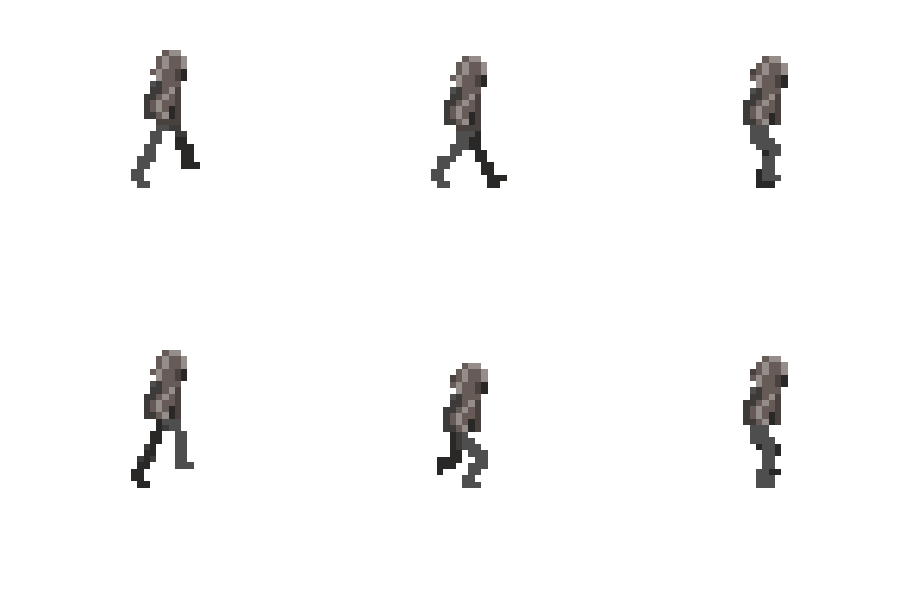
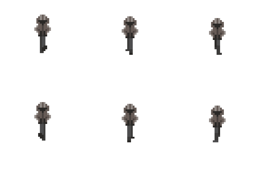
This week we the character concept and pixel art representation as well as animation:
We also noted several issues with the with the tiles that have been put into demo and how it needs works with the tech team and the colliders.
We also reached out to the marketing team of our client with the artwork we have so far, in case it would help them with promotion.
– Tina
Other things we did in the week:
Game our: Ticket to Ride: Europe! Guess who won?
For the next week, we’re planning to:
> Retrospective meeting about our first sprint
> Prepare for the half presentation (this is a lot of work!)
> Plan for the next sprint, clear goals and better estimate

