Journey of Onions
Week 7
Preparing For The Halves Presentation
To prepare for our halves presentation, we made quick big decisions using our previous prototypes as a guidance. We also used our guts to make decisions because we cannot justify all of those big decisions since the time is our biggest constraint.
Design Team - Recap
To recap what we have, let’s visit our fantasy statement once more:
Making a Huge Moving Castle that Attacks
To tackle our fantasy statement, we locked onto the three verbs “Make”, “Move” and “Attack”. So we made the first mechanics prototype which mainly focuses on the verbs “Move” and “Attack”. In this prototype, the player drives the castle indirectly by controlling a character inside.
From the playtest of prototype 1, we found that there are too many things that the player should pay attention to, which can be frustrating for the beginners. But we still found the next step that we should take: the sense of scale. In prototype 1, players can feel the sense of scale between the change of camera perspective.
After prototype 1, the second prototype we made concentrates the verb “Make”. In the prototype 2, the player controls a character in first person perspective and customize the fortress directly without UI menus. In this way, the player can feel the scale of the castle directly.
This prototype also revealed the problem with this design: Even though it has a good sense of scale, players will be confused about where to go next because of the lack of UI.
Design Team - Third Prototype
So far, we had our setting established, 2 tech prototypes, demographics broken down based on 5 essential parameters, a lego prototype for building, a movement demo, and game design documentation.
For our last prototype, we focused on Attack along with moving. Game designer’s decision was to utilize decisions from Diablo made by Blizzard. Camera angle, movement, and feel of being a hero.
In BVW tradition, we had an “Interim” review. It answered some questions, but more importantly, it got us to ask better questions. Internal playtesting indicated it had fun elements. But we tried to gauge it from the lens of a fortress.
Does it serve our fantasy? Not exactly. This prototype proves moving and attacking mechanics, which was satisfying. It served a point a necessity to move around and feel powerful, one core question came to all of our minds after playing this prototype is: Why does the character have to be a fortress?
Does it imply the need to be a fortress? This prototype did not emphasize that need.
Is the movement interesting? Clunky, crab-like motion of the fortress could be part of the constraints of the fortress (with more polish).
Is the attacking important? Fun but not novel. It was hard for us to come up with an additional design direction to separate our game from others with similar attack mechanics, such as Diablo III.
This prototype did not answer our questions.
Overall, we got more out of it on the tech and the mechanics side as opposed to gameplay, which led us to pivot a little on how the next iteration of our prototype will be like.
Design Team - System Design
From the beginning of our prototype productions, we had to systematically build on our game system and mechanism from a high level overview.
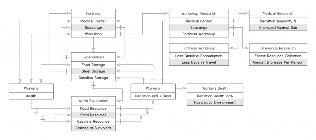
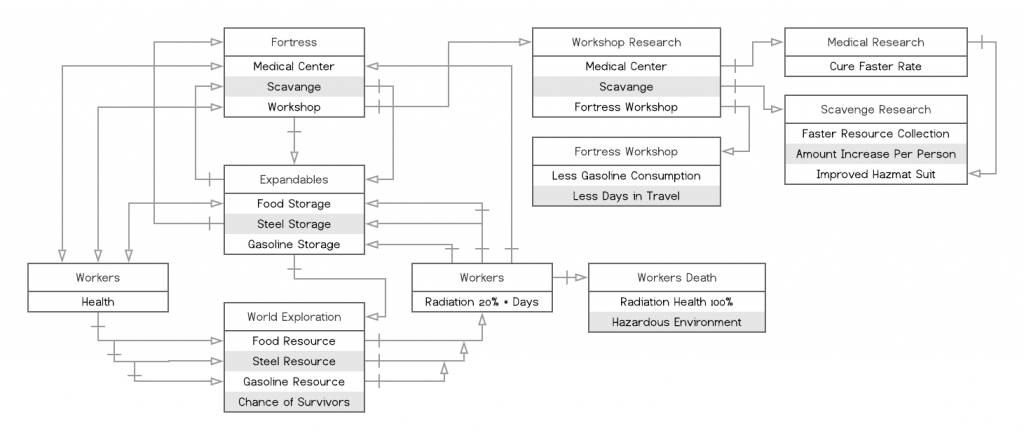
And as we moved forward, our team had recognized the complexity of our game structure that was nearly impossible to develop within our scope, including our next semester’s team. Many considerations were made to maintain the engagement of our demographic. With that thought in mind, we had to condense our game fantasy down for our future plan, which is maintained sustainability in a traveling machine. A simple resource management system that emulates a journey of the Oregon Trail.
Art Team - Recap
Based on what we have, art team made some big decisions:
- The world is polluted with radiation
- Human cannot be exposed to air directly
- Most creatures extinguished
- Vegetation grows into strange shapes due to the pollution
What are the emotions for our environment?
- Tension
- Helplessness
- Loneliness.
Using these three emotions, we made several iterations on our mood boards to find the most suitable mood or to say the personality of our game.
Art Team - Touchstone
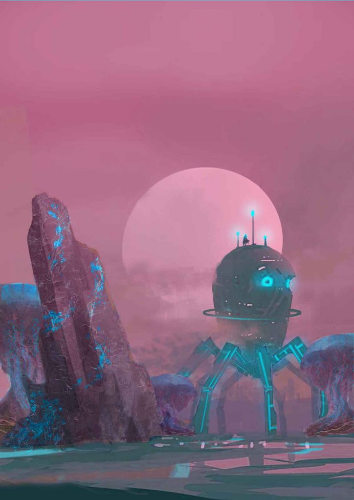
At the end, we made our concept art of the environment as well as the fortress which can guide our design direction in the future.
Art Team - Next Step
According to our latest mechanics, art team’s next step is to work on the indoor part of the fortress. Right now the indoor elements include two types of human-like characters, 4 functional rooms. The process will go as what we did for outside environment. Touchstone, reference image, black and white sketches and final rendered images.
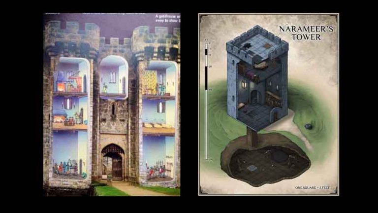
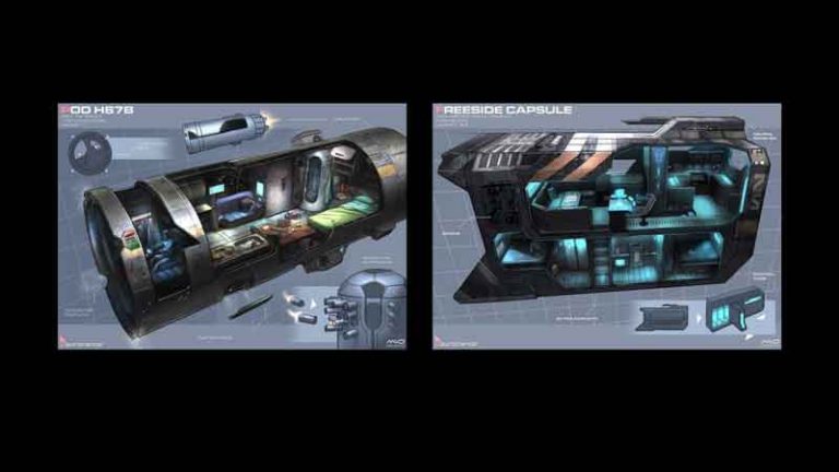
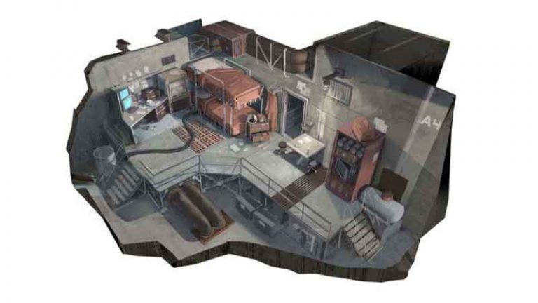
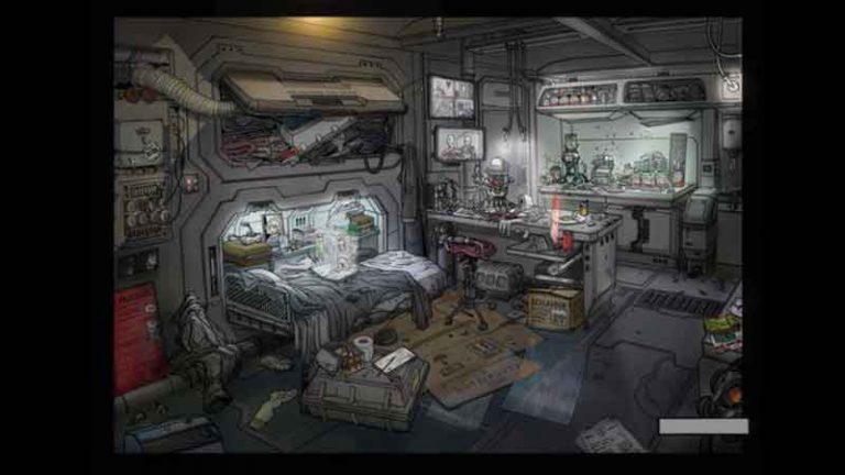
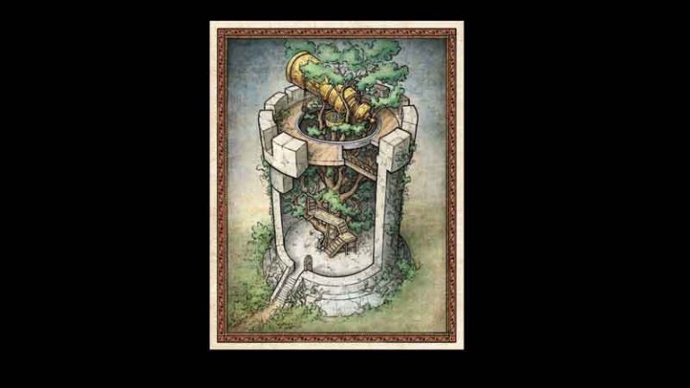
Reference Images for Interior Design
The final delivery of the art team, we would like to cover first, concept art for various elements in our game world. It could be rendered images with detailed background settings. Second, the art asset of some usable models, some important elements, like characters, functional machine