This week saw the continuation of development, but also saw a number of shifts in our design decisions based on feedback from playtesters and advisers. Though we didn’t expect the final visions of our game to change so much in just one week, we’re confident that our changes do not add significantly to the scope of the game, and will altogether result in a better end product.
The first event of the week that really changed the way we thought about the game was Sabrina Culyba coming in to play the original Poverty Spiral and learn about our interpretation for the mobile platform. As you may remember, Sabrina Culyba is the author of The Transformational Framework, and thus is an expert in using games as a tool to create change in the players. She was excited to work with us, and really brought in a new, fresh perspective of The Poverty Spiral.
A big takeaway we got from her was that as it stands now, our game focuses very much on a few individuals’ lives, instead of focusing on the systemic issues that let poverty pervade in our society. In other words, if we really want players to understand the big picture impact of poverty, we need to make some changes. We aren’t fully sure of any large changes we want to make to fix this, but for now we’re putting more focus on social impact in the news app and shifting the causes of the various situations in the game to focus more on external reasons rather than any of the characters involved being clearly to blame.
Another aspect of the game that Sabrina pointed out was the time taken to play. The time span of three days to play the game was something many faculty members were wary of due to scope reasons, but Sabrina had a different reason for disliking it: it makes the game harder for different players to discuss when they’re done. If two or more players who are friends need three days to finish the game, it’s very hard to guarantee that they’ll both be in the same room when they start and when they finish, making face-to-face discussion about the different decisions they made improbable. Sabrina suggested that we switch to an hour-long game that can be played all at once, players can compare face to face how the characters they played ended the game. We agree with her, and will now focus on an hour-long game. We suspect many faculty members will be very relieved by this decision.
Sabrina spoke highly of the board game version of The Poverty Spiral, and one thing she liked about that version was the spiral itself; it gave a very visual representation of how well a player was doing. Sabrina played as the homeless character, the most disadvantaged character in the game, and was very engaged by how much farther back in the spiral she moved, as well as how satisfying it made the victories when she moved farther out of the spiral, even if it was only for a brief moment and futile in the long run. In our version, statuses of finances and relationships are represented primarily numerically, which is much harder to visualize than the spiral. We agree that Sabrina has a point here (as she so often does). For now we’re going to represent the positions on the spiral with bars, but may change that later.
The final big takeaway we had from Sabrina was that a home screen may not be a good idea. Sabrina pointed out it may look empty if we can’t make more than five or six apps, and the current UI is so close to what one would find on an iOS device that players would frequently press the real home button and leave the game by accident. Incidents like this would likely take players out of the experience, so we’re going to switch to a notifications menu, which will more concisely display the different kinds of interactions players can do, while allowing for a more empty list of possible tasks if necessary.
Sabrina left the team a little overwhelmed with the novelty, validity, and magnitude of her feedback, leaving us wondering how we can change our design plan in so many ways, though our worry has calmed as we’ve invented solutions to the problems Sabrina discovered, and we realize that the scope of the project has not significantly increased, as we feared it may have to.

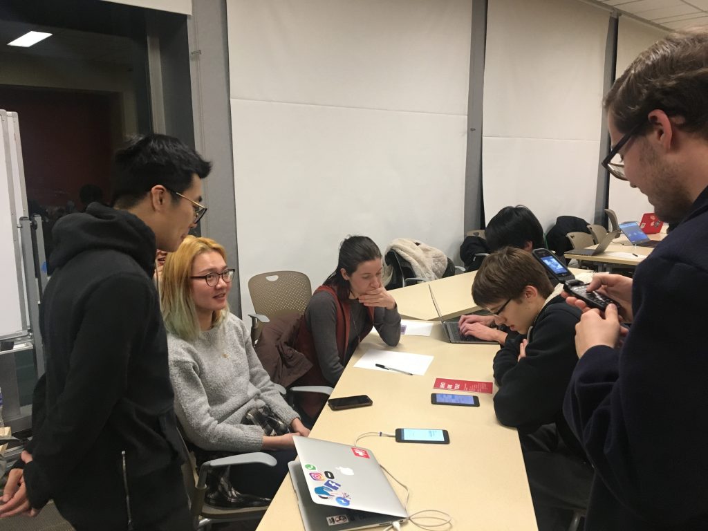
We learned a lot from playtesting the game with Sabrina, but just playtesting once wasn’t enough. On Wednesday night, the team took a trip up to main campus for our first playtest night. We got several undergrads to play two different stories from our mobile version of the game, currently in the form of the prototype we had for quarters. We came armed with a google form and got some great feedback. They related to the recent college grad character (about whom both of the situations we brought were written), and many understood the game’s central theme of poverty without being explicitly told that the game was about poverty. The big thing that didn’t land so well with them was that the interface and UI resembled that of iOS so closely that players often wanted to perform the actions they’d perform on their phones outside the game, like typing custom responses to messages, but they could not, because six people can’t replicate everything Apple has done in the span of five weeks. This further supported what Sabrina said about how we should change art styles, albeit for a different reason.

Development continued to progress this week. We figured out the code architecture for the app, and now know exactly how the apps all link together programmatically as well as how the decisions the player makes will affect their character’s profile and the future of the player’s experience. A lot of work has gone into developing these large-scale systems in the game, like app callback functions, middleware, view control and databases in which the content will be stored. More small-scale functions have also been programmed, like progression between situations within one app, and the display of texts within the texting app. A lot is still yet to come here, especially in the way of interaction, but we’ve put a lot of work into laying the foundation of the game.
Our designers have also been busy making the changes Sabrina pointed out, as well as creating more content for the text, news, and email apps. The designers have also been discussing when to end the game and how to incorporate privilege. Both of these have some proposed solutions; Dana, our client, proposed that the game can focus on the period of time that a GoFundMe campaign runs to get the player character something like a car, and the game starts and ends with that fundraiser. The designers have also discussed implementing privilege like a premium, limited currency in the game; in the event of difficult decisions, sometimes a third, obviously great decision will be available to the player, but they have to spend privilege points to use it. Privilege is very limited and precious in this game, forcing players to think carefully about when they use it.
Our artist has been revamping the art style of the game, changing it from one that mimics iOS. After conducting copious amounts of research, she proposed a style with a deep purple background, like in the board game, and UI with rough edges. Our client was very satisfied with her proposal, and we will likely take that style into the final game.
At the end of the week was the final major event, when Dana, our client, proposed that we change the name of the game. She proposed a few names, like Give Back the Refrigerator, which was perhaps the most memorable one, but we agreed on a new name proposed by the client that we all agreed was the best choice: Broke. It’s easily understandable, impactful, and short enough to appear under an app icon, and so we are now the developers of Broke.
So, our game is Broke. Despite the despair of the name, we’re stronger than ever coming out of this week, and are ready to give this new version of the game everything we’ve got.
