This week, the number of people who have seen BROKE has increased by the hundreds, and the response to the game as it stands has been better than we expected. Let’s see who these people are, and what we did this week to make it so likable.
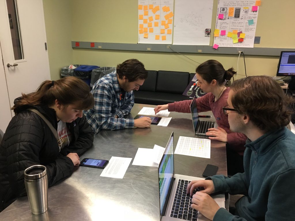
This week, we had two big opportunities to get BROKE out into the world: A conference our client went to and playtest day. Early in the week, our client, Dana Gold, went to a conference about transformational games, which was attended by about 300 people. Attendees were instructed to work together to come up with game ideas that focused on poverty (how convenient), so Dana showed her group Broke, and they really liked the idea. One of the people in the group, who was representing CVS Pharmacy, said they would be interested in buying BROKE to help with employee retention, since that’s a problem the company faces. At the end of the conference, Dana got to present BROKE to all the attendees there, and, again, had a very positive reception. The only complaint was that sometimes it took too long for messages to appear on the screen (even though all the characters type at 90-120 words per minute, but a great game designer knows that great games often don’t reflect reality in ways that players don’t notice), which leads us to what the design team did this week.
Firstly, the design team worked on increasing the speed at which the characters in BROKE type. They now type at 210-300 words per minute, staying consistent with the reality that every person in poverty in the world is also a stenographer. The design team also finished all of the homeless character’s conversations and started on those of the rural character. They also renamed the Team app, since our client thought it should be named something that relates more to the real world, so the new name we chose is Circle Up, referencing the circles in Google+. Circle Up is also currently being tinkered with and balanced. Also, through marketing on Facebook and Reddit, we have six more people interested in being intervewed for BROKE’s documentary.
The programming team continued their work on the text app, so the contact list is now implemented. The news app is also done, and history for the bank and news is progressing. The database can now retrieve and store data fully. The Circle Up app has also been started.
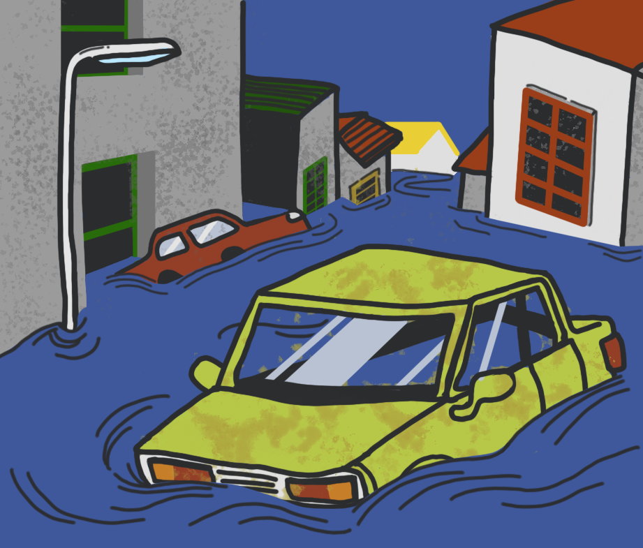
The art team has finished the interface for Circle Up and BROKE’s logo. We also have a new image for the flood, which is a news item that will come up.
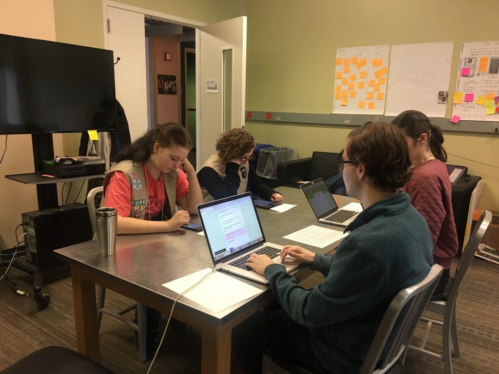
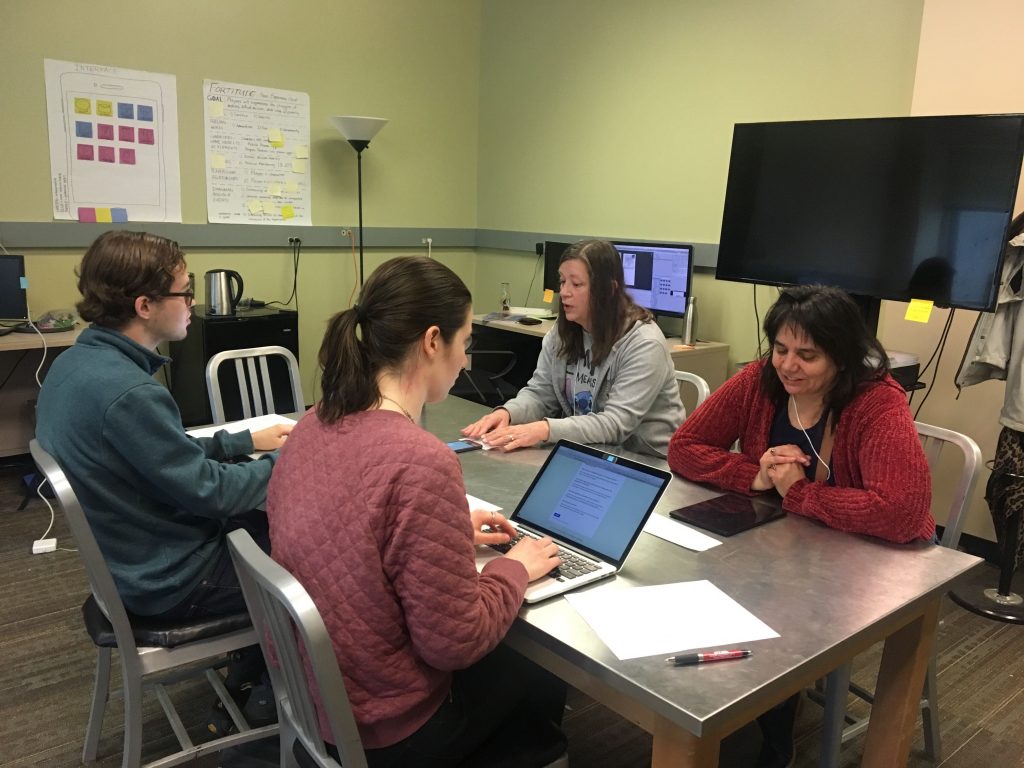
The last event of the week was playtest day on Saturday, an ETC tradition that brings masses of people in to test the teams’ games. Playtest day brought 10 strangers into our project room, and we got to hear from them what they thought of the game. Overall, the response was much more positive than we expected. They really felt immersed and connected to the characters, and we were praised for making a game that brings attention to the issues that people in poverty face. There were some minor suggestions, but nothing remarkably difficult or out of scope.
Overall, this week has been a big morale booster as we’re getting closer to the end of the semester. It’s too late to make many huge design decisions, so it’s a relief to know that the big-picture design choices are being received well by the outside world. We’ve still got a lot to go, but we hope we fully intend to keep the high quality work coming.
