Week 4 – Responding to Quarters / Attack Plans
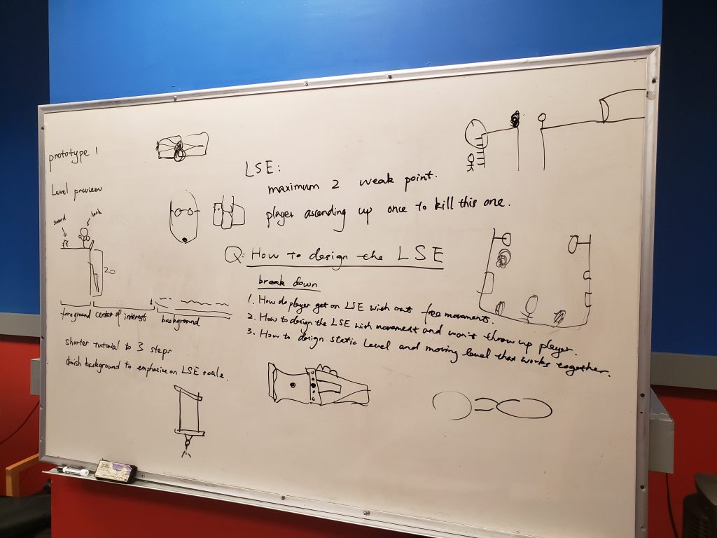
Week 4 might be the biggest week of them all so far, given the fact that our Quarters presentation, as well as faculty sit-downs, were this week. Various faculty members came into our room to discuss our project, and all had great thoughts and opinions not just on how we can tackle certain problems but also how we could be thinking about certain topics. Clearly, there was a lot of information to digest here so this post will be tackling some of the information as well as our thought processes in two parts: Quarters and Aftermath. Quarters will have what was asked and/or suggested as well as some initial thoughts on key topics, while Aftermath will be what we decided to go with and build towards. Different subjects will also act as sub-categories.
Quarters
Art
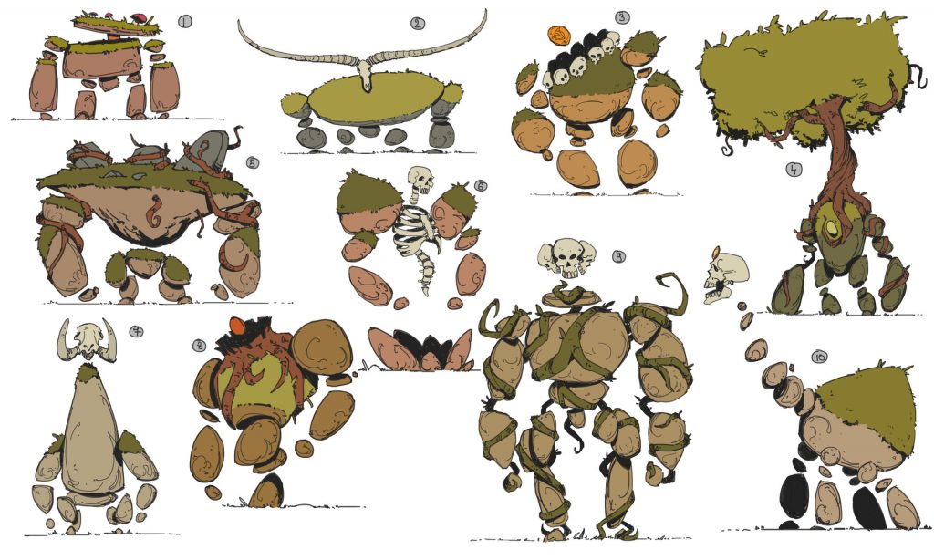
While we had some reference images to show as seen in Week 2, there were still some questions and suggestions that were given to us when it came to the direction and execution of making a rock-based giant creature. One question was “what if the LSE was made out of bricks (or similar construction) to allow for a grid-based system of visuals?” This was not a strategy we had considered and got us thinking more about a very important aspect of this project: disorientation. Up until this point, we had been using the term landmarking to notate how we will approach the player knowing where they are (ie. certain landmarks placed on the LSE to provide contextual and locational points of reference). We also considered that the LSE’s walking animation could provide pivotal landmarks with slow, swinging arms. While we may not press forward with a grid-based system, this question about visuals got us talking more about landmarking and orienting the player on where they are and where they need to go.
Design
Up until this point, we had been spending time and energy working to build a tutorial stage to get the player associated with the LSE. While this area served us well, a big comment was how this is not necessarily the focus of our project. If we have a title like “Giant Combat”, then why aren’t we building for combat against giants? While this tutorial area taught us a great deal about many aspects, it was still designing in more of a static space as opposed to a dynamic one that would be interacting with the LSE.
We looked at each other and realized they were right.
Scale
We got an insane amount of advice from Jesse Schell on this topic! Having worked extensively in the VR space, Jesse was kind enough to provide us with some tips and tricks to better amplify and exemplify scale, including using real-world comparisons (a door, a person, etc.), using natural elements like fog to manipulate a sense of depth, secondary effects such as dust or falling debris to not only push the sense of scale but to make the rock-based LSE feel more real and alive, and mentioned the “loom response” native to humans. Some others felt that perhaps our LSE was still not big enough, even though it is clocking in at 60 meters tall (or a 20 floor building). This will be something we continue to experiment with and take note of.
Aftermath
Art
After some time to process these questions as well as additional sit-downs with some faculty later in the week, we decided to do some pivots. Sitting down with Moshe Mahler highlighted some aspects both in the visual and technical side of the art process, specifically how to handle the skeleton and rigging of the LSE to prevent blocks from overlapping. His insight was most appreciated.
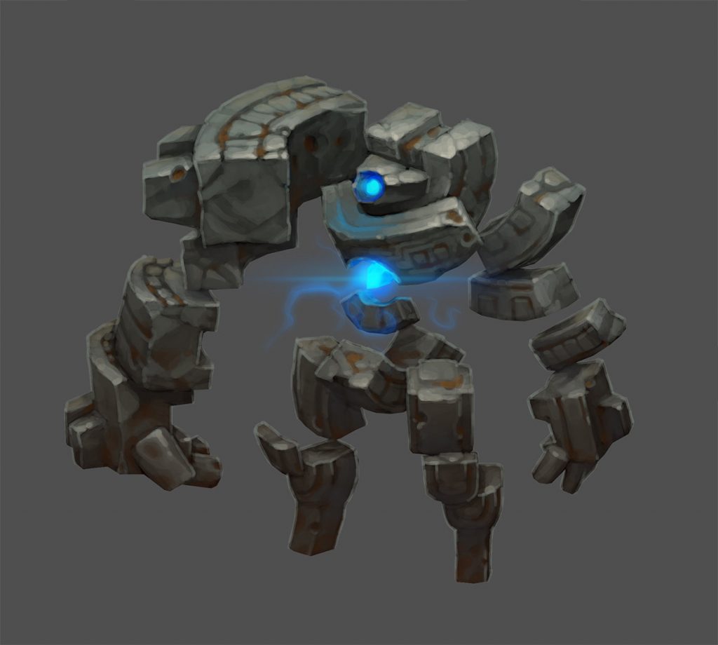
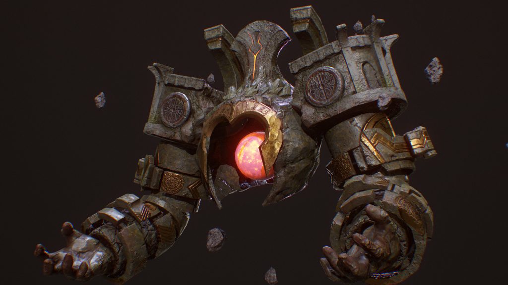
In order to speed up the production of the LSE while still fitting theme and aesthetic, we decided to “loosen” the LSE a bit and have it not necessarily be a living being with rock skin per say. but have it as a magical amalgam composed of various boulders and ruins.
In this way, there won’t be any worrying about joints while still fitting our needs. It will also allow for climbable sections to be more visible as we can utilize the architecture innate within the ruins to guide the player.
Design
We took the advice to heart and started diving deeper into how one will travel on the LSE. Taking our lessons about scale and importance of landmarking, we have a new plan of attack.
If you don’t know where to go in The Climb, you can access a glowing pathway to guide you. We thought perhaps this can be useful in our design concept while exemplifying the more magical nature of this new LSE. While the weak points the player will need to destroy will be glowing, in context they are the “hearts” of the LSE. It was then discussed if “veins” can come from these “hearts”, acting as a network of pulsing lights to show the player where they need to go without the use of intrusive UI. This idea was a big hit, and one we will be testing in conjunction with just glowing weak points. Perhaps the glow of these points is enough landmarking to provide routes for the player.
In addition, we still made the decision to keep a minuscule section of our prototypes reserved to help the player get acquainted with the different player mechanics. While we will be on-boarding playtesters and players verbally and with diagrams, we still felt it was vital to have them be comfortable executing the mechanics in a controlled environment. We also felt that given our usage of Valve Index controllers (hardware that may seem alien to some) it was prudent to include some kind of “play area”.
Scale
Our original plan for introducing the LSE involved the player climbing via a bridge (like monkey bars) and having a large mountainous structure rise up, revealing itself to be the LSE within the ancient rock. The bridge was about at the level of the LSE’s waist, with the LSE standing in a pit of sorts. When testing this moment out, we realized that while it was a strong moment when coupled with music and animations (as you are essentially hanging helplessly while this titanic creature rises to meet you), but the “looming” presence we were going for wasn’t necessarily there. Even when standing on the ground with the LSE rising, the emotions weren’t as powerful as we hoped.
With this new LSE design, we plan on having the head at ground level. Some kind of treasure chest would be visible in the LSE’s head somehow and would open, causing the head to light up with the magical energy of the treasure inside. In a swarm of dust and debris, ruins and boulders would come to the head forming the body and, eventually, the whole of the LSE. In this way, the player has a solid sense of scale (treasure chest as reference) and a focal point (head) to observe rising higher and higher into the air.
Granted, this all requires playtesting, but we are putting our early lessons into practice with this new design.
Other Progress
On top of all of these changes, building still got done.
The sword was implemented and can be grabbed with either hand from your back. Grabbing hookshots from your “holsters” (as mentioned in Week 3) was also implemented. Haptic feedback for both items has made them feel even better. Sounds for the hookshots launching and connecting with their target provides aural feedback as well. A wind sound effect was also created that gets louder as the player gets higher in elevation, which we believe could be very useful for being on the LSE.
While our development process has been a bit ad hoc, we decided to inject Agile sprints into the mix. However, these will be “sprints via questions” as we work to build answers for inquiries we currently have. This aims to give us more focus on what truly matters so we can better allocate our time and energy.
Phew. I just sifted through 3 pages of notes and a 12 slide presentation full of questions, observations, and new information to digest. This week was perhaps the most pivotal for our project, and it will be exciting to see where we go from here!
