Introduction
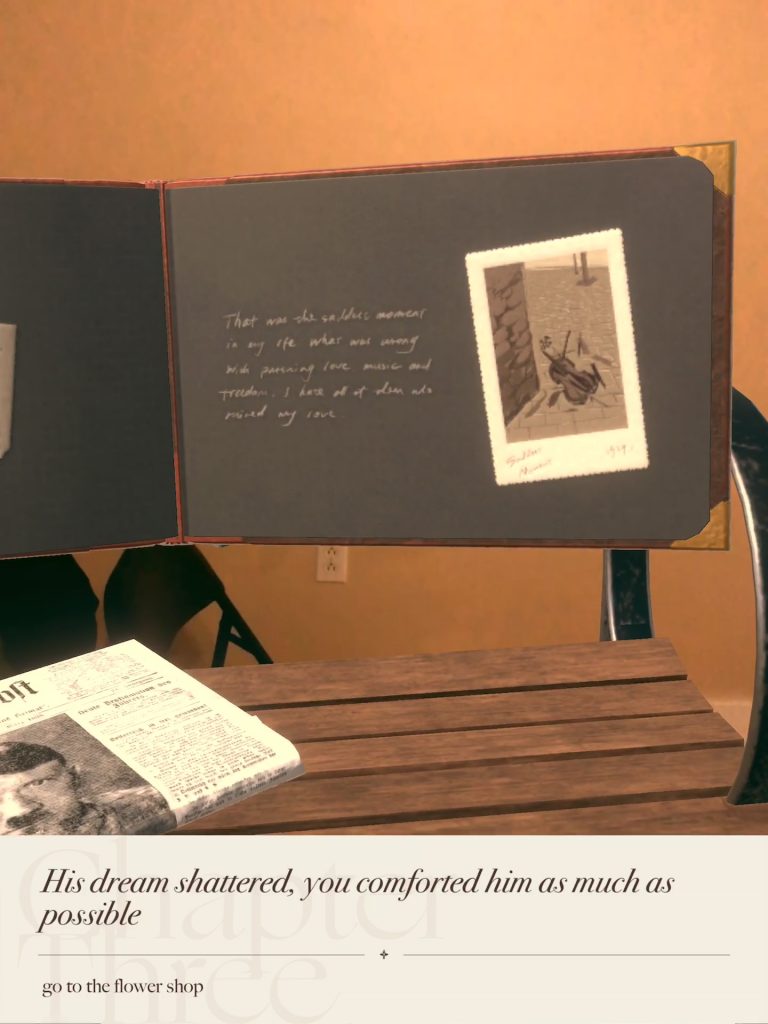
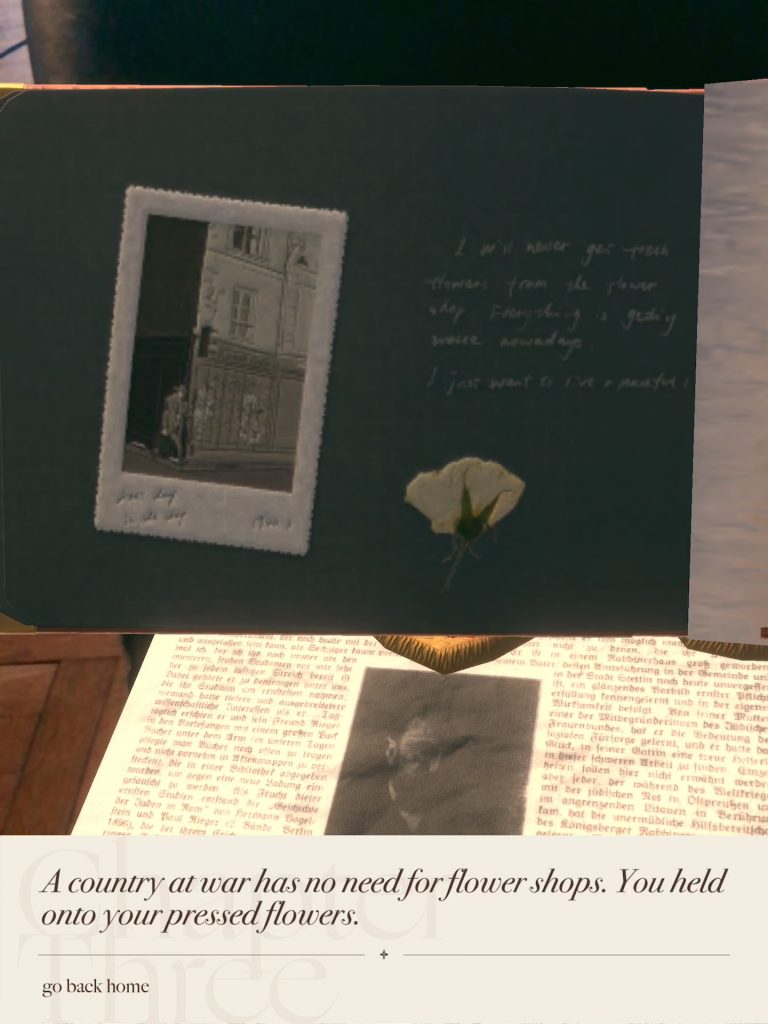
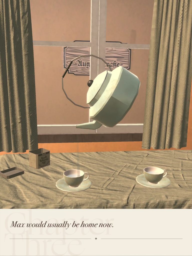
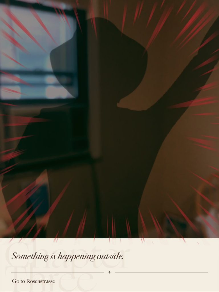
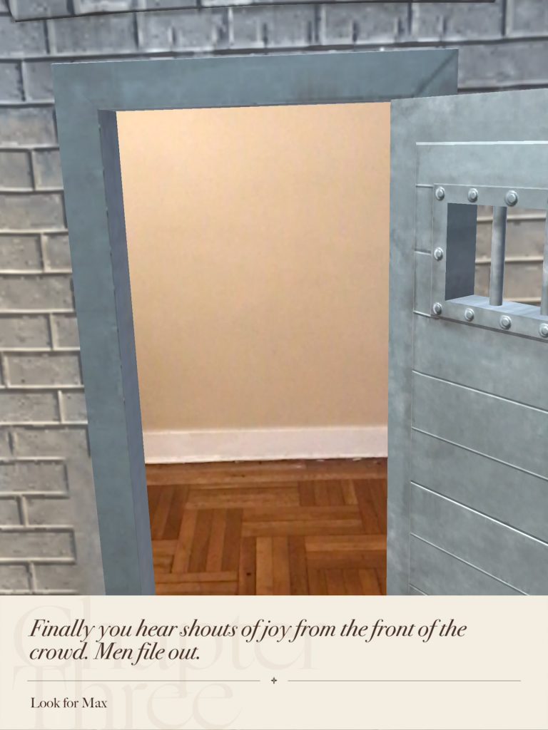
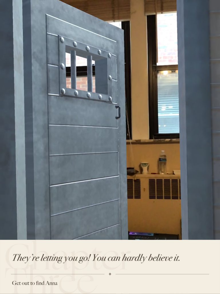
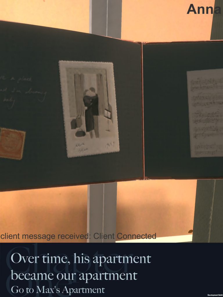
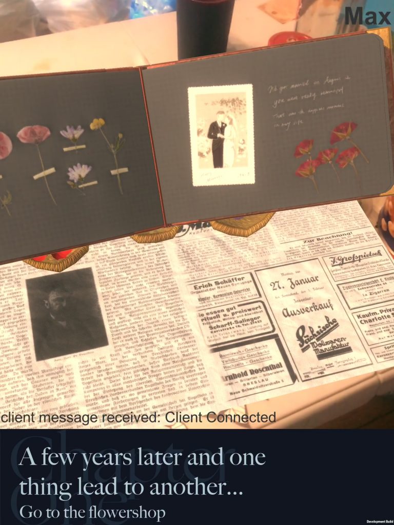
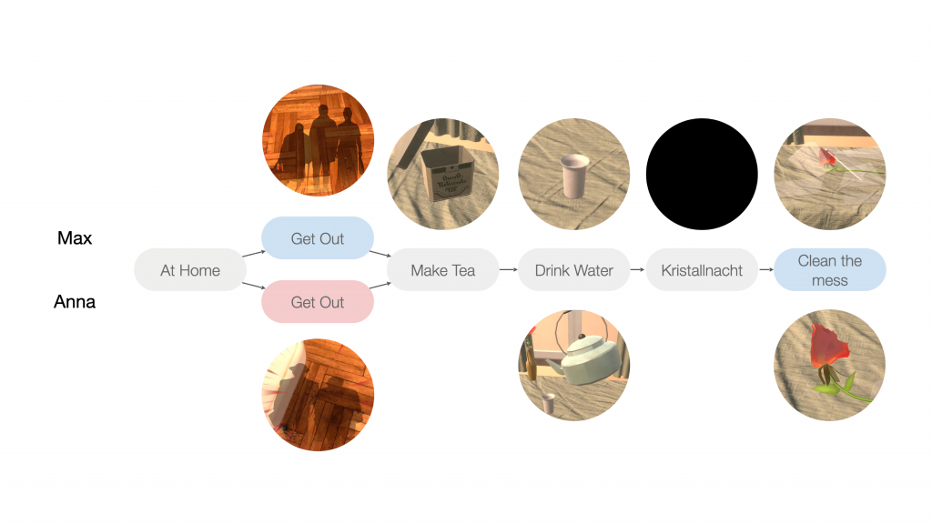
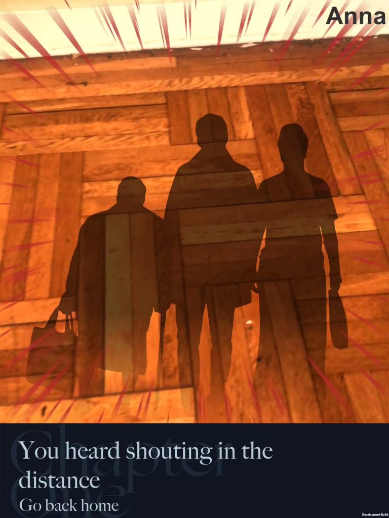
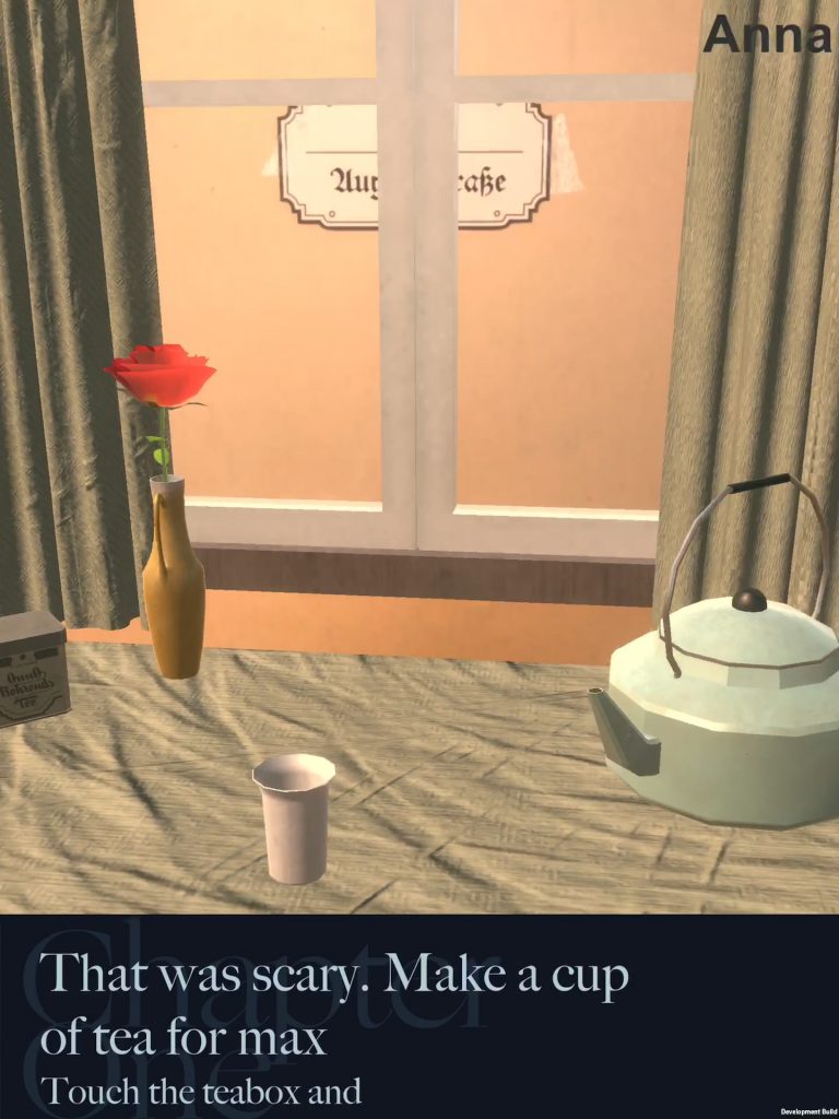
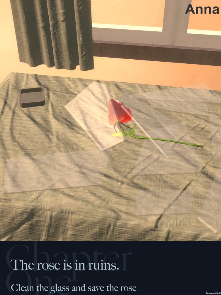
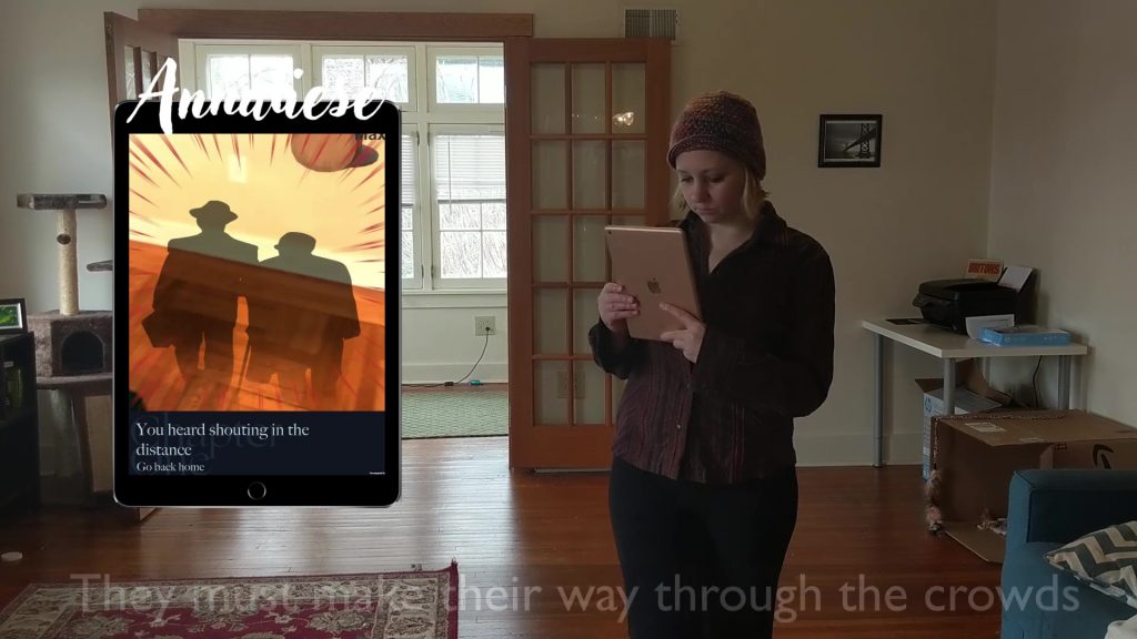
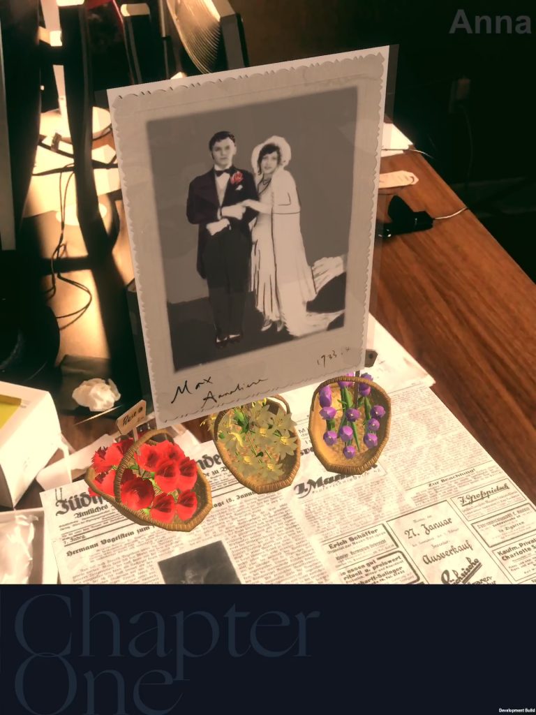
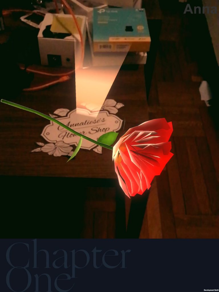
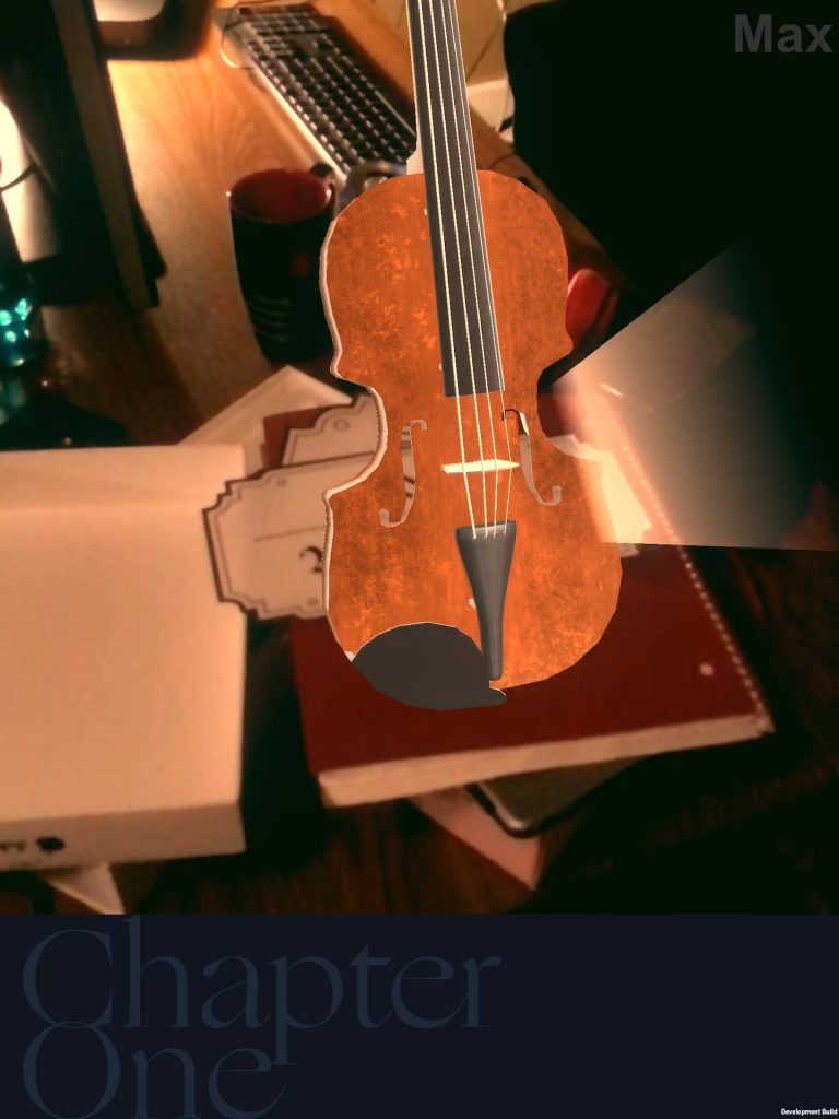
Rosenstrasse: We Choose Each Other (WCEO) is a location-based, multiplayer roleplaying AR experience created by ETC project team MemoiAR under the direction of Jessica Hammer in the Spring of 2020. Based on Jessica Hammer’s board game Rosenstrasse: We Choose Each Other explores the future of storytelling in AR for the Snap Creative Challenge.
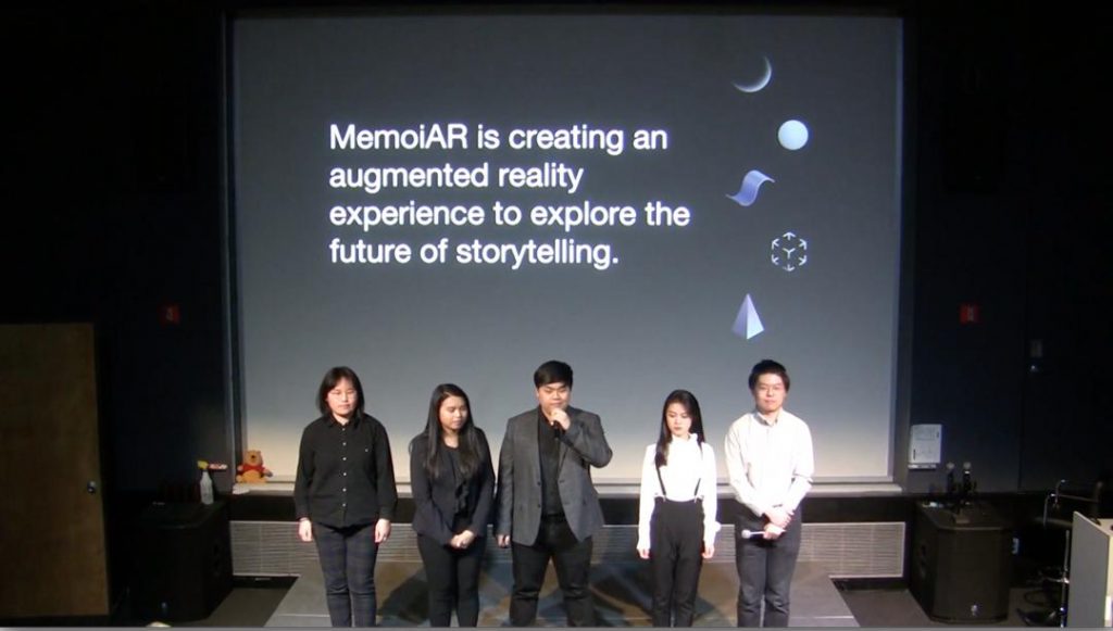
The team consisted of the following ETC Students:
- Programmer, Technical Artist: Ran “Ryan” Zhang, 1st Year
- 3D Artist: Qiyi “Chelsea” Tang, 1st Year
- UX, Graphic Designer: Mingzhi “Minz” Cai, 1st Year
- Co-Producer, Game Designer: Roderick Luke “Derek” Chan, 1st Year
- Co-Producer, 3D Artist: Sally Im, 1st Year
Halfway through the semester, the project (along with all ETC projects) moved to working completely remotely in response to the 2020 COVID-19 epidemic. The following is a post-mortem analysis of what went well, what went not so well, what we learned, what we would do with more time, and the life of our work after the end of the semester.
The remaining steps for memoiAR are to conclude final changes to the demo, conclude a documentation package for future development, and to remotely present the game to the Snap Creative Challenge Summit on Wednesday June 17th.
Our client Jessica Hammer expressed a desire to pursue funding for potential future development of the concept (thus the documentation package). Ideally, a future team should be able to read the documentation and continue development on its design themes. Additionally, PhD candidate Erica Cruz expressed interest in pursuing academic publication of the design process of this project to interested HCI publications. The team plans to communicate with Erica further about the project following the conclusion of the semester.
What went well
Productive and positive client relationship
The team enjoyed a productive and positive relationship with our client, Jessica Hammer. The client was communicative, clear with her expectations and goals, as well as enthusiastically supportive of the team’s progress (even after the transition to remote work and the pivot in final deliverables).
Logistically, the client had an intimate understanding of ETC projects and deliverables and was able to tailor her goals to the unique work environment of the ETC. She knew what she could expect from 16 weeks of work from an interdisciplinary team of graduate students.
Creatively, Jess was able to advise the project as a subject matter expert on the historical period. The game is historically accurate thanks to her input. Additionally, being an original designer of the Rosenstrasse game, Jess provided useful feedback and suggestions on interactive storytelling and roleplaying. She also made space for new interpretations of her original mechanics and story. At every client meeting, she was willing to discuss opposing design choices and playtest unorthodox designs.
We recognize Jess Hammer to be an unorthodox client (i.e. not all ETC clients may be as involved or enthusiastic), but also recognize that much of what went well with the final product stems from her professional relationship to the project team.
Genuinely Novel and Innovative Designs
To quote one comment made early on in the semester, the project is like “a theatrical play in which the actors don’t know where they are supposed to be, what they’re supposed to do, or what they’re supposed to say.”
Several playtesters and faculty advisors expressed genuine interest in the idea of a multiplayer, location-based, roleplaying AR game. Despite the eclectic and seemingly-disparate parts of the design, the experience successfully functions on a technical level. Following the shift to remote work, the team was even able to create trailers of the experience that successfully explained the game’s idiosyncratic design (even if the footage didn’t show people actually playing the game or was “faked”).
Design innovations that we identified fall into the following categories:
- Blending VR concepts with AR
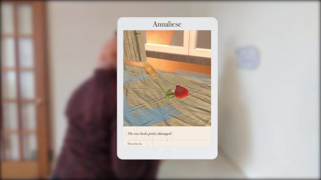
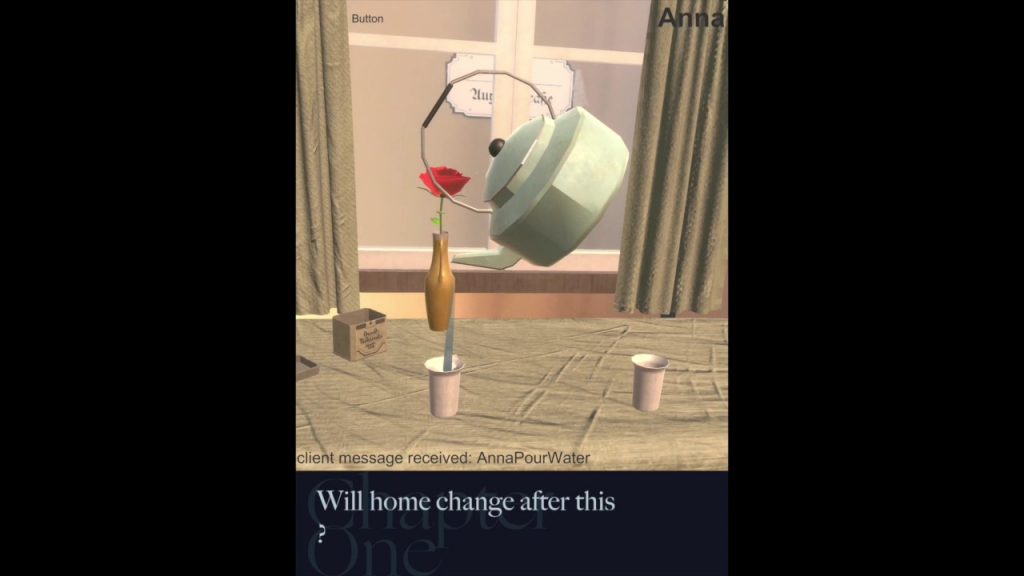
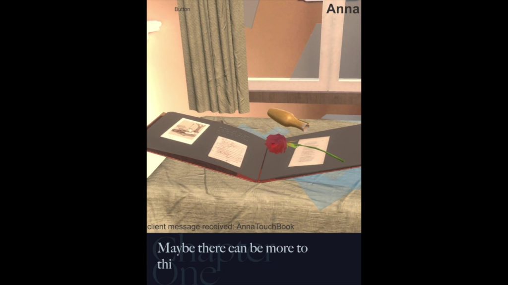
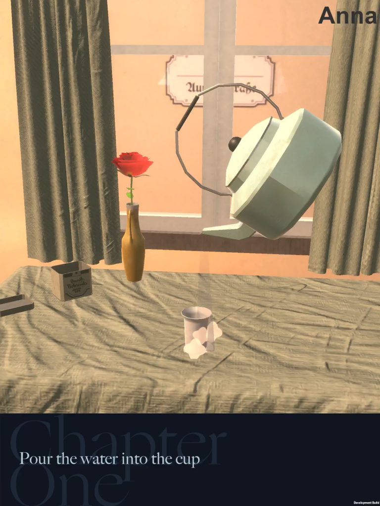
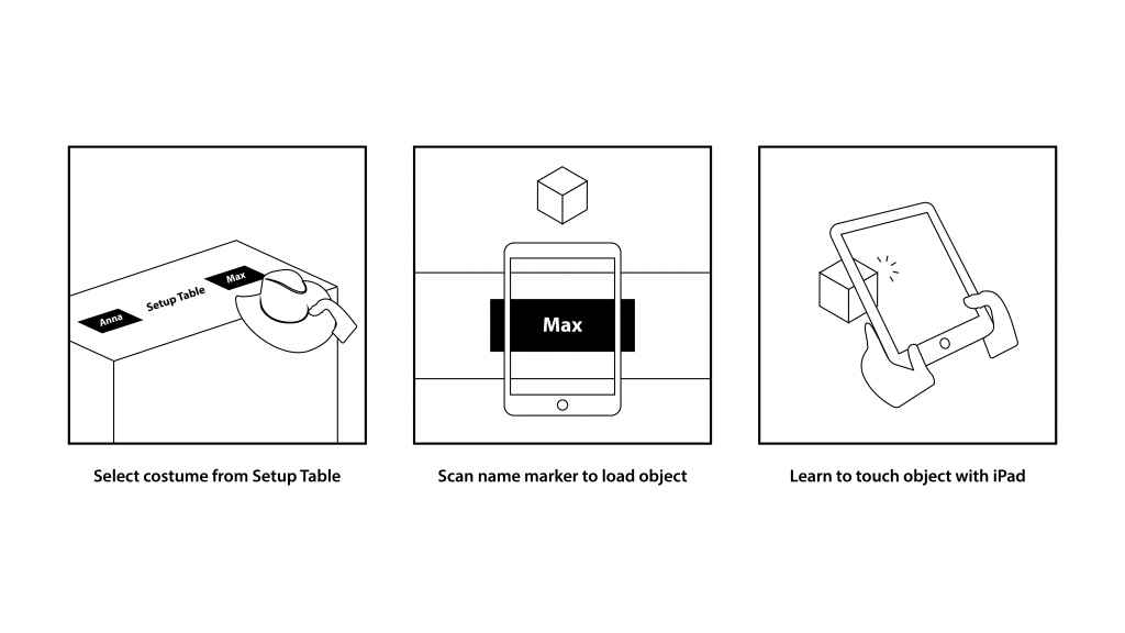
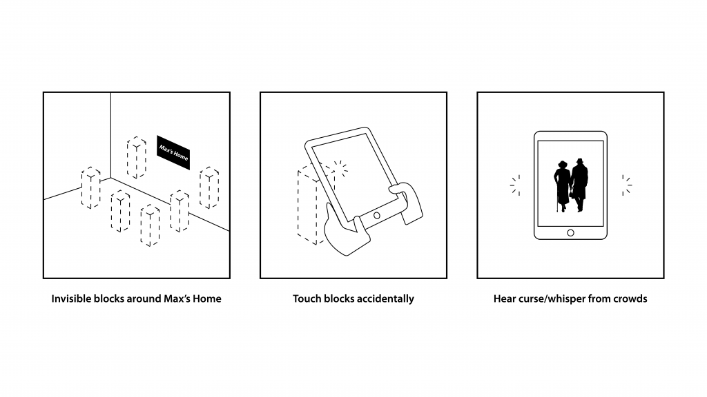
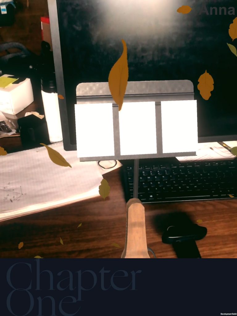
- Touching digital objects with the AR device: This was novel as many AR experiences focus on visuals overlaid onto reality as opposed to engaging a physical experience. Physicality in digital actions was adopted from lessons learned using VR trackers.
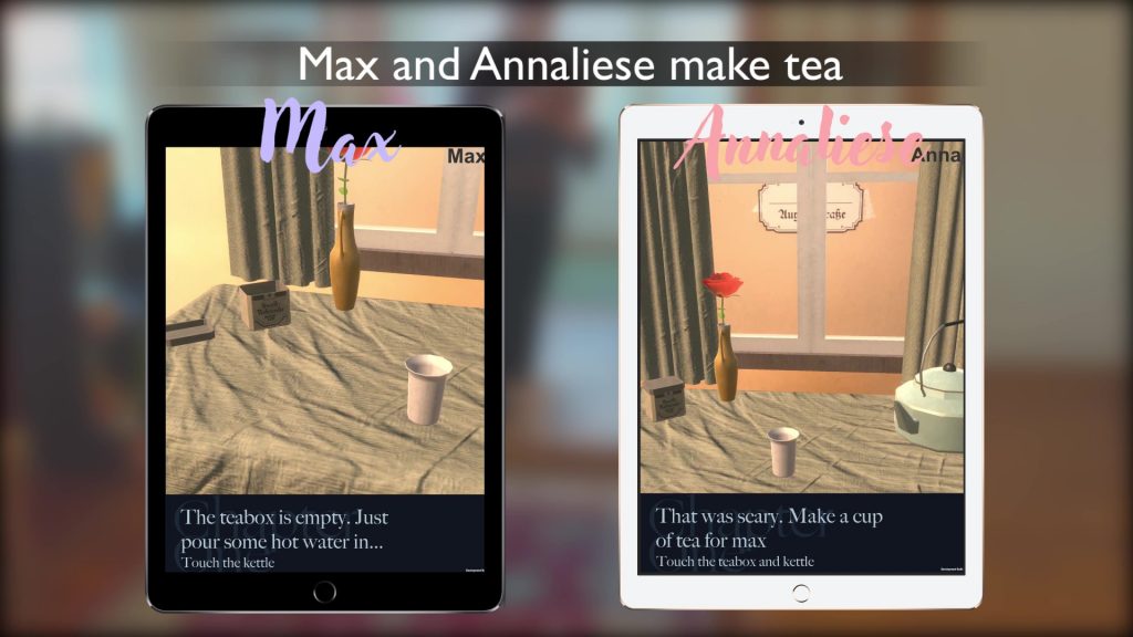
- Multiplayer experiences using Networking: Since the focus of our game was on linear scenes and progression of on-screen text, we were able to keep both players in the same state of the game using simple TCP networking. Most commercial AR games struggle with networking since they attempt to track the location of 3D objects and use action-based mechanics vs. verbal mechanics.
- Augmented Roleplaying
- Players connecting with their partners: AR had been used in roleplaying games before (primarily to visualize board pieces or sets). We tried to place inter-player conversation at the heart of the experience and examined ways to meaningfully interact with it, beyond visualizing 3D assets.
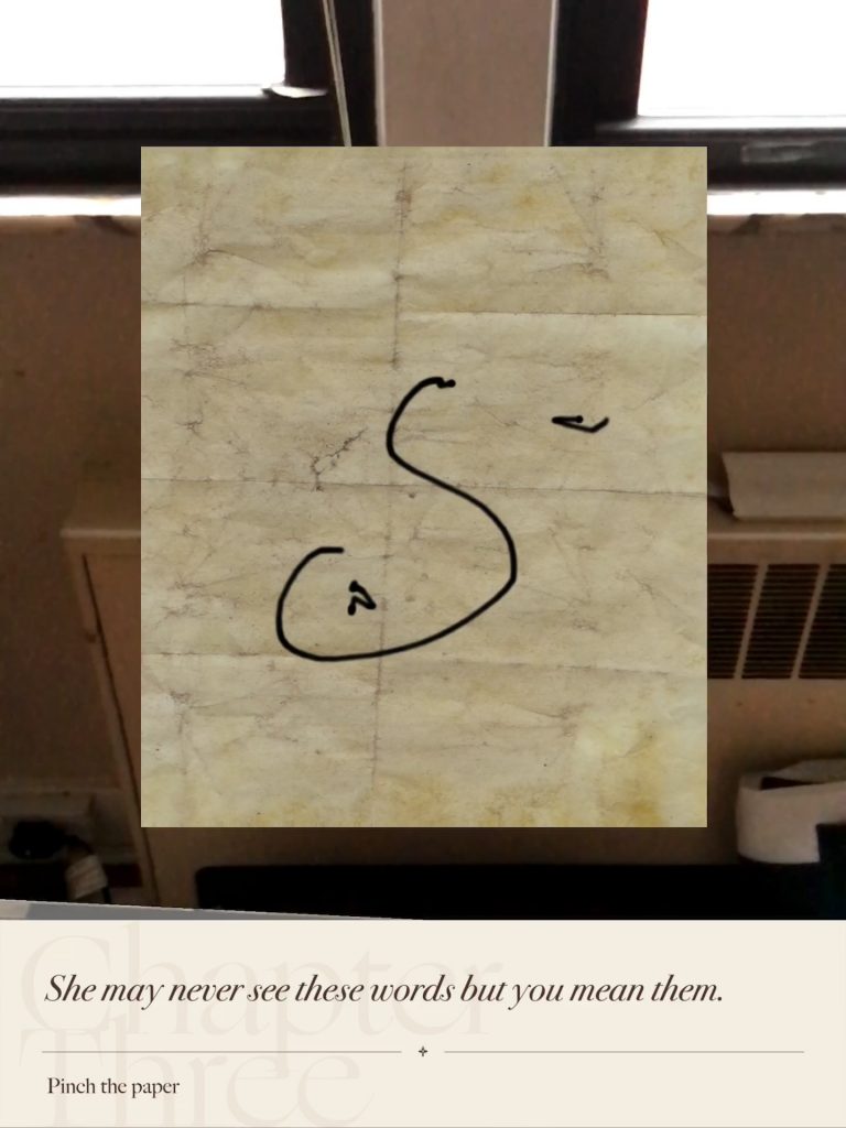
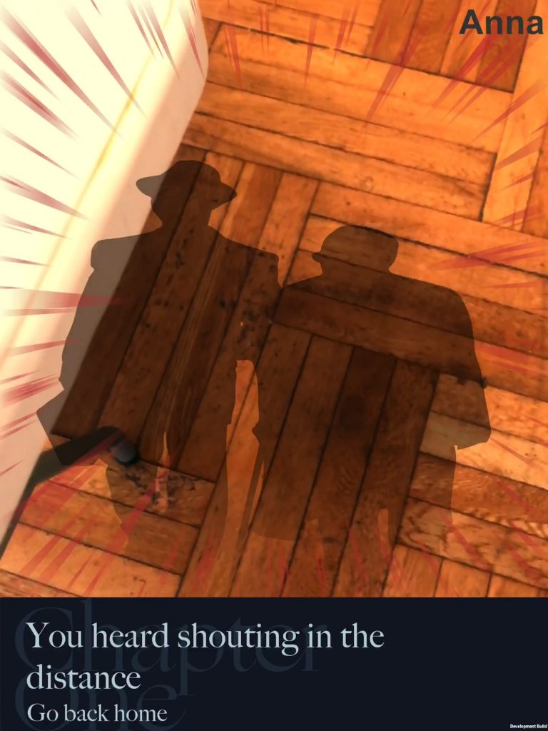
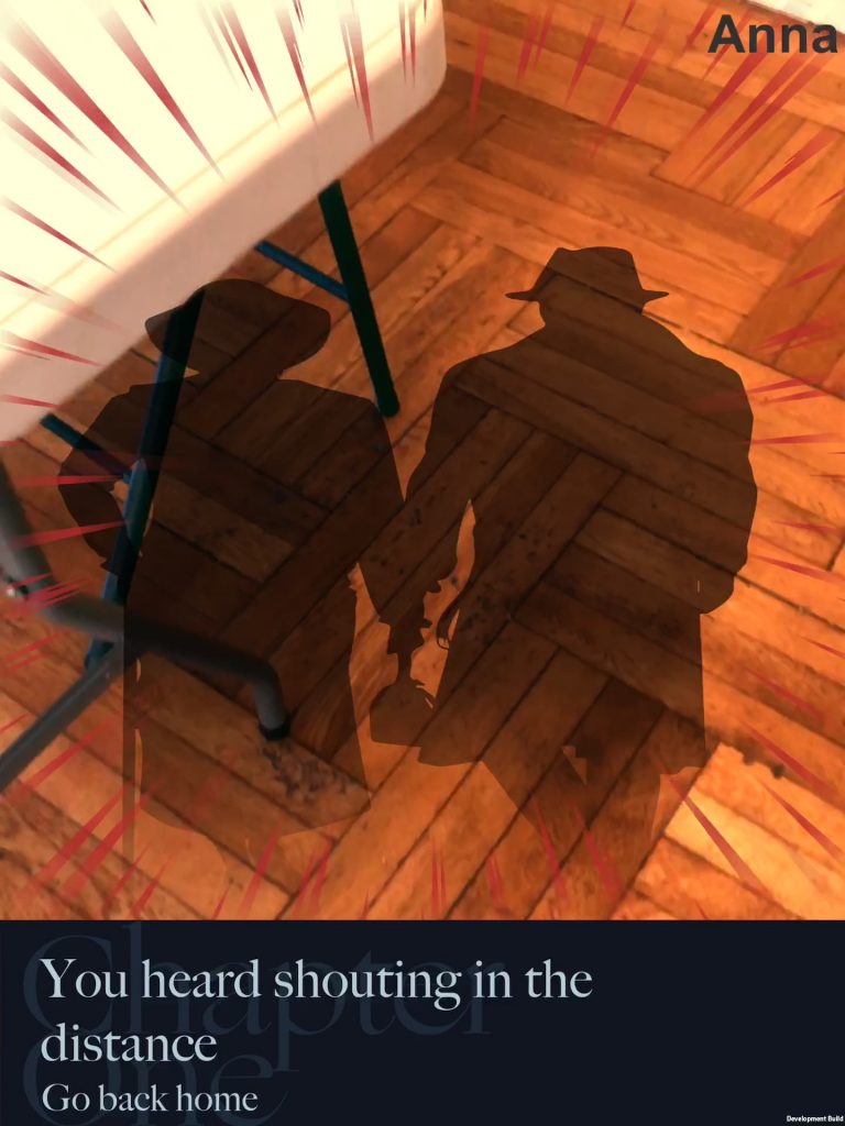
- Physically embodied actions: no AR games had used the device as a controller in addition to a camera. By taking the design paradigm of theatrical performance, the team was able to develop several scenes where players must assume a physical gesture in the real world in addition to imagining it.
- Location-based AR
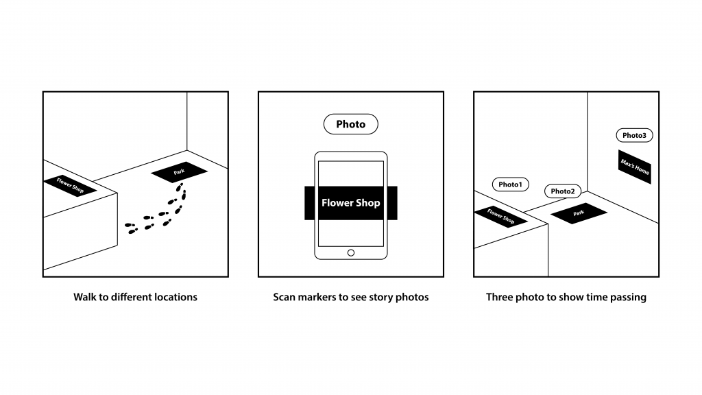
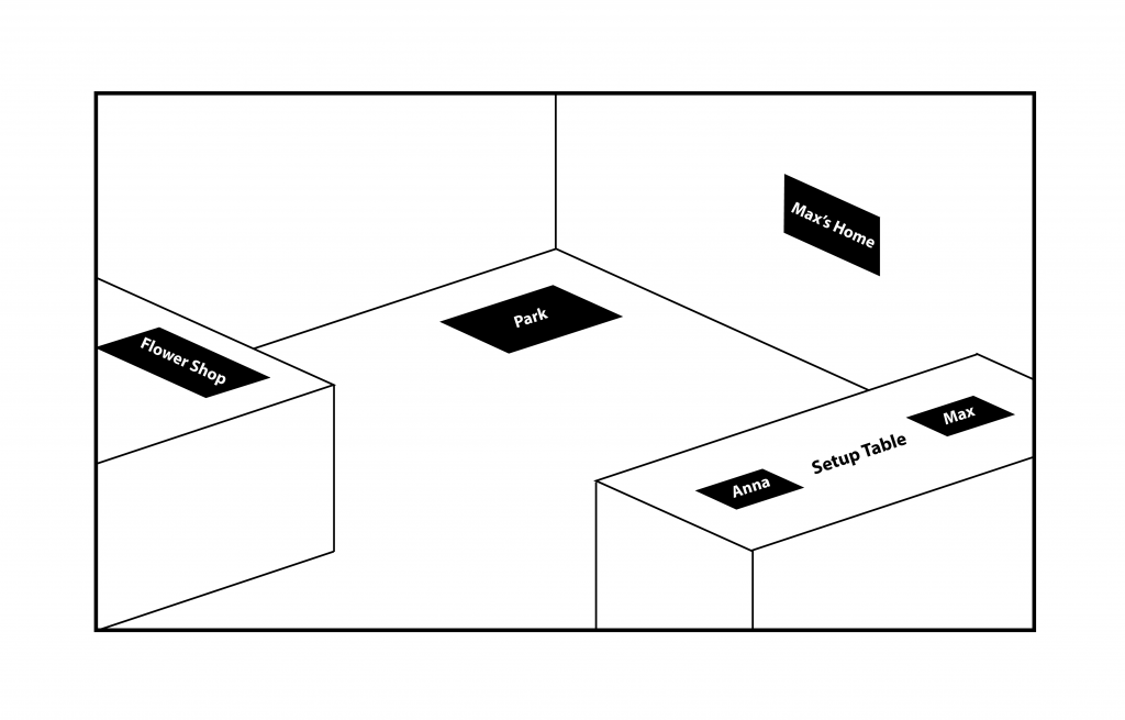
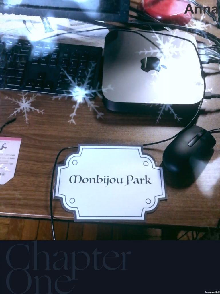
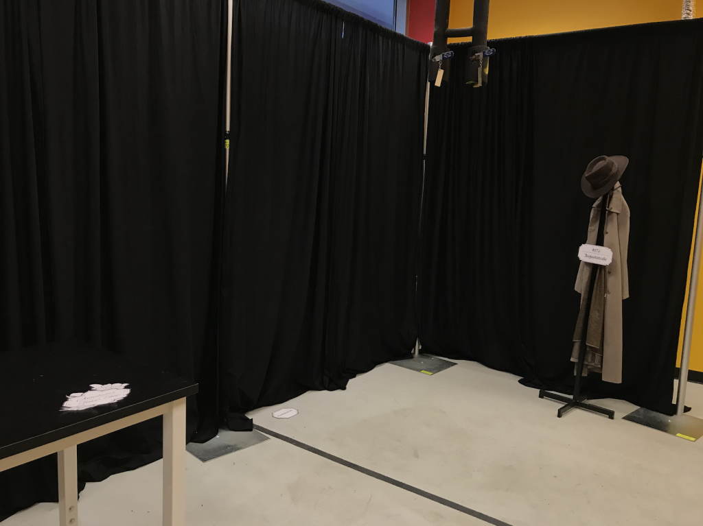
- Diegetic markers and set pieces: One common criticism of AR is that the real world distracts from the digital world. We attempted to circumvent that problem by curating real-world visuals. The team recognizes that doing so placed constraints on where the game can be played (i.e. the game is best played at the Entertainment Technology Center).
Shared creative vision between all team members
Perhaps as a result of the unorthodox design of the game, the entire team was involved in all steps of design, from initial conception, to writing of scripts, and finally to execution. This made up for the lack of systematic and exact design documentation, since all members of the team would sit at the meetings where these design choices were made. Team members would also elect to be present for creative meetings rather than be notified later of the final design. Jess Hammer would later comment that the designs pitched to her “reflected the many hands that had helped make it.”
Remote work was mostly effective
The team was able to transition fairly effectively to working from home. Since most of our documentation was already digital before the transition (e.g. Scrum boards, interaction scripts, meeting notes), our work process stayed mostly the same. Dependencies were communicated through instant message on Slack, tasks were tracked on Google Sheets, and assets were transferred using Perforce/Google Drive.
One challenge to remote work was version control. Since our team only had 1 programmer, the team relied on him to manage all changes to the digital build using Git. Even though some teammates had experience using Unity, very few had used Git to control versioning on a Unity Project.
On the whole, the team was typically able to maintain forward progress and meet deadlines during remote work.
Playtest-Centric Pipeline was successful when we could playtest in person
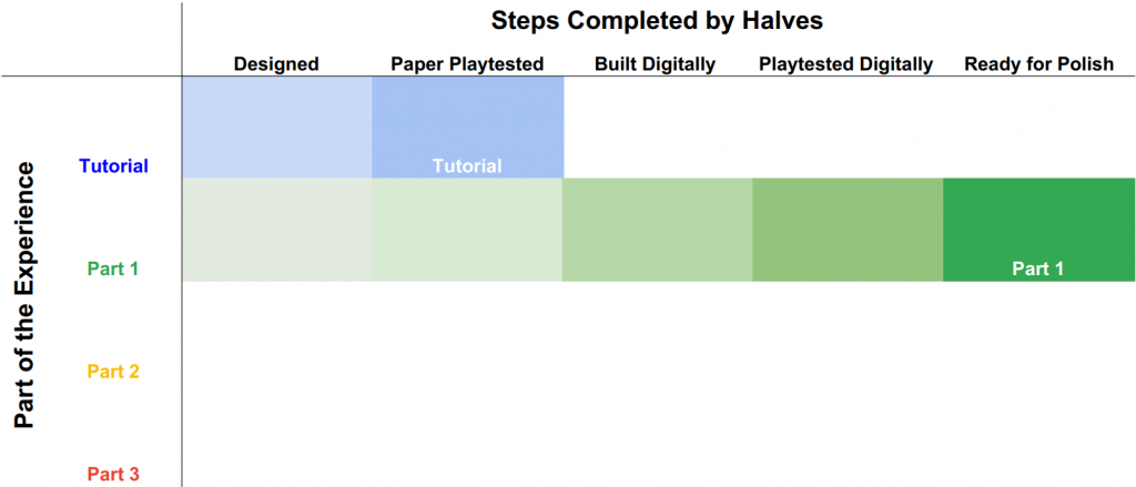
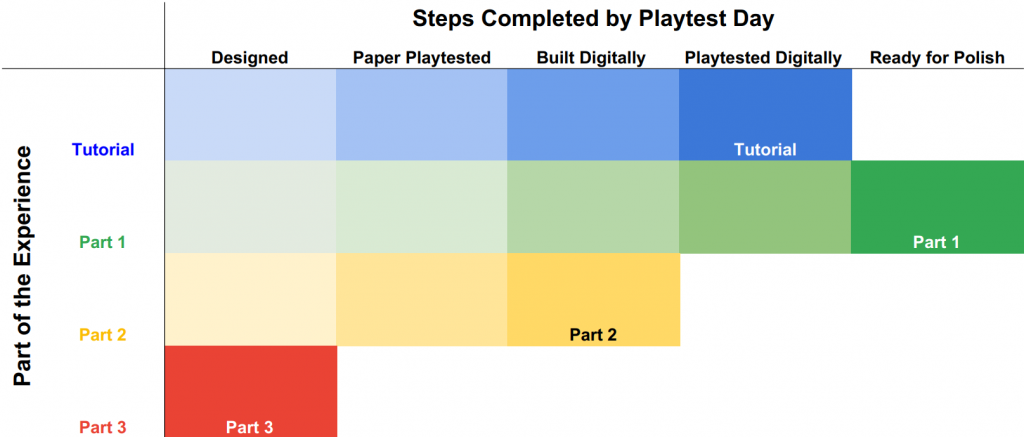
As a result of only having 1 programmer, the team successfully implemented a pipeline where the design of the game would remain 1 week ahead of the digital build of the game. In a given week and following the first creative meeting, the team’s programmer would implement changes to the digital build while the Game designer and UX designer would create paper prototypes of future features.
Generally speaking:
General Design → Paper build → Paper Playtest → Digital Build → Digital Playtest → Polish/refine
This typically resulted in more feedback and relatively higher-quality designs making it to the digital build. The pipeline appeared to work well prior to beginning remote work. Subsequently, the team planned to scale up production of the final 2 parts of the experience using this simultaneous workflow.
Unfortunately, this pipeline broke down when paper playtests became impossible. While attempting to design remote playtest methods, digital work began to pile up. This forced the team to focus on the production of digital work to meet deadlines over polishing existing work. Since a significant portion of the game required players to physically move through a space together, many of the emotional beats remained theoretical and unpolished before becoming integrated into the digital build.
Multiple Playtest Methods
As a result of going remote, the team had to use playtest methods that captured parts of the experience, since the whole experience could not be played as previously designed.
Types of playtests used are as follows:
- Full playtest or “Dress-rehearsal” playtest: This involved running people through the experience itself in 100% intended conditions. This is the conventional way to playtest a game and typically resulted in the best feedback and changes to the experience. Because our experience is relatively long, these playtests were conducted with few “expert” players. This method prioritizes few, deep playtests over many, shallow playtests to look for high-quality expert opinion over volume of data.
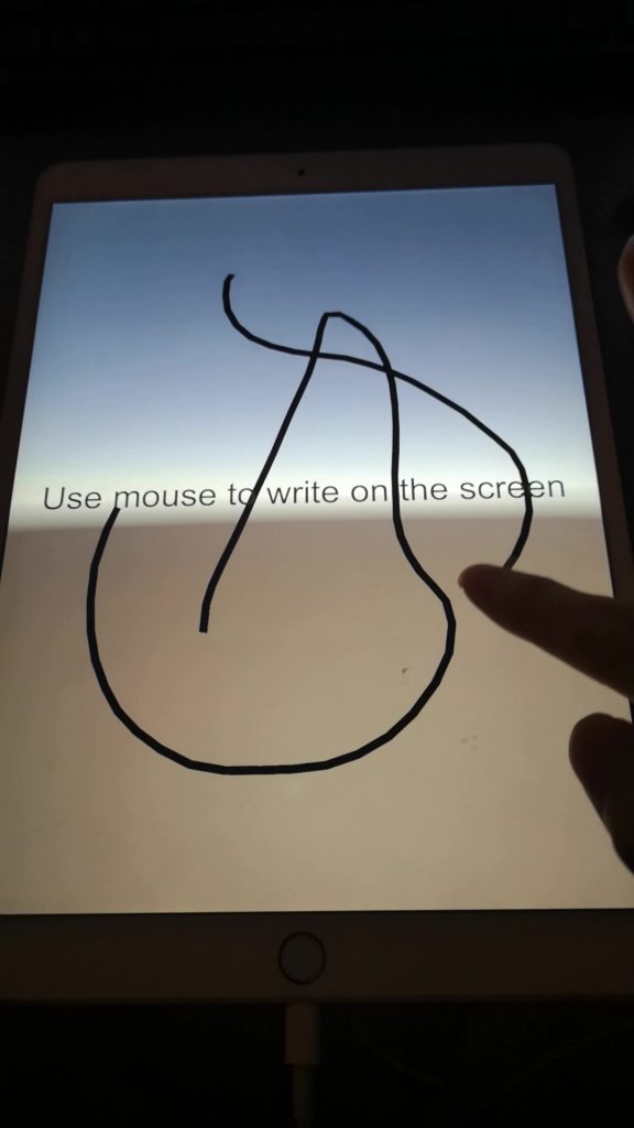
- Paper playtest: this involved sticky notes and paper cut outs to simulate on-screen UI and the specific logic of certain mechanics. Since creating a full build took up the Programmer’s entire week-long sprint, the game designer and UX designer would use paper mock-ups and talk users through the intended experience. The key is to only provide as much detail as necessary to gauge players’ instincts and desires. Most playtesters were willing to accept the low-fidelity of these playtests and provide feedback on a hypothetical high-fidelity version. The Tutorial/Chapter 0 was playtested in this manner.
- Composite video trailers: this involved editing together footage of live actors, recordings of the iPad app, and spatial diagrams to communicate the intended experience to remote audiences. These were time consuming and resource intensive to make; however, they were the most accurate and high-fidelity way to explain the experience to a playtester (short of actually playing the game); however, since all of the editing of the footage was accomplished by 1 member of the team, these trailers were difficult to change and modify to reflect changes in the experience itself.
What didn’t go well
Technical Challenges
iPads were inelegant and uncomfortable to use for long periods of time. The project has never been executed fully with purely naive guests using the iPads as intended. iPads that run the experience best are also very expensive. Given the performance requirements, the experience becomes much less playable on lower-end iPads and apple devices.
iOS development also proved a great hurdle to remote development: only specific pre-registered devices can run the experience using testflight. While iPads are the premier tablet on the market, having to build the project on iOS increased build time and involved many iOS-specific steps before pushing the build to the iPad itself. Committing to iOS also meant that the game experienced weird glitches when switching platforms to Android.
Marker-based mobile AR in its current form is unreliable and prone to “glitching” out. The client directed the team (and the programmer) to pursue completion of the entire experience over ironing out the stability issues. The team understood that gameplay footage could be edited to avoid showing unsightly glitches caused by a combination of lighting, marker quality, robustness of Vuforia’s marker-recognition functionality. We were also unable to test marker recognition outside of the programmer’s own home due to iOS deployment issues.
A programming bottleneck occurred due to the team only having 1 programmer able to modify the Unity project and implement new digital features. Additionally, due to working remotely, the only member on the team capable of actually running the experience was the programmer. No one else on the team had iPads or an iMac to build the project. While we tried to design around simple theoretical implementation, the programmer still had to prioritize completion of new functionality over changing UI text, implementing sound effects, fixing lighting effects, etc.
Complex and cumbersome design pillars
While the team successfully understood the original Rosenstrasse’s complex and moving emotional design, we struggled to turn the original’s emotional design into elegant design principles. Our design pillars always felt confusing or difficult to make actionable given our project’s goal to make a “full experience.” Consequently, we stopped using the design pillars late into the semester.
Complex and ambitious narrative left unpolished
Having an ambitious and complex narrative meant that the team struggled to do justice to the story as a whole in all its nuances and complexities. While we had a sense of high-level narrative concepts (e.g. what happens in a part, what the general feeling of a part should be), we were never able to dig deep into specific moments of the story and what is supposed to go through the players’ minds as they play those moments. Holocaust storytelling is in and of itself a great challenge. For the purposes of building as much of the experience as possible, we brushed broad strokes for the narrative and it shows. As much as the game is designed to immerse players historically in 1940s Berlin, the project also struggled with what that really meant in terms of the game’s visuals, UI, and text itself. Arguably a more cohesive, intimate, and polished 10-minute experience would have accomplished our design goal of telling Max and Annaliese’s story of “we choose each other” better than the 30-minute experience.
Additionally, the team’s background and storytelling skills leaned towards theater, film, and studio art. These skills required access to the physical location in order to playtest and iterate. In contrast, a team with a dedicated writer or even script-writer might have had more success creating a story that could be refined without a physical location. The team believed that story and narrative would emerge from iterative playtests of the full experience. When those full-playtests were not possible, less and less progress was made to refine the narrative itself.
Roleplaying is still difficult for most players
Roleplaying remains a high-bar for most players of the game. The team never came to a satisfying answer to what successful roleplaying looks like. Does it look like a family of 4 walking into a museum to learn about the Holocaust? Does it look like improv actors holding iPads? When we played Rosenstrasse, we knew it was working because we didn’t want to go home. We wanted to see what happened to their characters. We physically leaned over the table. We never had a chance to see what types of roleplaying emerged in our players and then choose which types of roleplaying behaviors to develop further.
Playtesting was difficult
Niche and Changing Audience: The project began with the explicit goal of being deployed to the IMX conference in Barcelona and pivoted to laying down groundwork for future potential deployment to museums or other academic conferences. Our understanding of our audience was the overlap between academics, fans of history, and experienced roleplayers. This small audience required us to process all feedback through the lens of if our playtesters fell under our intended audience. Additionally, identifying this audience and having them play the game was difficult. Of all the playtests conducted this semester, maybe 5 individuals met the above criteria. Because the experience lives in one location, specificity on audience will drive successful designs on how best to incorporate them into the experience.
Remote playtesting of a location-based game plagued the second half of development. The team ultimately chose to not alter the design of the game to be easier to develop remotely. Since the experience is location-specific, the game was never truly and authentically playtested. This combined with iOS-specific development restrictions, meant that the game could never be deployed or played outside of the home of the programmer. While we did our best to work around these challenges (i.e. test android deployment, paper playtest through zoom, shift project goals to documentation, create trailers of edited footage, etc), final rounds of feedback pointed out the lack of polish in some parts of the game.
Physical Materials do not exist
Setting aside the problems with remote work, designing the physical materials of this game would have been a time-consuming and serious undertaking: it could be one teammate’s entire job. Objectively, the team was unable to realize its design goal of an “immersive location-based” experience beyond the high-level design phase. None of the team’s expertise or technical skills lent themselves to building cardboard street signs or capturing the feeling of blackbox theater spaces. Even if we had gone to Barcelona, attendees of the conference would have likely been distracted by the walls, floors, and chairs of the venue itself.
Audio-based mechanics were implemented very late
While compelling, the proximity-based voice lines and sound-based mechanics remain unpolished and rough in their current state. A sound designer was also involved in the team very late in the semester. While audio is a crucial part of effective storytelling, we were unable to create the sounds of our game until very late in the semester. Additionally, we never created a unique musical identity for the game’s trailers.
Lessons Learned
Playtesting is key to a high-quality final product.
We had wanted to playtest often, with clearly defined questions, and diverse playtesters. This was also the key to many of our first design iterations (e.g. sign shape matching, iPad as mirror, etc). The project suffered when it couldn’t be playtested fully. While we developed a few different ways to playtest specific parts of the experience, the final product reflects a lack of polish and refinement that a final deliverable needs.
Potentially, we could have pivoted the design of the project itself to be more easily playtested. Alternatively, if we had prioritized a narrative playtest tool, we could have addressed playtest questions sooner.
Interactive storytelling is very complicated and can be one person’s whole job.
Conventional roleplaying is a strange and foreign concept to many people. The current project never came to a strong consensus about what a successful and emotionally moving playthrough of our game would look like. Text is also a necessary but insufficient medium to communicate narrative. It requires a lot of exactness to do effectively.
Writing could also be the entire job of one team member. The team tried to disperse the responsibility of narrative design, but ultimately found most teammates focusing on their primary responsibilities before refining the narrative.
Simultaneous production pipelines work best with familiar, repeatable processes
While we had a plan to work on parts of the experience simultaneously, we underestimated how long polishing each part would take. While our team was able to execute and build new parts to the experience, our pipeline did not adequately budget time for incorporating feedback or testing. Additionally the paper design phase of our pipeline was never really able to playtest mechanics and designs before being incorporated into the digital product. Since the steps for developing Part 3 differed from the steps to develop Part 2, we wound up with inaccurate time and work estimates.
Last Steps and Wrap up for the Project
The remaining steps for memoiAR are to conclude final changes to the demo, conclude a documentation package for future development, and to remotely present the game to the Snap Creative Challenge Summit on Wednesday June 17th.
Our client Jessica Hammer expressed a desire to pursue funding for potential future development of the concept (thus the documentation package). Ideally, a future team should be able to read the documentation and continue development on its design themes. Additionally, PhD student Erica Principe Cruz expressed interest in pursuing academic publication of the design process of this project to interested HCI publications. The team plans to communicate with Erica further about the project following the conclusion of the semester.
