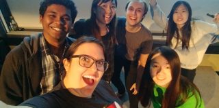
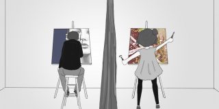
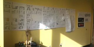
Hello everyone, As we wrap up, we thought we would share some of the lessons we learned. Dedication: Our team was incredibly dedicated to the project. Animation is difficult and inevitably there will be crunch time. What got us through was the fact that everyone is incredibly passionate about making this project the best it could […]
As we conclude this week, the reality of being only two more weeks away from soft opening is starting to hit us.
Amazingly, though, our dread at facing softs has prepared us remarkably well for it. The last time we sent the entire film (with poor animation and lighting) to the render farm, it took 2 whole weeks! The burden that placed on our timeline was terrifying, so we began to investigate ways to cut it down. Today, when our animator said that he is behind due to technical issues, we turned to our Render Defender, keeper of the doomsday clock. She informed as that, by baking everything into the scene and making changes to the render process, we have cut that time down to 3 days! Between that and the one week buffer we built into our schedule, we’re on track. Our producer even said, “This is the first time that I stopped worrying since the semester started.”
Chances are, we’ve jynxed something by feeling so good, but we’re rolling with the high.
While our animator works on getting the kinks out of the motion, our 3D artists have used this time to playtest the environment and refine the textures. Last Saturday was Playtest Day – a day long demo event run by the ETC. We put folks between the ages of 12 and 40 in each of the four different environments we built to see how they identified objects, which lighting they responded well to, and whether they could recognize where they were.
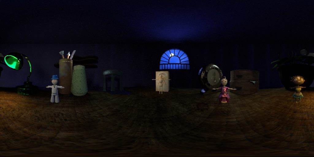
The first environment we showed playtesters was the Workshop, or what we sometimes call the “Start Room” in conversation. It is meant to be a toy-maker’s desk at night. Whether or not viewers could identify it was the question. Objects like the pencil/pen jar, the desk lamp, and the chair told our playtesters that it was a desk. When we asked whose desk they thought it was, testers had vastly different answers depending on their age. The 12 and 13-year olds all said they thought it was a girl’s desk. The adults thought it was some kind of craftsman’s desk. While this didn’t necessarily impact our design (we felt we were getting the point across well enough to move forward), it did help us come to understand what opinions people bring to their viewing experience, and how it impacts what they see.
Next we showed them the three different cultural environments to see if they could identify the objects or the culture to which they belong. More importantly, we needed to know whether the textures and lighting “felt” right.
In India, the lighting of certain objects wasn’t catching right, and the texture on the floor was looking pixelated. We thought this color was going to be a favorite of viewers, since our team loved this environment so much, but the red color was putting off some viewers. In addition, we realized a serious cultural faux pas, when a number of our viewers identified the building behind Indian doll as a Mosque. It is supposed to be a Hindu temple…. Whoops. Our Hindu teammate immediately stepped in to suggest changes.
In Ghana, the lines of night and day were blurred. The sheer amount of yellow confused viewers into thinking that the light outside the window was the sun. Of course, in the film, this will be mitigated by the fact that this environment is sandwiched by context – a starting nighttime environment and transformations that turn the lights on.
Brazil was an audience favorite. Perhaps a lot of people just love the color blue, but our producer suggested an important point: the cultural origin of the viewer matters. Red is considered auspicious in Asian countries, where four out of the six of our team grew up. In the United States, the nationality of all of our playtesters, red is the color of anger and violence, while blue is meditative and soothing.
We spent the rest of this week making changes to the models and textures in order to increase the clarity and appeal of our environment. This weekend we wrap up the animation, and next week we lock in VFX. It’s crazy to say, but we’ll pretty soon have a first pass of the finished product.


