Week 3
At the end of last week, we realized that power may be a huge issue in our original idea. So we decided to sit-down and brainstorm as a team together some new concepts that still encompass the vision of our experience.
We discussed how our ideal user flow is the following:
- I can do something on my own.
- I can do more things on my own.
- When I work with other people, there are more interactions to explore.
The words that we focused on were:
- EXPLORATION
- PERSONALIZATION
- COLLABORATION
We discussed the minimum viable product for the Sensory Blocks idea:
- Needs to be portable
- Battery charging to work
- Needs to be robust
- Boxes/sensors won’t break
- Communicate purpose of each block
We also came up with a back-up plan, putting all of the sensors, power, and Arduinos into a wall which is then interacted with:
- Passive RFID tags in cubes
- Key to lock mechanism
- Each cube changes the value of a property in the wall
- Wall can also react to motion?
Right after this brainstorm session, we met with Jess Hammer to review where we were at.
At the beginning of the meeting, we weren’t sure how to proceed. We were really tied to our Sensory Blocks concept, but did realize that it had the potential to fall short if we couldn’t figure out power. We wanted to still try, but we were waiting for all of our equipment to come in to begin prototyping.
We had also brainstormed a few different ways to the lock & key mechanism idea mentioned above. But we didn’t know how to proceed since we still had so many ideas!
Jess suggested that we:
- Figure out how to prototype this for satisfying interactions – paper prototypes
- Lo fi
- Get underlying mental models
- Start getting more concrete and specific
- How many colors?
- How long to interact?
- Are they equally distributed?
- Go through every aspect of different ideas – narrow and shape interactions – create our own constraints!
- Make a list
- Generate questions that we want answered about each prototype
We met with our faculty right after, and they agreed that we needed to start getting more specific:
- What are our boundaries?
- Demographic?
- Model for play?
- For Quarters:
- 3 directions that are fruitful – what is the main point, and then the extension
- Cooperative play
- Competitive play
- Single player
- How reliable is this tech?
- What materials?
- What is the dimensions of the floor space?
- 3 directions that are fruitful – what is the main point, and then the extension
- Determine the window into prototypical play experience
- 2 people?
- Passing back and forth?
- Less maybes
- This week:
- Prototype!
- Define interactions
- Define model of play
- Make an argument for:
- Why is physicality good?
- Accessibility?
- Get client buy-in early
- Why is this where you want to go?
- Follow the fun!
From there we began to prototype! First, we were interested in re-visiting our LED Bridges idea (remember from Week 1?). But with the LED structures resembling I-Beams.
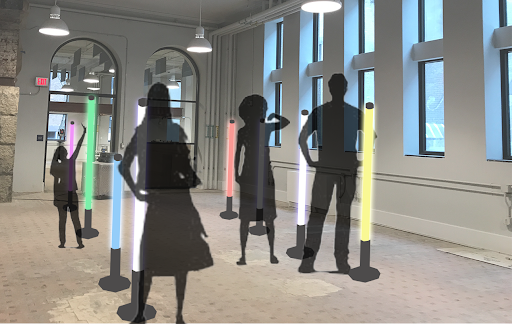
We built a bunch of I-Beams…and then realized that these structures were not very approachable. We wanted guests to be able to touch the light structure. But these were SUPER awkward to touch. While it theory, it sounded like a great idea, it wasn’t until we built it that we realized that this would not work.
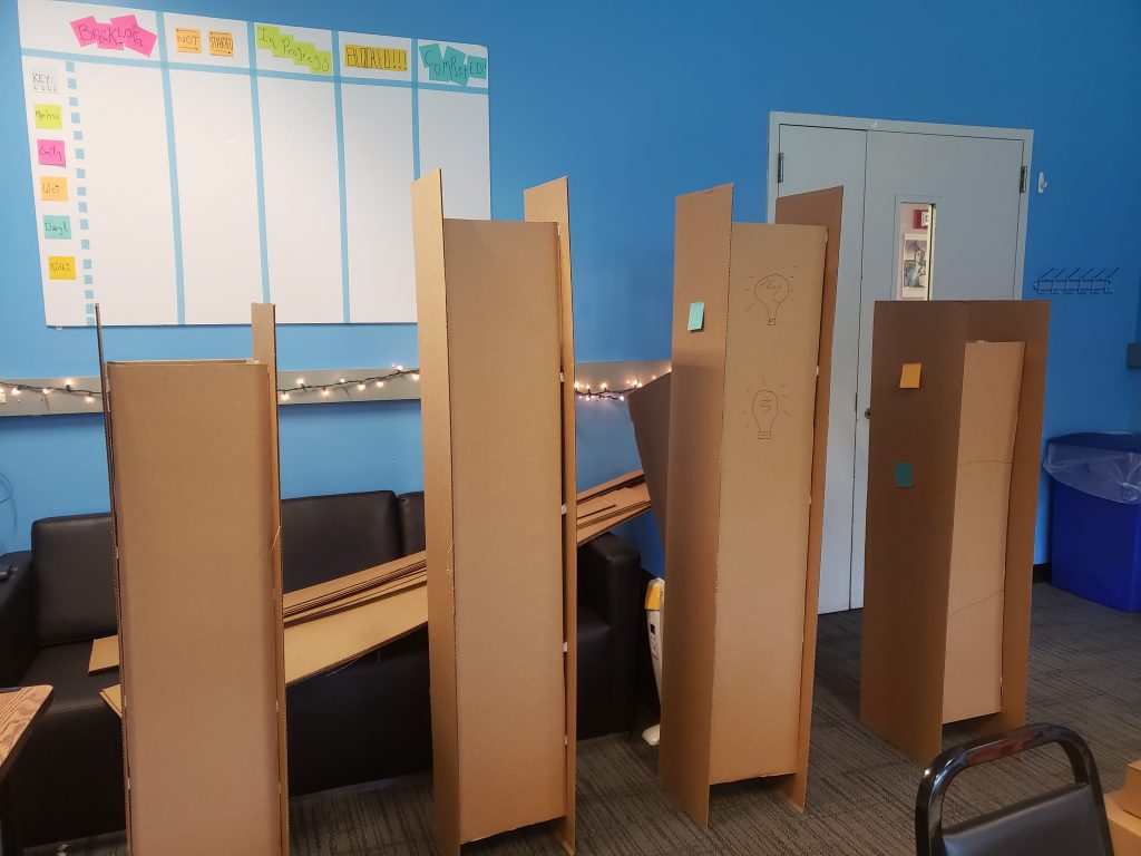
We came up with three other versions of our lock & key mechanism. The idea being that we put all the sensors and lights into the wall.
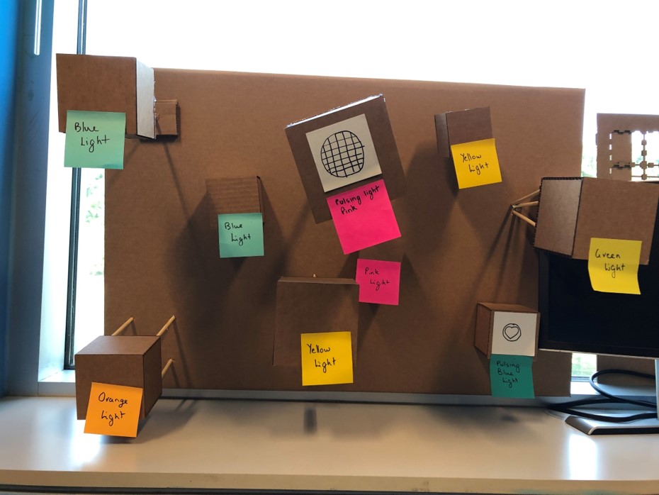
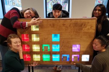
This above version allows the guest to get closer with the blocks, allowing them to touch all 4 sides. The idea here is that the boxes are closer to the guest allowing them to hold it and affect its content through a series of different inputs. It also looks pretty cool and exciting! The downside of this design is that it is inviting for guests to pull off of the wall.
We are interested to playtest and see if our assumptions are correct, that the guests’ instinct is to pull and grab. We are also going to try this version on a flat table, seeing if the guests interact with it differently in that setting.
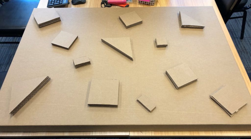
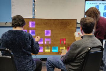
A similar design above, solves for the problem of desire to pull off of the wall, but perhaps is more difficult and less inviting to touch. We are interested to see here if the lack of 3D shapes effects the experience we are trying to go for.
During playtesting we are interested to see if the guest finds this interface appealing and if it is more natural on the wall or on a table.
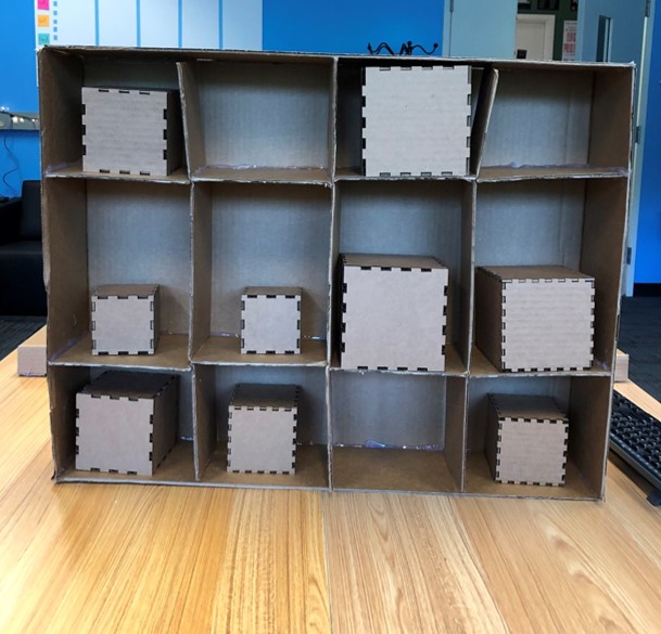
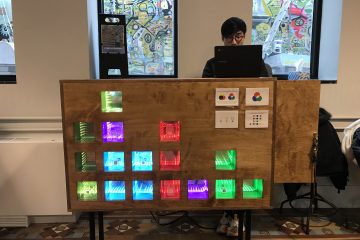
This version about is our ideal interface, but instead of affecting the color on the blocks themselves guests would use the blocks to affect the color of the grid.
During playtesting we are interested to see if guests find this appealing, and what would they want to see happen if they had a choice?
Check back next week to see what we learned during these tests and if our assumptions are correct! We are hoping this will help us to narrow our scope!
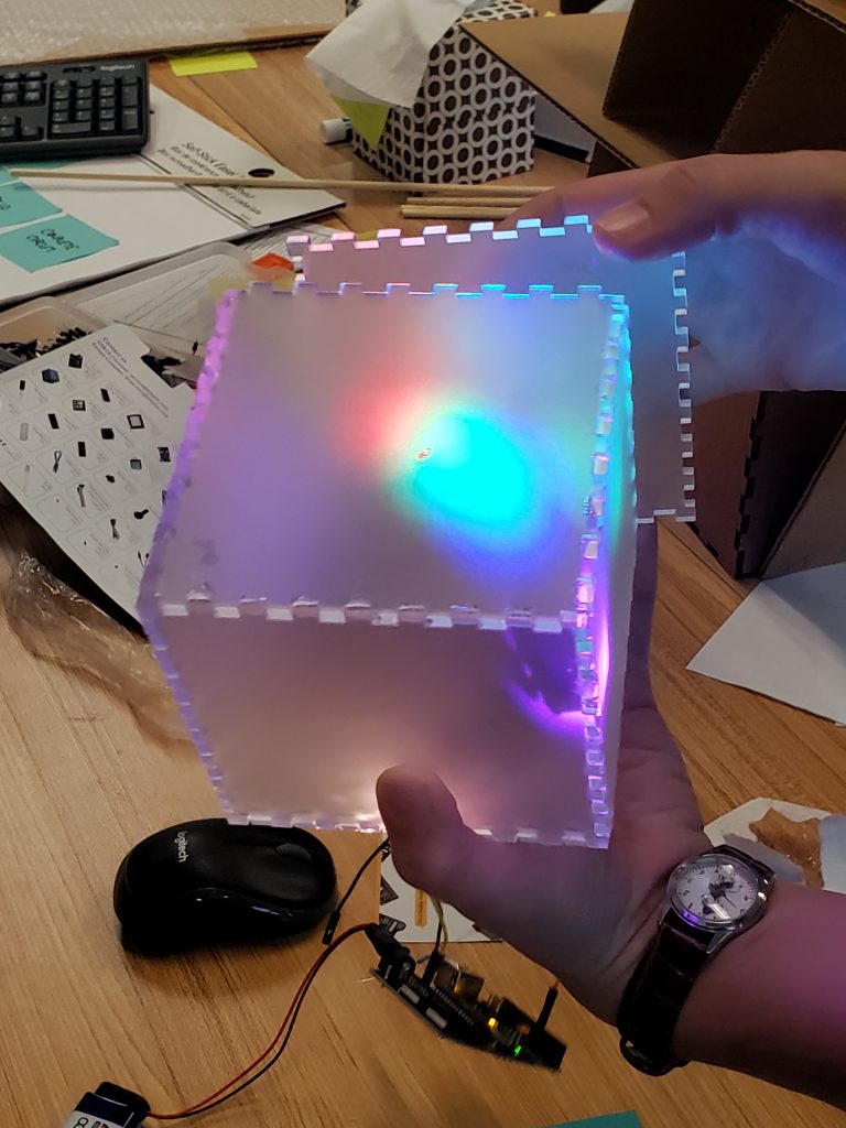
We also got some of our supplies this week and we able to build our first Sensory Block!
