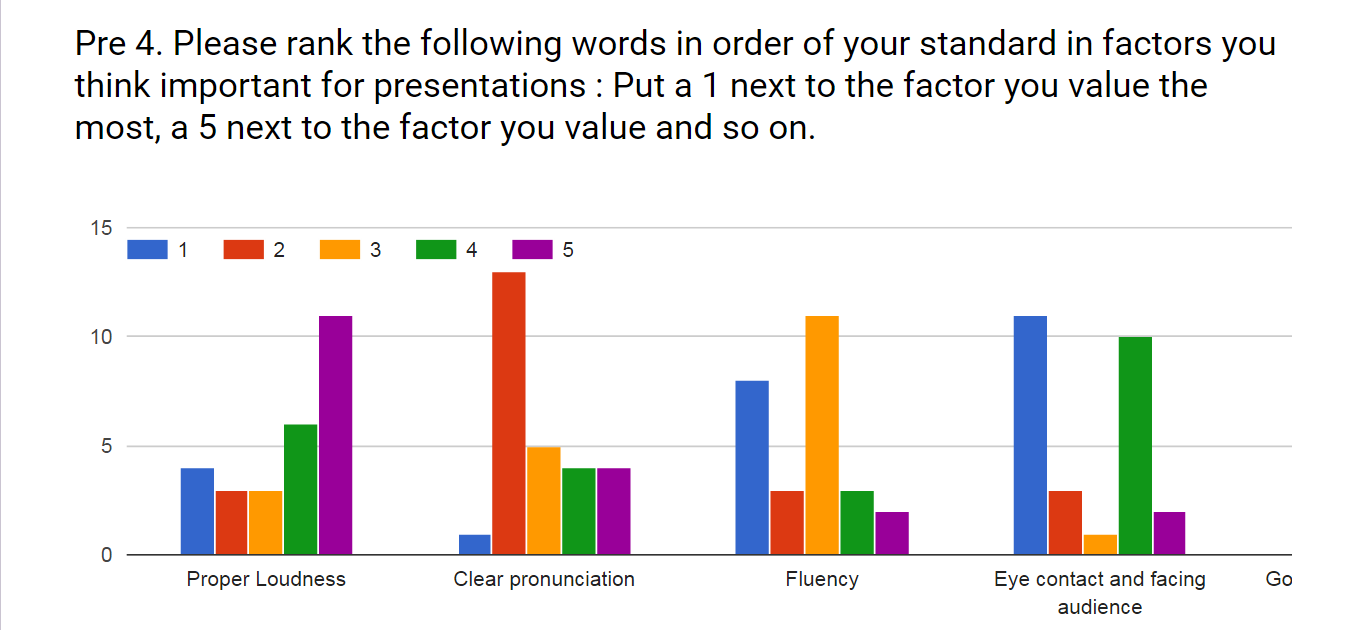
We have researched the important factors of good presentations since the beginning of semester. Through books, articles and thesis about good presentations, We found out several factors including loudness, fluency, eye-contact, time management, confidence and so on. Among the factors, we selected factors which can technically be trackable and be possible to process for feedback data. In the last, the selected factors were Fluency, Eye-contact, Time management. We regarded these factors as the design guideline of our application.

The playtest survey result on April 2016
First, we believe that frequent appearance of filler words, i.e. hesitation words such as “err”, “um”, or “uh” is regarded as a sign of unprepared presentation. We designed our application for guiding the user to keep it smooth and not to make unintended pause during their presentation.The fluency is checked by processing the recorded sound. Initially, we had planed checking filter words. However, It was too ambitious to finish this function within 14 weeks. Therefore, we changed a way of processing fluency by catching user’s hesitation moment. If the user hesitates too much, then the virtual audience changes their behavior such as nodding or folding arms. In addition to this, after the VR practice session, we provide the marker on the voice active graph on review page.
Second, proper eye contact with the whole audience is regarded as a sign of confidence and respect, and leads to more efficient expression. We made effort to design to get the user to give better eye contact or eye movement by using the application. the application checks the user’s eye-contact through the head tracking data from mobile phone. The head tracking data affects the attention of virtual audience depend on user’s performance in the VR practice session and provide eye-gaze heat map on the review page
The last is good time management. A time restriction is a common feature of most presentations. This is why presenters should be prepared for well-organized time plan. For achieving this point, we marked out a time management bar on the review page in order to let user check their time plan. During the VR session, the application records the spent time on each slides. After the session, the user can see how many times they spent on each slide on the slides bar.
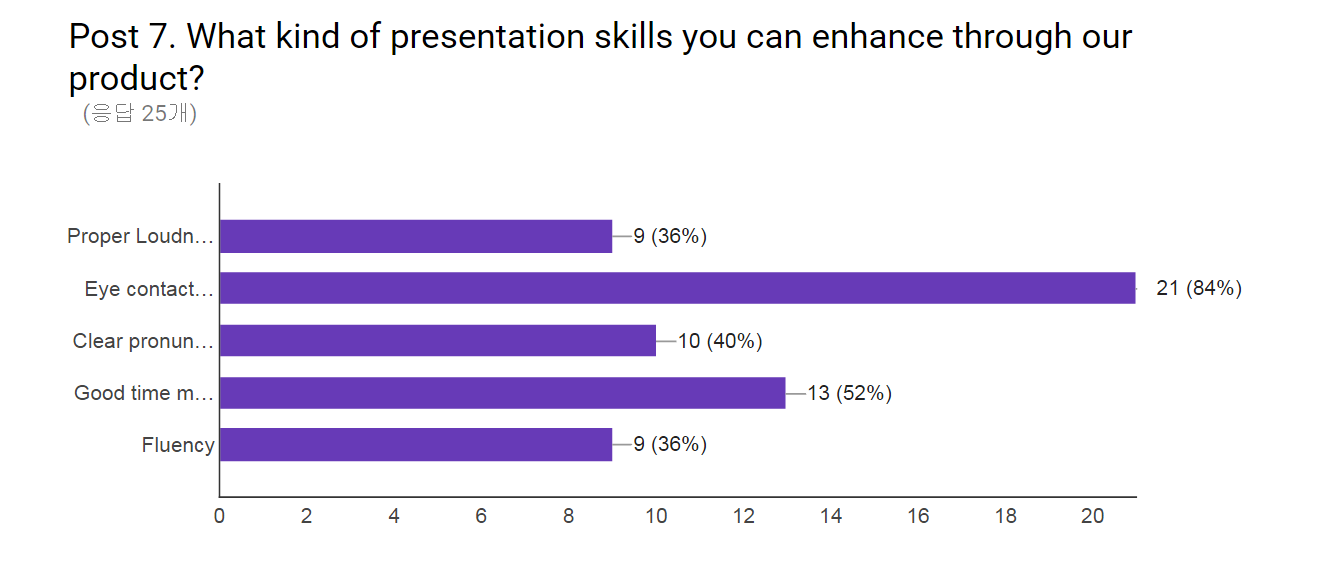
In conclusion. we designed our application for providing feedbacks to users as mechanism of self-practicing. the user receives abundant feedbacks including eye contact, speech volume and fluency from our application. They are encouraged to perform self-check and self-correction based on feedback data, thus they are able to gradually improve themselves over time.

The playtest survey result on April 2016
