It’s hard to believe it, but we’re almost done with the semester! We have one more week before final presentations, and then we’ll be wrapping up. These last few weeks are flying by!
Soft Opening
 On Monday of this week, the faculty came by to see our work for themselves. This is essentially a preview of the final product so that they can give us feedback that we can (hopefully) implement by finals. All teams should be basically done by this point so that the faculty can give honest feedback based on what they see, and not what the team says they promise they’ll do in the next two weeks. For us, this meant having all six of our prototypes ready to demo and a solid first draft of all of our documentation.
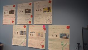 We presented our work by showing the faculty summaries of each prototype on posters, telling them the rundown of our documentation (with copies available if they wanted a closer look) and then inviting them to try a prototype or two. Overall, we’re quite pleased with how things went. The faculty as a whole seemed to understand and appreciate what we were trying to accomplish, and we got some useful feedback for final presentations. We still got a bit of feedback about usability, which is less relevant considering that these are only prototypes, but definitely still worth taking into consideration. Ultimately, we were still able to continue with our basic plan of solidifying our documentation and making minor tweaks to prototypes this week, using the faculty feedback to inform the details.
So Much Documentation
 We started this week with a solid first draft of our documentation, so the main focus of this week was cleaning it up and making sure it was consistent. This meant making sure that the prototype-specific documentation was in the same format for each prototype so that it’s easy to navigate and adding information to some of the documentation based on faculty feedback, like adding common misunderstandings and mistakes to the demonstration walkthrough guides for each prototype. We have several kinds of documentation, at a high level covering the entire project we have:
- A high-level analysis of the design and process aspects of the project, including major takeaways.
- A project post-mortem reflecting on the process of working on these and what we learned about working on this kind of project.
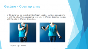 In addition, for each prototype we created:
- A video of the prototype.
- A high-level overview of the prototype, its goals, and what we learned from it (these can be accessed via the “prototypes” tab of the menu at the top of this page.
- A step-by-step guide to leading someone through the experience, intended for teachers or anyone who would like to demo the prototype.
- Sample pseudo-code specific to the prototype that could be used in a lesson alongside the experience (which can be viewed on the overview pages).
- Technical documentation intended for developers who would like to continue working on the prototype.
We intentionally separated the documentation based on who would need to use it, so that people who just want to try or demonstrate a prototype don’t need to wade through information about the code, and vise versa.
Always Tweaking
Although we are not making any major changes to the prototypes, we have continued to make minor ones based on feedback from the faculty at soft opening and our own ideas. (It makes a good break from writing pages of documentation.) Primarily, this has taken the form of fixing any remaining bugs, making small improvements to usability to prevent some of the more common (and easily avoidable) user errors, and adding sound effects to make the experiences more satisfying.
Next week we’ll be preparing for our final presentation and getting all of our materials into deliverable shape.
