One of the critical things we noticed during Playtest Day was that our demo would need to have a higher active engagement with the player. With limited time remaining in the semester, we had to think of creative ideas that would be in-scope, easy wins, and “game-changing” for our demo.
While we had a solid foundation for the creation of a demo, our team recognized that there are several areas in which the game could improve. After having internal meetings, meeting with our advisors, client, and even other experienced ETC faculty, we were able to identify key parts of our current plan that we wanted to address for the creation of the demo.
We knew we had to focus a bit more on indirect control, using Mech placements in our level as a way of guiding the player through the level. Since our team is a production-focused development group, we knew it would be imperative for us to start giving extra attention to the design of our game. Once we had this realization, we were able to think of new ways of approaching the Streamer controls, camera orientation, overall level difficulty, level design, lighting, and UI.
All these were in a bid to, at the end of the day, create an eventual demo that can be engaging to any type of gamer – Streamer or Twitch Audience. While our semester is really about the journey of using an AAA game engine, their pitfalls and strengths – especially for a group of students who want to make something fun – we did not want to let go of our ability to put together a demo that can excite and delight. So, to that end, the team upped the ante, made concrete design decisions that changed our demo’s design for good, and are on track for creating an engaging experience for our final presentation.
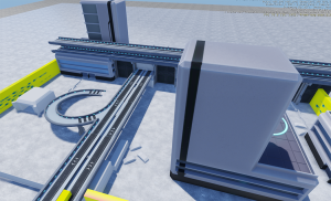
For art this week, a lot of progressive implementations have been made. We have figured out how animation needs to be optimized before importing into Lumberyard, and two key things are adding a root node at the center bottom of the character, and moving the character up so that this root node is at (0,0,0) in Maya. All we need to do for mechs now is to have them move according to AI navigation, on the technical side. Also, Kenhai is fully rigged, and in the process of animating. In terms of textures, after discussing with faculties, we have settled the textures for Kenhai, so that to make her look fierce and attractive at the same time. On the environment side, cityscape texturing is still ongoing. We want to keep a clean, cool-toned style to emphasize the city’s characteristics, such as valuing efficiency and practicality. Artistic direction wise, we also adopt a blue overall tone to express boredom and stiffness of the city.


This week in tech, we re-evaluated our game scope. We have decided to cut down on some of the features to make sure we can polish what we have. With tech integration in place, we are looking at ways to make the game fun or more engaging. We are working with the artists and sound designer to get some FX into our game. UI is also being iterated on and most of it will be locked down in a few days. Now that we have a decent grasp on Lumberyard’s different systems and how they interact with one another, we have been able to foresee and avoid some of the pitfalls we could have run into. While still in beta, the engine does have a lot to offer, but it’s a lot to take in in such a short amount of time with limited resources. We are now focused on making the best of what we understand of the system, discovering small details about the engine day by day.

