At the beginning of the project, we realized one thing. We had a real lack of UI depth. We set out trying to find a solution, as most of the artists would be working hard on trying to make our animals and environment seem as believable as possible. One person mentioned two current students at the ETC, Chong and Bing, who may be able to help us.
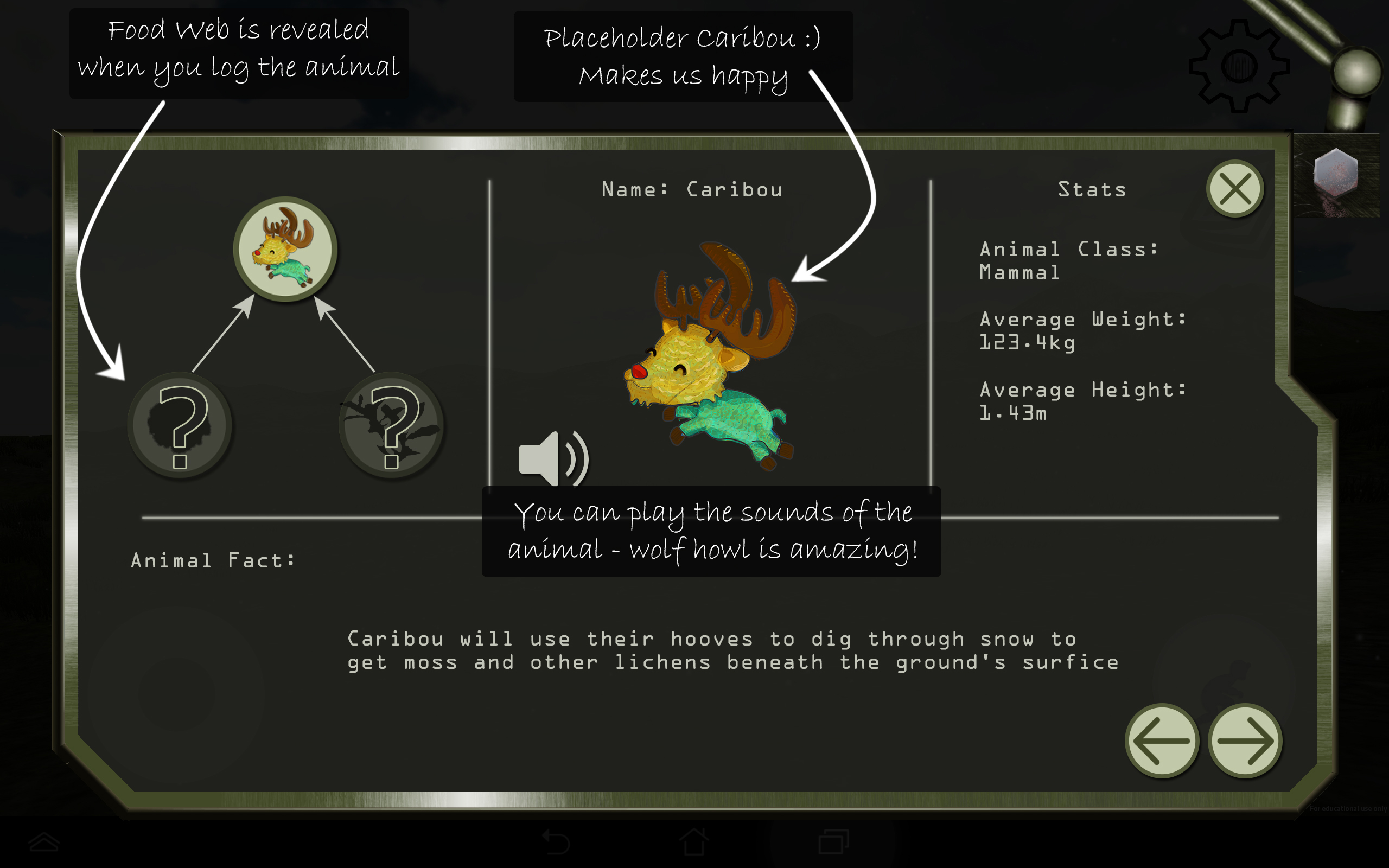
Our designer, Christian, got in contact with them, and they said they’d be able to help! What a stroke of luck. Timing would need to be on our side, and we knew we wouldn’t be able to ask them to be on our schedule. We moved forward creating some placeholder UI for our initial playtest and to give our developers something to work with.
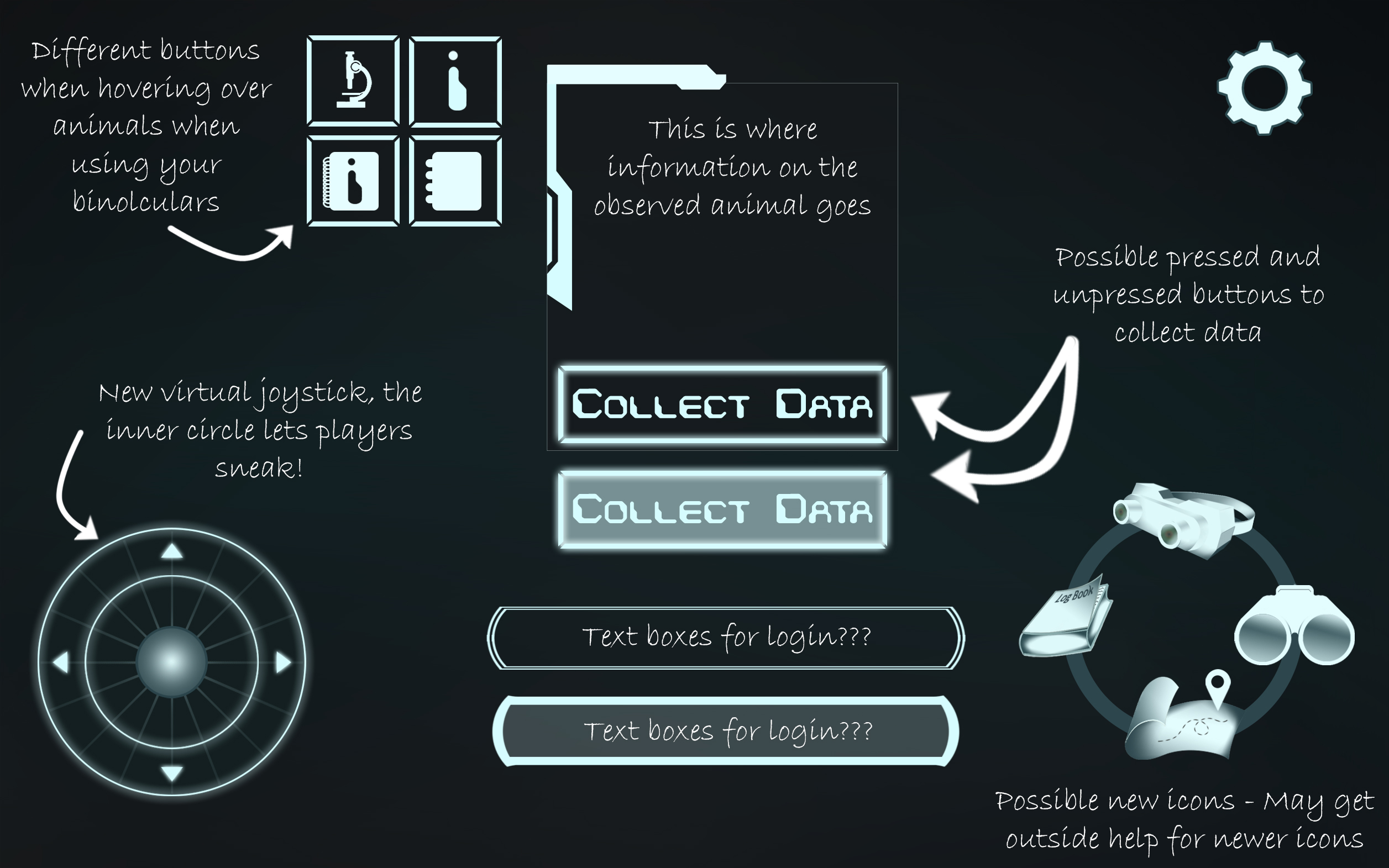
We used this for the first playtest, and it seemed to work just fine. Just before halves we were provided with an awesome PSD that had a whole set of new UI we could use to put into our game. Using this we could also make adjustments and form a better direction of final UI.
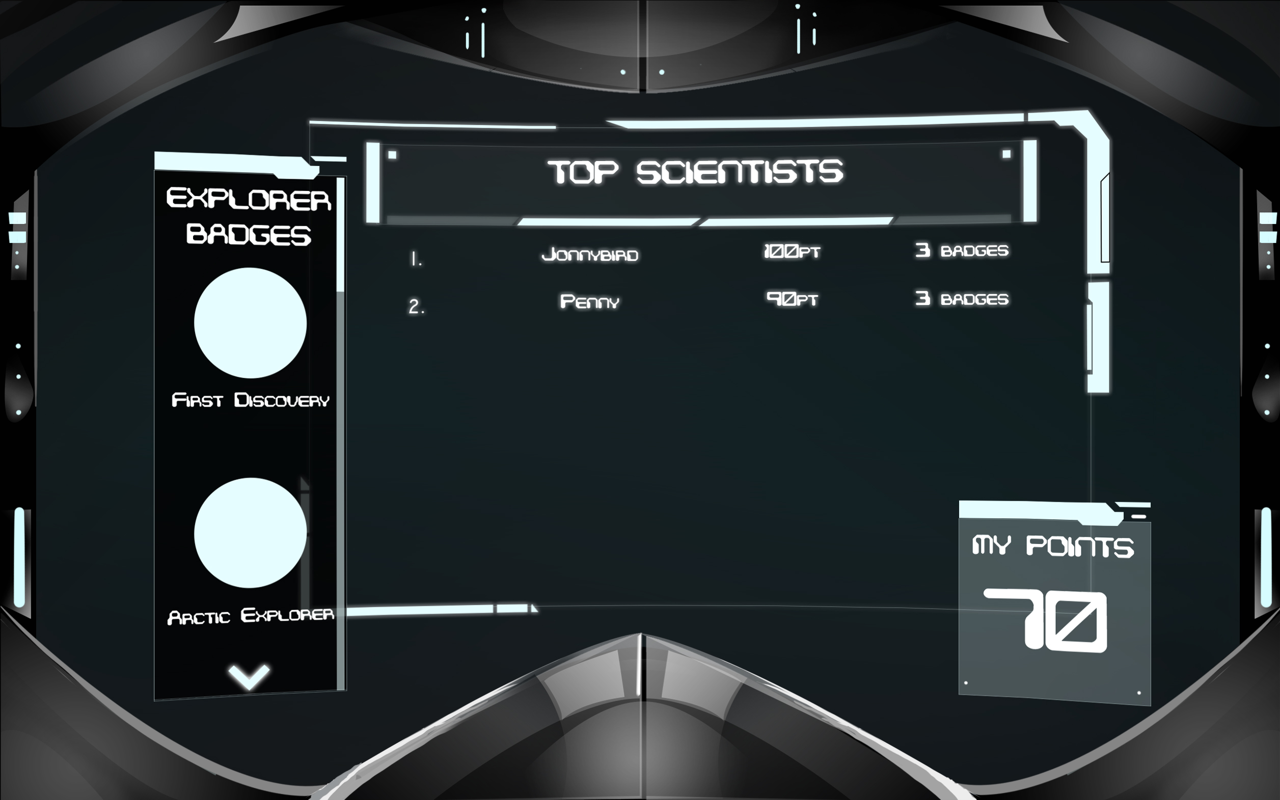
Here you can see some ideas we had for having top scientists realized
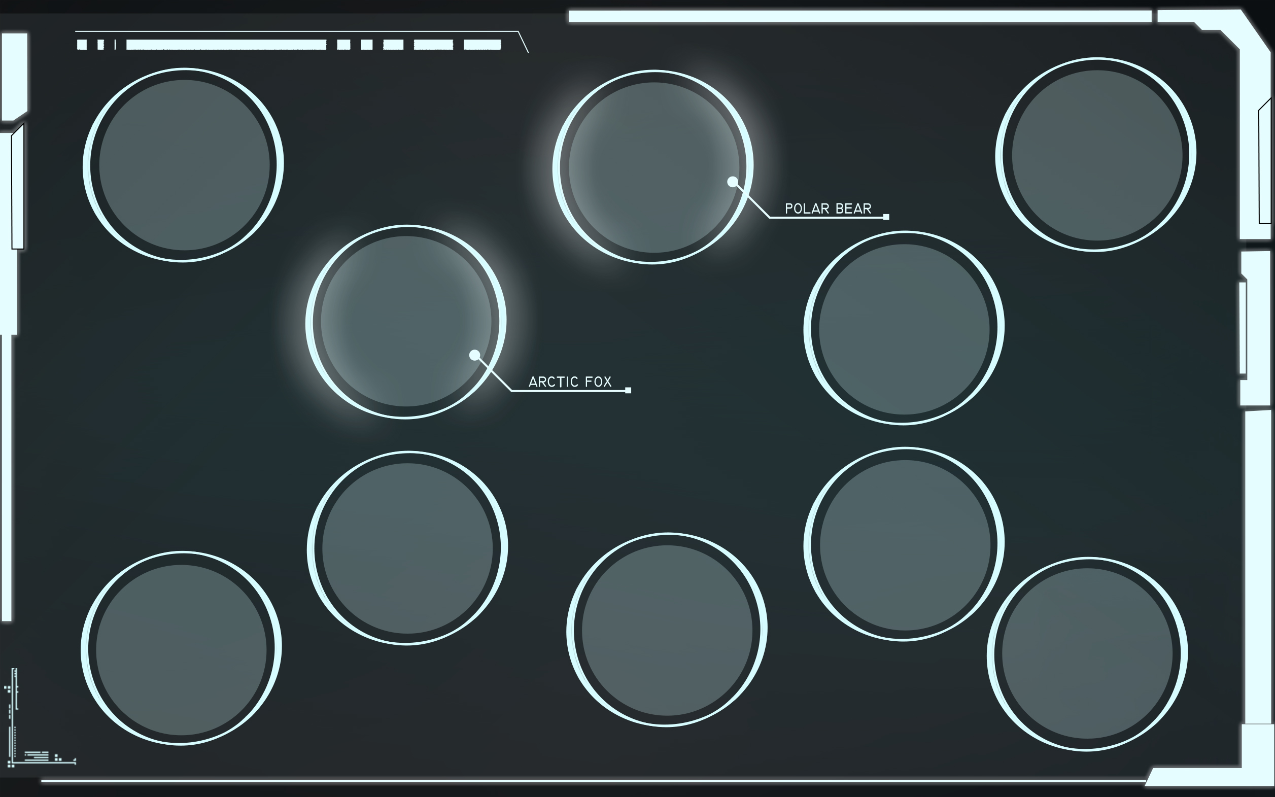
We are hoping to populate a food web, and this has such nice consistent feel through all the UI
Here are some thoughts about the newer UI and what we hope to use it for
Update: 12th December
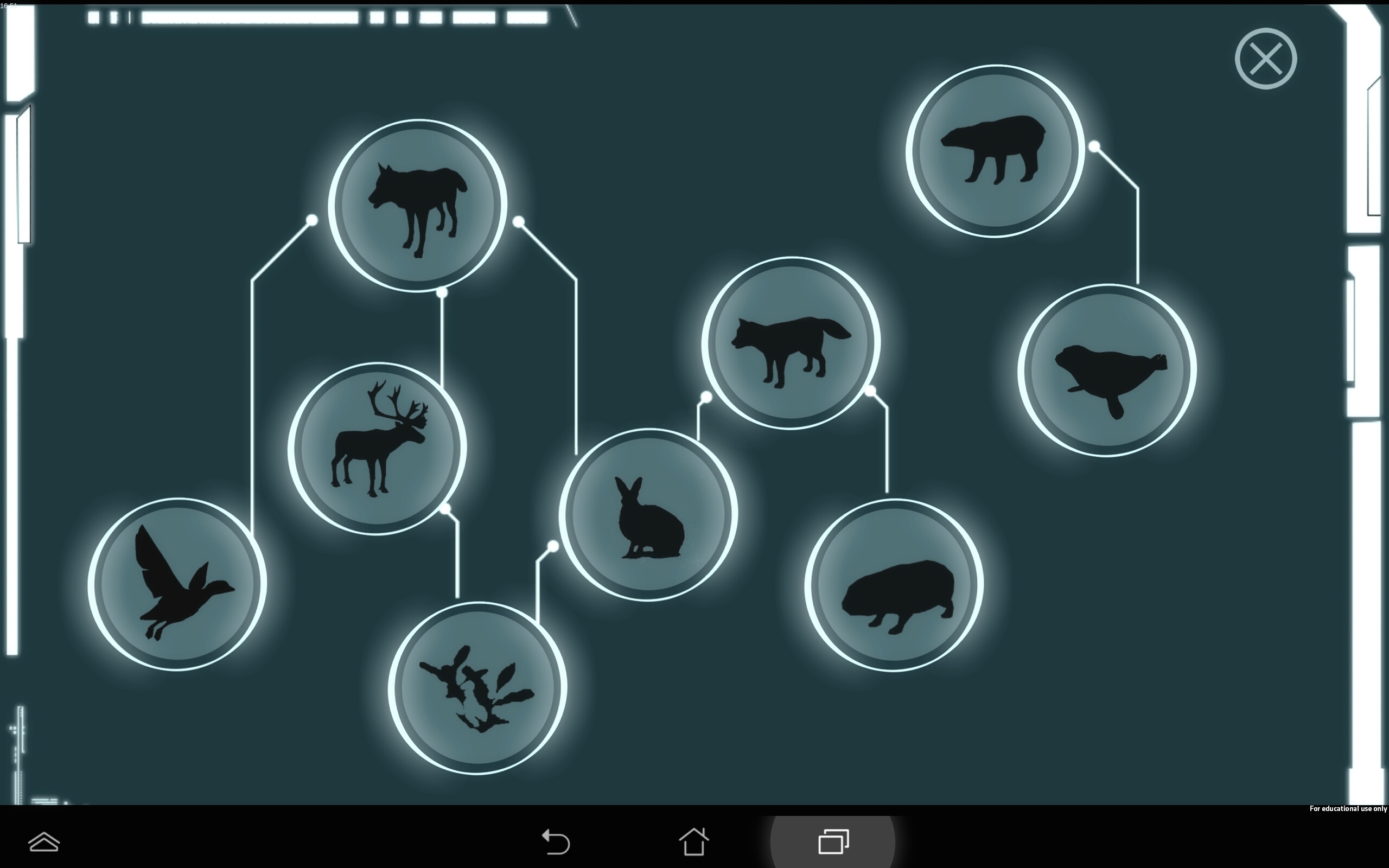
As we wrote above, we wanted to add a lot of this UI in. We did get to a complete food web of our animals and that can be seen below. We also had some newer icons that were given to us by Chong and Bing, and these made it into the game too! We decided it would be a great idea to include a compass rose on the joystick to help players guide themselves through the game world. This helps when looking at the map and deciding which places to go, whether North, South, East or West.
Here you can see the full food web
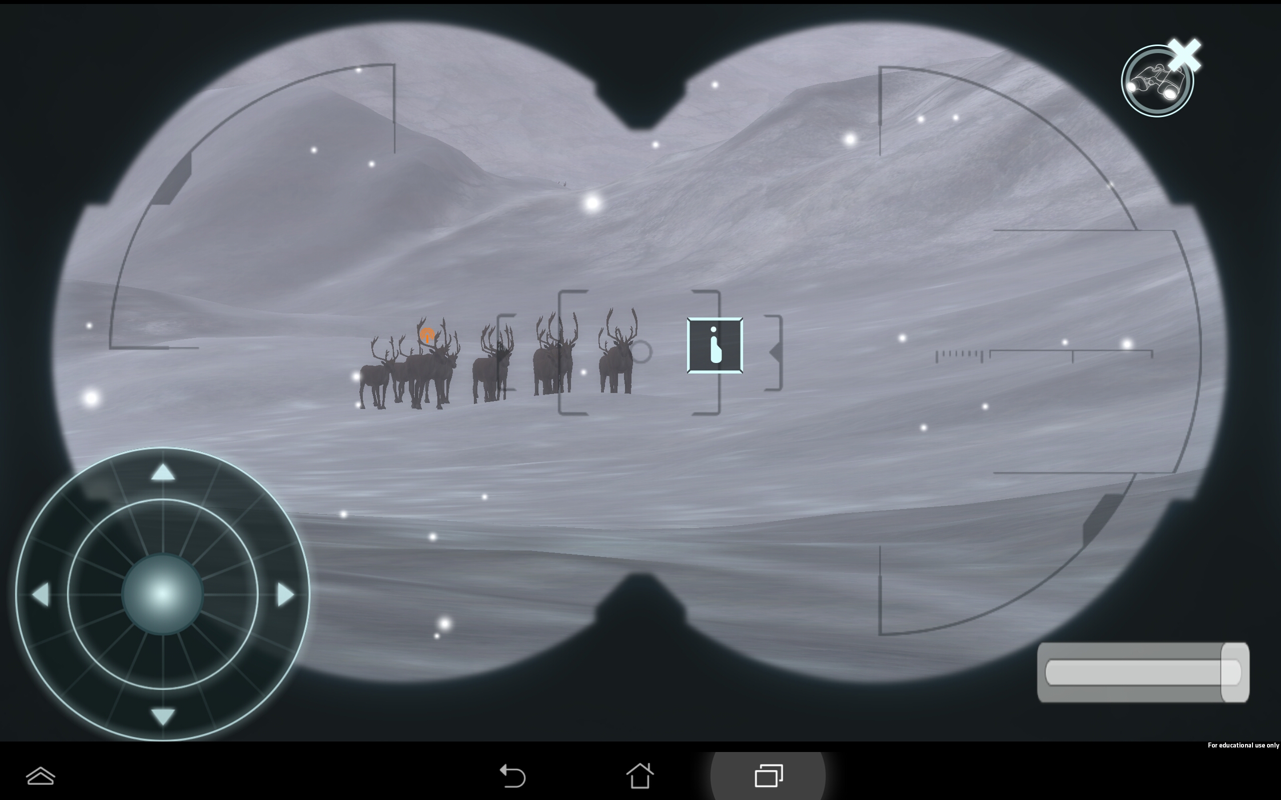
Here you can see the updated binoculars UI
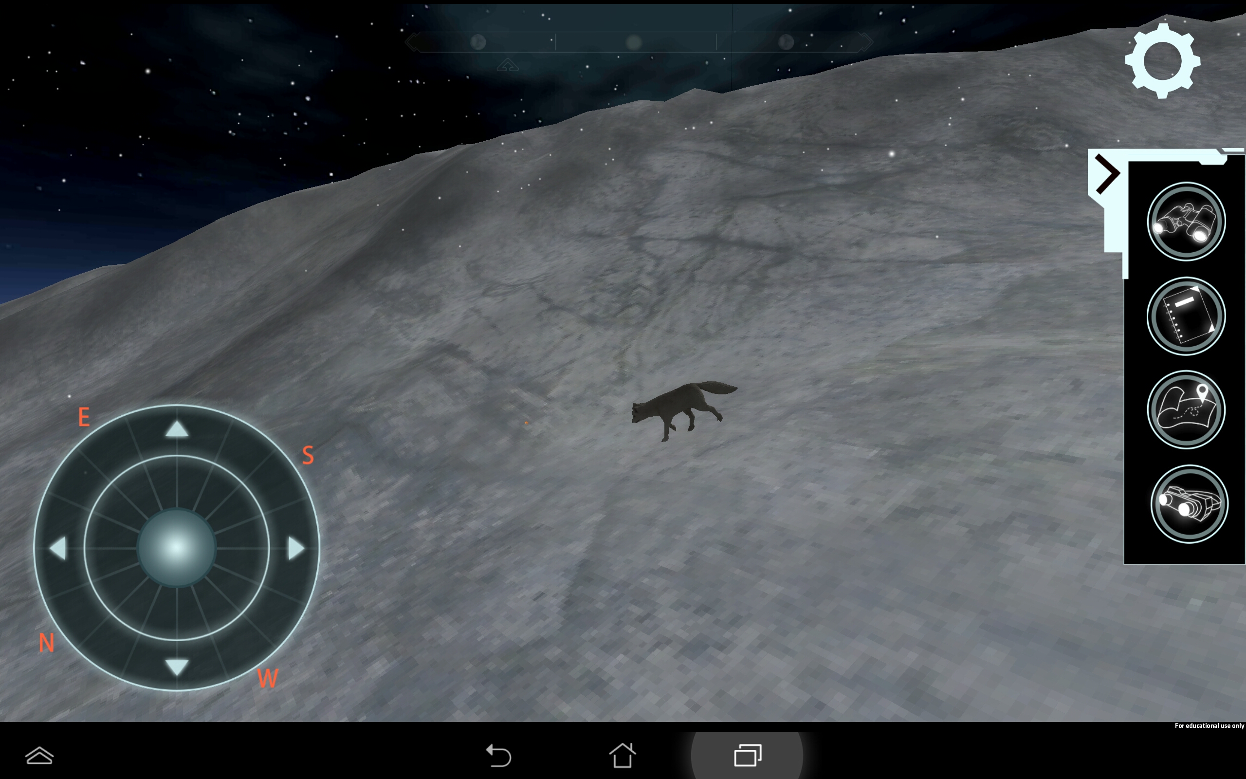 Here you can see the new panel and icons we have for the tools
